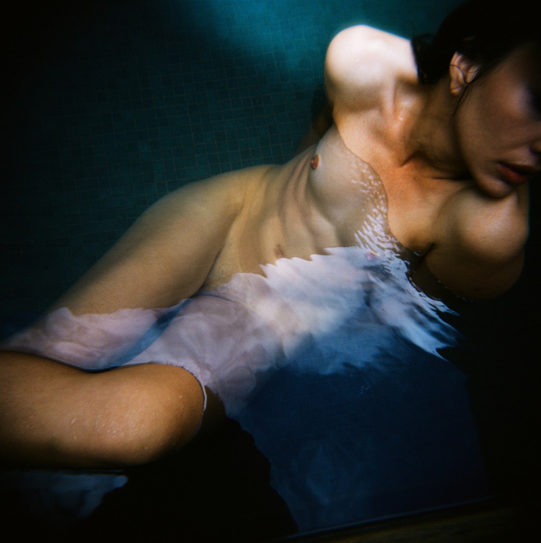
Vlastimil KulaUntitled (2004)

Henri Cartier-Bresson famously admitted to staging many of his best known photographs. This? Staged. This? Same.

It’s ironic that as one of the first to pinoneer the genre of street photography, that his work pretty much flew in the face of many of the subsequently codified conventions of that genre.

Personally, I could take or leave his work. But I do think his staged photos are better for their contrivance–I think that’s why so many people revere his work: it unified the criteria for what made a good street photograph with what distinguished an objectively good photograph.

This image is staged as fuck–and not in a good way. (HCB, at least, staged his shots so that there was an easily apprehended logic to the blocking and composition of the shot.) This is… I mean… if she’s going to get into that tub, it’s going to overflow. Also, the way she’s pulling off her top is something you’d expect of the overly theatrical way you’d expect to see someone perform a striptease. (This runs counter to the placement and framing of the camera which logically suggests surreptitious voyeurism.)

What I did find interesting about this is that the level of water in the tub, immediately made me think of Archimedes and his Eureka! moment–wherein he realized that you can determine the volume of an object by the amount of water it displaces, i.e. buoyancy.)

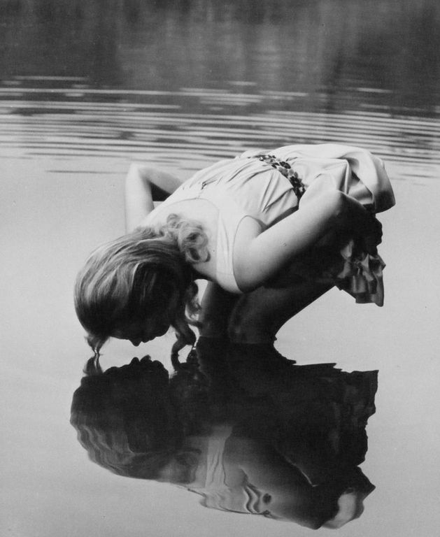
I think conceptually it’s interesting that buoyancy tells you about what is there by what is not. (The displaced water indicates the volume of the object that displaced it.) Reflections show you what’s there but reversed–left is right, right is left.

This is also complimentary to Heisenberg’s uncertainty principle that states the more accurately we know the position of a molecule that less we know about it’s momentum and vice versa. It’s as if measuring things in terms of other more easily grasped things automatically becomes more difficult with the increasing complexity of the system being measured. (My feeling is this relates to Wittgenstein’s aim in Philosophical Investigations. And while I’m not in love with this photo–it’s kind of salaciousness for the sake of being salacious, and otherwise hollow–I do feel like it prodded my brain in an interesting direction.)

Robert RossenJean Seberg in Lilith (1964)

I know nothing about Rossen and precious little about Seberg.

I’m posting this because damned if this isn’t a precursor to, like, a third of Arno Rafael Minkkinen’s work.

What interests me more has to do with the title: Lilith.

Thanks to the Lilith Fair, I think most people know that Lilith was the Adam of Biblical myth’s first wife.

The details of her story are wonderful. Unlike Eve, she was made from the same dirt as Adam–instead of a pilfered rib. She refused to be subservient to Adam and eventually departed the garden of Eden, had an affair with an angel and refused to ever return. As such: Eve was fabricated.

Another post that I saw this morning mentioned the story of Susanna and the Elders–expurgated from The Book of Daniel. Essentially, two total creep see Susanna bathing in a garden and approach her saying that if she doesn’t surrender to them sexually they will publicly impugn her virtue. She doesn’t go along and so she is put on trail.

Daniel is like–well, let’s interview them separately and compare their stories. One says she was bathing under a mastic tree; the other an Oak. The size difference in the trees means that neither is telling the truth because one tree is small and another is enormous.

I went to a parochial school and I find these stories fascinating because the world in which they take place is familiar but these take on a slant that make them more relateable, they are also somehow more believable.

Also, I’m curious what other sort of ‘aprocryphal’ stories like these with which I am unfamiliar. I’m starting to think it might be worth building a body of work based around these strong women who were deleted or marginalized (looking at you Bathsheeba) by The Bible and creating photographic icons for them. So what about it? What other similar stories about strong women am I missing, should I consider?

Rodolfo AsinNoelia (2013)

A black and white photograph (and I say photograph specifically because no matter what your opinion on digital, there is no damn reason anyone should be working in B&W in digital–it’s just poor form) can convey a lot of things. It can be sinister, moody, clinical, severe, etc., etc.

In other words, a B&W photograph no matter the concept or execution carries a sense of shining a light onto a scene in a such a way that allows the viewer to discover the foreign in the familiar.

Color just doesn’t work like that. A photo or image can be in color and be good and important and sumptuous without really even being about the color.

So every B&W image is at a certain level monochromatic in the same way and every color photo or image appears in color in a different way.

Loosely speaking, when we are interrogating color images there are two sorts of photos/images: those in color and those about color.

To my mind, William Eggleston is really the only photographer who ever managed to cobble together a body of work managed–largely–to accomplish both.

Eggleston established a beach head that allowed other photographers–like Stephen Shore, Jeff Wall and Joel Sternfeld to emerge. These photographers were interested in trying to bridge the gap between color as facet of the image and color as intrinsic to the images manifold meaning.

Yet, most work post-Eggleston color work seems less interested in solving a problem like color than dealing with issues of color fidelity, depicting mundane normalcy (for some reason B&W always seems more immediate and authentic, even though it’s not how we naturally perceive the world) and the employment of color as a means of orchestrating emotional response.

Whereas, folks like Harry Gruyaert, focused on color itself.

Now what I find interesting is that to a certain degree Shore, Sternfeld and Gruyaert and desaturate their photos, the images lose some of their punch but they still work. (With Gruyaert, you have to bear in mind that he titled his images. Also, I’ll concede that this might be splitting hairs since both Shore and Wall both work in both color and B&W.)

Eggleston desaturated is just fucking pointless–the color is effectively the glue holding everything together.

These days–sadly–most of the raft of internet famous photographers & image makers produce images in color or B&W and more likely a combination of the two. But I’m hard pressed to name anyone who like Eggleston is making work that only works in color. @pru-e is the first person who comes to mind. (But that’s also not entirely fair since she’s arguably one of the best up and coming image makers in the world.)

Asin, like Shore, Wall and Sternfeld, loses a good bit of his punch in a desaturated reimagining of his work. But he is doing some extremely exciting things with color. The work absolutely loses some of its punch in B&W but it also loses a vitality that the color contributes to the scenes.

I’ve featured another of his images several years back and I was just as taken with his use of color then as I am now.

Karmabella – Reflection (2010)

The subject in this image is a Flickr user who goes by the alias Tangolarina; she documents her life with an emphasis on a curious and unflinching examination of her own sexuality. (I’ve previously featured an image in which she captures herself masturbating.)

I can’t and won’t argue she’s a good image maker–though she does deserve credit for her brash audacity and seeming fearlessness in what she shows of herself.

The above image–presumably made by a friend–is from the stand point of technique–better than the majority of images in Tangolarina’s photostream.

Yes, it has a nice tonal range: it’s segmented between what you might call sepia-lite (in the skin tones), sepia-mid (in the area surrounding the subject) and sepia-heavy (in the reflection). The way it almost looks as if her reflection is staring back up at her is an inspired touch.

Unfortunately, the canted angle distracts from everything else. (What’s that? You say it’s a reference to the cinematic tradition of using an unleveled camera to convey a sense of nightmarish anxiety. Uh, no. I realize that the vast majority of photographers and image makers don’t have the budget of someone like say Annie Leibowitz. That means that we can’t always control everything about rendering the location an exact match to the initial vision. If the fence hadn’t been there, it’s arguably that this might have worked. (And it might’ve worked better given a vertical composition–the trade off being that the aspect of up-down flow would’ve been de-emphasized.)

My point is merely this reads like a back yard that someone is trying to use as an oneiric setting. The tilt isn’t severe enough to fully convey the aforementioned sense of expressionist foreboding and the fence actually blocks additional light that could’ve filled in allowing the reflected face to be fully visible.

As something between proof of concept and a preliminary storyboard, this is a stellar concept that I would like to see executed with greater attention to detail and working towards a clear conceptual end.

I really need to make one more crucial point here–and this is also sooo much more important than any of the preceding observations: I ADORE the way that Tangolarina is pushing the envelope on at what point depicting the body becomes pornographic. While some of her preoccupations and concerns are decidedly prurient, at no point does she allow things to drift across that nebulous line into the realm of pornography.

That alone is worth the time and energy necessary to explore her work.

Laura KampmanUntitled (2015)

I’d post this just based on the exquisite tonal range and use of the depth of field–the mid-ground is soft while the background (both actual and reflected are sharp).

But really this deserves to be celebrated as a testament to discipline.

Anyone who’s ever tried to take a Traci Matlock-esque mirror self-portrait without looking through the viewfinder, knows it’s nowhere as easy as it looks.

But here Kampman is using a TLR–so she doesn’t even have the benefit of a  straight forward view as I’m reasonably certain that Rolleis mirror left to right in the waist level finder.

And she’s set things up with very thin margins as far as composition, so this is emblematic of a degree of mastery I’ll admit I lack the patience necessary to cultivate.

Faber Franco2rectangulos (2015)

When it comes to conceptualizing my own work, I’m like the cat that has to turn in circles a few times to find just the right spot/angle so that I can drift off.

I don’t know fuck all about Franco’s process; his work suggests a calculated effort in service of established momentum following a clearly planned trajectory. In other words, it’s less novice swordsman sheathing and unsheathing or otherwise sabre rattling, than samurai who only removes the sword from scabbard with the intent of using it to kill.

What I don’t understand is that although Franco seems to possess a complimentingly developed grasp of craft, I don’t follow his penchant for restricting the tonal range in his images.

Take the above for example: if it were mapped according to the zone system, we’d have roughly 5 full tones. In this the restricted tonal range does contribute to a sense of failing half-light (which is very much in character for the piece).

However, as there is a similar truncating of tonal range in virtually every image on Franco’s Flickr, it smacks a bit of a self-conscious stylistic ‘signature’–something I find frustrating given the overall quality of the work, taken as a whole.

I couldn’t swear to it but I’m reasonably sure there’s a Lynchian influence acting here–the primacy of angles in composition and interplay between super saturated complimentary colors.

And as much as I love most of Lynch’s work, I’m reminded of a criticism leveled against me after sighting Lynch as an influence back in college. Most of the people who claim or demonstrate influence from Lynch tend to use his work as an excuse to break rules before you’ve bothered to learn them properly.

In this case the tonal restrictions do evoke a Lynchian ambiance, while unfortunately overlooking the fact that although Lynch will definitely limit his tonal range for surrealistic effect, he almost always does so by amplifying those four or five zones to the moon while still maintaining a crisp, well defined luminous range. (As just one example consider Frederick Elmes’ cinematography in Blue Velvet, especially the scene where Jeffery finds Dorothy’s husband and the Yellow Man in Dorothy’s apartment.)

Source unknown – Title unknown (20XX)

Even though I suspect this is a composite–the dust scratches are not on the wall and they would necessarily move if that part of the frame were not a single repeating still frame; the wall and mirror are a mask, the mirror is transparent and footage of the masturbating boy has been strategically placed in such a way so as to appear as if reflected–it’s gorgeous.

Try an experiment: using both hands block your view of everything but the boy. Watch for a moment; then remove your hands. Note how the sense of vague exhibitionism disappears and a sense of voyeurism permeates as you consider the scene in totality.

Also, I like that he’s already orgasmed (you can see traces of semen on his abdomen), but he’s still stroking vigorously.