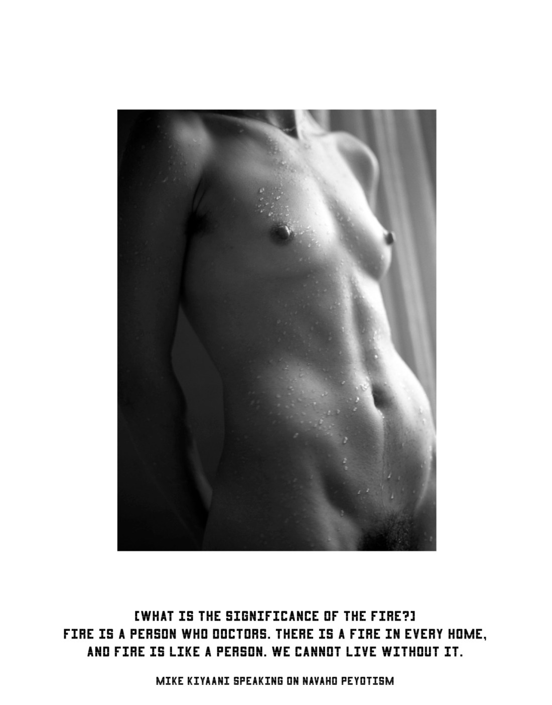
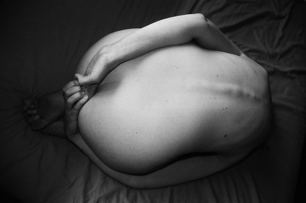
Ashley MacLean – Untitled (2015)
See also: The psychoanalysis of fire


Slide to Unlock – Laundry Day (2014)
[Recalling] the Chinese legend that says that when a boy and a girl are destined for one another they are tied together forever by a red thread.
Viola Di Grado (70% Acrylic 30% Wool)
Slide to Unlock is a tumblr documenting the sex life of a thirty-something married with children couple living in London.
They’ve earned attention due to their submissions to NN and (more recently) their intense sex tape.
Typically, I’m not super fond of the couples’ sex blog thing. The whole She/He thing rarely strives for anything beyond the knee-jerk archetypal. But I’ve found myself warm to the way this couple presents the sex they have as a multifaceted part of a highly connected, communicative relationship. When I view their images, I can’t shake the feeling that if I could zoom in to the sub atomic level, that I’d see the red thread tying him to her.
That alone makes it stand head and shoulders above any other couples blog (or 95% of porn, for that matter).
Also, there’s the fact that both are all kinds of twitterpated making levels of sexy as fuck. Especially her, who I–I have to confess–has always for me borne a more than a casual resemblance to the one to whom I am tied with red thread. But in this sequence, it’s like the resemblance is even more pronounced. And I’m reminded of the way we two made love but it also foments memories of what it was like to share the burden of day in/day out exigencies. How touch figured into everything we did inside the bedroom or out. Her fingers tracing the circle of skin between my t-shirt tail and jeans while I saute vegetables–her kids pretending to do their homework so they could side eye us meaningfully from the kitchen table. We held hands more than we didn’t.Almost every day for two years I woke up with the palm either niched in the small of her back or laying against her stomach, the first segment of my fingers nestled into her pubic fringe. And doing laundry together in that bizarre, huge but always empty Greenpoint laundromat. The coy, surreptitious teasing.If anyone had seen us they would’ve guessed we were in the first days of our relationship and not that nearly 700 day one’s.
I find this sequence to be devastatingly arousing not only because they remind me of her but because they remind me of what it was like with her, there is no room left to doubt their truth.


k.flight – [←] in the back of the bus (2008); [↑] we thank you for the spirits that dwell in us and all things (2008); [→] P1080259 (2011); [↓] good morning (2008)
I don’t know what to say.
I’m just… I mean… fuck me, whoever k.flight is, she has a perfectly, omnivorous eye. I didn’t know it was possible to be in love with images but, well, yeah… learn something new every day.
Not to sound like a twitter tween but this, this right here is fucking everything.
Absolutely perfect.
Go ahead and do whatever you want with what’s left of me. And also, if someone knows who k.flight is I would do anything, and I mean ANYTHING for the opportunity to collaborate with her at some future date.
Source unknown – Title Unknown (20XX)
Artfully depicting masturbation is not an easy feat.
The act is private, sequestered. Thus, the question of how one witnesses such goings on becomes central—is it voyeurism, exhibitionism or a bit of both?
The more voyeuristic the image, the less intentional it appears, the more it relies upon the reputation of the image maker to supplement its ‘artistic’ merit.
The more exhibitionist the image, the less artful it appears–exhibitionism being rooted in self-consciousness and the efficacy of art being so commonly measured on its ability to annihilate notions of self and other.
This scene suggest an altogether brilliant fucking with this dichotomy: subvert the distinction between subject and object. What’s one of the oldest means of doing that? Reflections.
Now, I will not argue the young woman is unaware of the camera. (She definitely is… at least initially but she’s watching herself trigger and experience her bodies sexual response.
This discursive nesting of contexts–for me at least–continually refocus my attention on her increasing arousal and accompanying pleasure.
That to me is such a fucking turn-on that I really can’t even…
(NOTE: I had previously published .gif excerpts from this clip. I’ve elaborated somewhat on the comments accompanying those .gifs in an effort to tidy things up a bit.)


Source unknown – Title Unknown (201X)
I suspect the image maker intended to nominate a single image to represent the entire sequence. (Or, perhaps, the context whereby I initially encountered them was individual and not collective.)
Each frame features both compelling and distracting features. For example:
Yet, when they are re-collected and presented as a series… the continuity between the frames bridges the gaps in each of the individual images. In that way it’s clever. And it shows a certain inspired instinct in that this isn’t the sort of image I’d normally be interested in, much less turned on by.
Lina Scheynius – amanda (2014)
If you do any reading on Scheynius, after the model turned photographer angle, you’ll invariable hear folks opine ever so elegantly about how her work focuses on intimacy or is preoccupied with the so-called female gaze.
I won’t object to either suggestion but I do find the tendency towards reducing a complicated, nuanced work to one or two of it’s representative elements almost always does a disservice to the artist and the work.
To my eye there is always something related to an effort to externalize and give voice to a primal, gnawing physical desire.
I don’t remember where I read it–perhaps in Scheynius’ recent interview with Zeit–where she recalls how one of her first modeling contracts stipulated that she could not gain more than a cm in any of her measurements over the course of a year.
And in much of her self-portraiture there is an element of violence in the way she documents her body that is always in dialogue with a ferociously unapologetic presentation of sexuality and a flirtatious ambivalence towards coyly implicit and outre explicit.
However, this approach to depicting herself doesn’t extend to others. The unflinching eye she turns on herself, becomes tender, seeks the wonder in light on skin, the line of the body in space–a fierce awe that acknowledges the connection between physicality and sexuality while refusing to sexualize the subject against the parameters of how they wish to be seen in any given moment.

Clare Laude – Untitled self portrait from When Water Comes Together with Other Water series (2014)
I spent the winter break of my junior year of college watching Fassbinder’s arguably best film Berlin Alexanderplatz.
Upon returning to my filmmaking class, I felt a spark to get out and make something. It seemed like I had all these new and intriguing ideas.
One of my classmates–and truthfully my only rival for dominance in the class–inquired what I’d watched over break. It was so casual and off-handed that I didn’t realize the trap until I was snared.
Tarkovsky, Wenders and Fassbinder are unparalleled geniuses, he started: But to schmucks like you and I what they offer in inspiration is just as addictive as any drug. We much be wary in approaching them, mindful of the profound effect they have on us.
I thought of him as a preposterous bloviating dickbag at the time, but increasingly I’m realizing he isn’t wrong.
And that’s what sucks me in to Laude’s work. She wears her profound regard for artists such as Andy Goldsworthy and Tarkovsky on her sleeve but does so in her own distinct voice–I’d label it quiet, more in the way of the lack of volume being the point (think John Cage’s 4’33").
Further, I think I just share a certain affinity of personality with the artist since she expresses a connection to two of the most important places to me in the world: Island and Berlin.
And I’m always excited to see nude self-portraiture seamlessly integrated into fine art photography as an element instead of the sole focus.

Allison White – Scrubbed Clean (2014)
Looking at this I can’t help but compare and contrast with another image by janies. I featured 1.5ish years ago.
Comparing how and why both images work and in what ways that functionality is tied into the decision over whether they are in B&W or color are a worthwhile exercise.
I’ll leave that as sort of a bonus assignment because I’m currently fixating on a different association; namely: Juul Kraijer & specifically this photograph.
Wait! You admonish, wait… what does a high contrast image of a neck speckled with loam have fuck all to do with an low contrast image of a hand covered in twenty ladybugs?
Well, it’s partly the angle of view. White and Kraijer both favor a similar perspective. The former is more dimensional, the presentation of the latter, flatter but they both share a disembodied separation from any sort of definitive contextual connection.
I have zero way of knowing whether White knows Kraijer. But I appreciate the overlap in stylistic considerations and the work that those considerations is rendering far more than a certain other image maker who is currently shamelessly and one dimensionally aping Kraijer’s approach. (Looking at you, Evelyn Bencicova. Further, note how Bencicova’s borrowing of content without any obvious understanding of the unity between form and function in the work she’s referencing results in yes, pretty but ultimately muddled images.)

Andrés Castañeda – Untitled (2014)
I see a lot of Castañeda’s work featured on a lot of the blogs I follow.
Until the set of images from which the above image emerges (and is the best), I’ve liked a handful of his images but have remained mostly ambivalent about his work.
Encountering this made me realize that what makes one image and breaks another is Castañeda seemingly pathological obsession with capturing raucous colors.
The difficulty–at least for me–is given the more explicit focus of the majority of these images, the lush profusion of color for the sake of color, or colorlust, if you prefer is inconsistently (at best) and haphazardly (at worst) applied.
In the case of the above, the riot of colors cause the orange stockings to pop. However, in popping they compliment the diminished range of skin tone which actually shifts attention to the unspoken focal point of the the image: the suffused, milk-white light.
In other words, the fixation on color in this image is less raison d’etre and more conceptually unifying than most of the work.
Also, I was reading something on typography a few days ago and it observed that the best typeface choice is the one you don’t notice. I haven’t quite worked out the corollary but I have a feeling this suggestion also works when considering notions of composition. Too often, Castañeda is (Stephen) Shoring when he should be (Jeff) Walling.

Source unknown – Title Unknown (201X)
I have objections to this–namely, the camera’s proximity to the action implicates it as a participant/not strictly an observer. The image would’ve been improved dramatically by moving backward say two feet. (Further, you know, DoF could’ve been a little more thoughtfully implemented and a series of unfortunate Photoshop decisions might’ve been avoided.)
Still, the image is super hot and not just because of the graphic penetration. (Also, it bears mention that I am super supportive of this as a depiction of safe sex that doesn’t come off as perfunctory, forced or trite.) I think it appeals to me because there’s enough context to suggest that this is a public environment. But something I’m realizing more and more about myself is depictions of sex that are salaciously focused on reproductive organs just do not do it for me. I want to see an effort to communicate physically the unsayable intensity of passion. Her the kiss is what sells the image and it in no small part reminds me of another equally arousing (though non-pornographic) photograph by Lina Scheynius.
