Dane – Johanna Stickland (2013)

First off: this is really the first time I’ve put a face to the name Johanna Stickland and Jesus Harold and Maude Fucking Christ on Christmas she is breathtaking.

Looking back I’ve seen oodles of her work before but it’s never clicked until this that it’s the same young woman in so many wonderful images.

I won’t lie: I am completely taken with this. If you’re a regular, you’ll ask: but what about your intractable opposition to #skinnyframebullshit?

It’s not #skinnyframebullshit. Why? Well, the composition doesn’t echo the model. Instead, the frame is oriented in this fashion to compensate for both the lack of room (the area between the shrubs and the chain link fence is quite narrow); also, if the camera were landscape oriented it would create all kinds of problems–there would be even more of the bokehed fence (which as it is teeters at the edge of too much), not to mention the shrub which you can see jutting into the lower-right corner of the frame would appear in the frame and distracting from the loose one point perspective that constantly refocuses the eye on Ms. Stickland and her intensely penetrating stare.

Lastly, this fence–like so many of its brethern–is slightly canted. Ms. Stickland’s pronounced lean away from the fence combined with the upper arm intersecting so precisely with the first horizontal third expertly balances the frame.

I am curious to know more about the image maker responsible for this but I can’t find fuck all about Dane anywhere. Alas.

The Frenzy of the VisibleSelf-Portrait (2013)

The first thing I notice about this is actually the last thing that registers: these are both close-ups.

I’m not averse to close-ups; they allow for focusing on details that might otherwise be missed and when thoughtfully applied can draw attention to the foreign-in-the-familiar.

However, most close-ups exemplify a knee-jerk, voyeuristic fixation: faces and erogenous zones.

It’s sensible enough tactic–glimpse up-close that which is instinctively watched; but there are at least two flaws:

  1. Contextual diminution imposes a representational metonymy wherein a part of the subject (the face) replaces the whole.
  2. Heaping familiarity on top of familiarity in tandem with physical proximity of the imaging device to the subject fosters a false sense of intimacy.

With something like say: portraiture, these are–at worst–critical peccadilloes. When it comes to imagery preoccupied with explicit content, it’s rather another.

This not only shows something beautiful, it shows its work with regard to why what is being shown is being shown in the way it is. (i.e. in close-up)

To see it: take either image independent of the other. Each is strong image in-and-of-itself; each offers an incontrovertible reading of the scene: a male-bodied individual laying on clean, white sheets, masturbating.

Taken together, the artful foreign-in-the-familiar framing in the separate panels merges to form a close-up than in an acharacteristic manner conceals more than it reveals. (Further emphasized by the matting and the orientation as a diptych.)

Truly a first-rate, fucking crackerjack image.

Source: Unknown (Initial posting here, maybe?)

With depictions of desire, why is it at best & always a little of the good and a little of the bad?

I want to like this. That’s not fair–dismemberment of her right forearm and both legs by frame edge & #skinnyframebullshit aside, I like it: I swoon over freckles like it’s my job and I prefer giving over receiving. Credit should also be given to the bokehed emphasis of her expression/face as opposed to her body and her lover’s hand shielding her is a delightful gesturing.

Still I am hesitant to embrace; I think because it strikes me as a clumsy half-measure.

Yes, shifting depictions of sexual pleasure away from the usual male-bodied locus and onto female-bodied individuals is out-fucking-standing; but this well-intentioned effort only serves to reinforce the traditional one-dimensional view of female bodies as the singular site of all that is sexual.

The unfathomably talented Sarah Polley–who, duh, I LOVE–implicitly calls bullshit on the double standard with regard to depictions of nudity in her film Take this Waltz. It’s depressing how shocking it is to audience to have female nudity presented in the way male nudity is: i.e. as incidental and unconnected to sexual behaviors. This reprehensibly simple-minded conflation of female bodies with sexuality is fucking everywhere.

And it’s not not that female bodies are not or shouldn’t be sites of sexuality; they are and will be forever and ever amen. The fucked-up thing is they shouldn’t be the only such site.

Again credit to those out in front of this issue. I’m thinking of Beautiful Agony, Clayton Cubitt’s Hysterical Literature and clever work like this; or, any effort really to present sexuality as an extension of an interpersonal totality and not the requirement of a body.

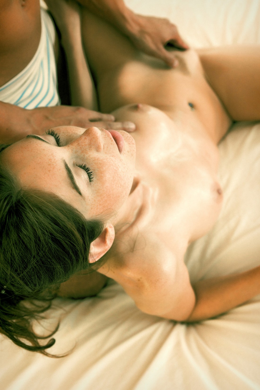
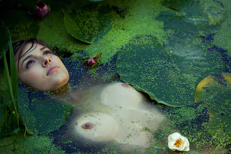
This is a self-portrait made by Zoe, a precocious, articulate and self-possessed sixteen year-old who blogs as Posh-Lost.

I admire her spunk.

Admiration aside, I have misgivings about posting this—not the least of which is the image maker being too young to ‘legally’ browse this site. Also, does displaying her work alongside more explicit content unnecessarily sexualize it?

Laurie Penny uses an ingenious coinage to refer to the well-intentioned worry we shower on the behavior of teenage girls: concern-fapping.

It is patently fucking absurd to think young women are not foundationally aware of the degree and extent to which their bodies are sexualized by society.

Further, anyone looking at this picture should know better. This is not some cell phone bathroom mirror selfie; light shines in through a window visible along the left edge of the frame, a la the Dutch Baroque. Further the staging speaks to an interest not in seeing while being seen but something closer to a preoccupation with the perception of self by another.

The flimsy, semi-sheer camisole is sexy; but whether sexy translates to something libidinous or reciprocally desiring remains pointedly unresolved.

Granted, it is not free of flaws. But it is thoughtful and I find it thoroughly and unironically interesting. But I can’t lie—there is something else to it that gets under my skin.

Long story short: I have never disclosed my gender on this blog. I’ve implied through omission, undertaken some linguistic gymnastics and mostly embraced opportunities to shore up ambiguity.

I have mild-to-medium gender dysphoria. As a child, I wanted to be a girl. When other kids played super heroes—I didn’t give a fuck about the perpetual fight over who got to be Superman because I was Wonder Woman. This was frowned upon. Frowns became stern words escalated to outright threats.

A dear friend suggested that if I was meant to be a woman, nothing would have stopped me. I think that is sage advice.

If you need a hammer but you only have a wrench, it doesn’t really work the best but you can more or less make due. From the standpoint of how my body relates to my sexual identity, this metaphor serves.

I pass as male and straight although I’d never embrace either. This creates a-whole-nother layer of complication. On the one hand, there are social expectations of me with which I find so uncomfortable they are debilitating; on the other, I have privilege in that I can somewhat function under the assumption that I am cisgendered. My ‘problems’ seem charmed compared to the struggles of the rest of the gender dysphoric community.

Additionally, I have a pathological aversion to anything related to medicine. Gender reassignment surgery is not a consideration. It’s that I feel more feminine that masculine. azura09 always says she thinks of me as a really dyke-y Daria Morgendorffer.

And yes if there was a Matrix like scenario where I could take the red pill and wake up female-bodied, I would do it without a second thought. Even if the ante was upped and I would die five years after taking the red pill, my choice would be the same.

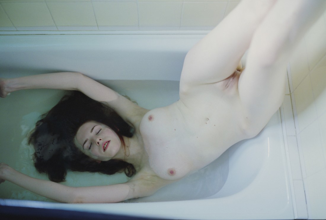
I know this image is Zoe and she seems really amazing and the last thing I have any desire to do is co-opt her experience or her own depiction of her body but—fuck me—this is to a T the way I see myself in my head.

If there were surgical procedures that would make this awful body conform to this image, they couldn’t cut fast enough for me.

Maybe then someone might be able to love me.

Normal
0

false
false
false

EN-US
X-NONE
X-NONE

/* Style Definitions */
table.MsoNormalTable
{mso-style-name:”Table Normal”;
mso-tstyle-rowband-size:0;
mso-tstyle-colband-size:0;
mso-style-noshow:yes;
mso-style-priority:99;
mso-style-parent:””;
mso-padding-alt:0in 5.4pt 0in 5.4pt;
mso-para-margin-top:0in;
mso-para-margin-right:0in;
mso-para-margin-bottom:10.0pt;
mso-para-margin-left:0in;
line-height:115%;
mso-pagination:widow-orphan;
font-size:12.0pt;
mso-bidi-font-size:11.0pt;
font-family:”Garamond”,”serif”;}

staceyelizzabethh:


Source: as best as I can tell these six images were likely gathered and arranged by fulme. (The top-center image seems to predate this assemblage.)

In theory, I am a proponent of bricolage.

However, if you are working digitally, there is very little that isn’t at hand for you to use. To me this muddies the already precarious distinction between ‘formal’ collage and MacGyver free association.

I don’t know how to illustrate it except to point to another image that was making the Tumblr rounds back in early October. It’s a really solid idea but the execution is lame brained–half a grapefruit on a white background super-imposed over what looks like the legs of a model wearing a white one-piece American Apparel swimsuit.

On the other hand, the six images above were carefully selected. The similarity in tonal range and luminosity is striking. Further, the arrangement serves to activate the images in different ways, promoting interplay, building and relieving tension by means of line, color, echoing of shape, conceptual mirror, etc.

Highly astute work deserving of recognition.

danishprinciple:

nicely in b/w

As per usual, I don’t like images that cut off the subjects head to preserve anonymity. There are literally a million more thoughtful ways to do it.

I am, however, enamored with the texture not just of her shirt but the way the light not only adds dimensionality, it gives a papery luster to her skin.

Texture isn’t only an aesthetic interest. I am highly sensitive to tactile stimulation. For example: on a good day so much as the rough seam accidentally sliding over my nipple as it is above would turn me on.

Then there are days–like today–where the thought of it is nearly enough to make me come like gangbusters.

These are the days wherein I would almost prefer to be no more than this goddamn alone.

danish-principle:

Joanna Szproch [also : The Quiet Front & Dripbook]

Welcome to Swoon Town. Population: me.

This. Is. Just… woah & woah again & amen.

Yes, it flouts conventions I drone on & on about: hands cut off at the left frame edge, legs amputated mid-calf by the right third of the upper margin.

Underlying these choices, however, is a logic strengthening the ambiguity of Eva’s pose: is she being lowered into the water or pulled from it?

& ambiguity in keeping with the image’s liminality; lingering as it does between color & desaturation; at once strong & vulnerable, artful & lascivious.

I cannot even begin to list the host of things that go through my head when I look at this image. But two things seem vital to mention. First, I am jealous of Eva. Not because she is so much prettier than me & not because I wish this was me instead of her (even though I do a little, okay: a lot.). It’s that I want to be seen by someone (anyone, honestly) the way Szporch sees Eva through her camera.

Also, in the interest of full disclosure: I wish I had made this image. It is chapter & verse the sort of work I try–& more of than not fail–to make.

toutdroitaller:

Irina Zadorozhnaja

Whether she is shooting street-travel hybrid images, landscapes or portraits, Ирина Задорожная demonstrates a precocious formal consistency.

Her images feel symmetrical. Yet, upon closer inspection they instead employ an objects implicit extension beyond the frame edge to balance out an equal amount of negative space on the opposite side.

For example: the lower frame edge cuts awkwardly below the model’s wrist + mons pubis. Notice though how this is balanced by the negative space above the model’s head at the limit of the upper frame edge.

It’s a sophisticated, compelling tactic.

I really like this image. The expression in tandem with the pose is both aloof and fragile; the visible texture of the sweater expertly counters the otherwise problematic flatness. The light is probably too harsh but I can forgive that.

#skinnyframebullshit still needs to be called, however. It baffles me how the same artist responsible for this image showcasing how portrait orientation ought to be used, resorted to the typically knee-jerk, portrait-orientation-for-portraits in an otherwise nearly impeccable image.

David Meskhi – from When Earth Seems to Be Light series Title Unknown 2008.

Meskhi’s website presents his as a photographer preoccupied with athletes, skateboarders and soldiers. Shooting predominately flat black and white, his inclusion of occasional, irreverent bursts of color do nex to nothing to lessen the work’s dour murk.

By contrast– and as suggested by the title– his When Earth Seems to Be Light series is full or warmth and whimsy.

It’s maybe not good but it is undeniably more accessible than the other work showcased.

It is incomprehensible that this image does not appear on the site. Instead, another image of the same young woman–Anna, apparently is featured. The second image isn’t bad; it’s casual immediacy seems forced, as if it seeking to neuter the sentimental nostalgia.

And I see how someone could read the image I posted could as self-indulgently sentimental. It is a little; However, that’s not always a bad thing–arrive for the nostalgia, stay for the Art.

In this case, neither sentimentality or nostalgia pull me in. It’s the sheen of water droplets on her skin, the texture of her wet hair. And I absolutely love how she is turned away– it reminds me of the hypothesis posited by either Edward Snow or John Berger that the young woman in Vermeer’s Girl with the Pearl Earring is simultaneously turning toward and away from the viewer. (If you’ve got seven minutes to kill, check out: a physicist tackling this question.)

I confess that this image does cause me to lapse nostalgic. But that is due to the content more than anything pertaining to the execution. See although I am in my… er… well, further from my teens than I have ever been, I missed out on a lot of normal– at least for John Hughes movies–social rites of passage.

I played Spin the Bottle a handful of times but was always told that at least one of the people playing had promised my mom that they would make sure I didn’t play. I would beg and plead but there would always be a caveat that if the bottle landed on me, the most I could do would be choose two other people to kiss. (The stopped letting me play altogether when I began suggesting two boys or two girls should kiss.)

I also realized sometime last year that I have never been skinny dipping. And it’s not that the repressive environment I grew up in was so effective and getting kids to not be kids. It was more that I wasn’t invited to gatherings where those types of things happened.

One of my New Year’s resolutions was to go skinny dipping this year. But the truth is I have just as many people to go with then as I do now.

rawpix:

Jun3rd♥hide…†o/dream(Matthieu Soudet)★

Untitled/Ophelia 2010

Browsing this kid’s work makes me think I’d be better off selling my gear, taking a vow of silence and dedicating whatever remains of my life to asceticism.

A year from now I will still almost certainly be reeling in response to his Different Ways.

Then I find out he shoots with a Canon 5D mark II (GAH, digital!); that Photoshop was never invoked on this image and he remained unaware of any correlation with Hamlet or J. M. Millaispainting of Ophelia until Flickr users inquired whether or not he intended such striking similarities.

How much is true and how much is personal mythology– I haven’t the foggiest notion, honestly. The answer doesn’t change fuck all, though– talent is talent is talent.