Sergei ShekherovI Hadn’t Anyone till You (2015)

This would be utterly unremarkable were it not for two things:

  1. The brazen placement of the two hands.
  2. The model bears an uncanny resemblance to Michelangelo’s David–the position of the arms is transposed but the likeness is otherwise flagrant.

Taken in the context of Shekherov’s status as a citizen of the Russian Federation and given that nation’s open hostility to LGBTQ+ folk, there’s a tension between the prosaic studio setting and the audacity of what is depicted.

The title speaks to something universal: the human feeling of being alone in the world and desperately seeking out a partner. Add the gayness of the work and the meaning deepens, encompassing the complexity of looking for someone when your experience and expression of sexuality is outside the mainstream norm–and how much more finding someone with whom you can share your authentic self means.

Then there’s the undeniable similarity to David along with the fact that unless I’m mistaken the clothed man is Shekherov–pointing to an experience of the erotic in relationship to masters and masterworks of art. (It reminds me more than a little of Luisa Terminiello work hard.

The Death of Youth – Guetcha (2016)

As I’ve noted several times already: a cliche is a cliche because it allows one a reasonable handle on something that is otherwise unwieldy and fraught with complications.

The adage against cliches emerges from the fact that by using them, one is refusing to re-engage with and analyze a concept that isn’t necessarily one-size-fits-all anew. In other words, the advice against cliches isn’t that cliches are inherently bad so much as their ready made-ness presents an obstacle to independent thinking.

The elements of this image are cliche to the point of ubiquity: luminous lighting kissing the skin of a nude model standing before a milk white background.

Here though, the cliche serves as a foil–drawing attention away from the elements; instead, highlight the compositional attention to shape, line and tonal form.

I’d argue it’s too dark–and I don’t think that’s a matter of opinion given that the underexposure results in lose of shadow detail in Guetcha’s hair and along the right side of her face. But it’s easy to let that sort of teensy mistake slide when the result is this dynamically eye-catching.

wonderlust photoworks in collaboration with Kathleen Truffaut – [↑] Atelier (2016); [+] Redolent (2016); [↓] Cauterwaul (2016)

My last trip out to L.A. was pretty much a cluster fuck of truly epic proportions. The highlight of the trip though was meeting and making photos with the angelic and thoroughly intriguing Kathleen Truffaut.

(An extra special shout out to @jacsfishburne–without whom the above would not have happened.)

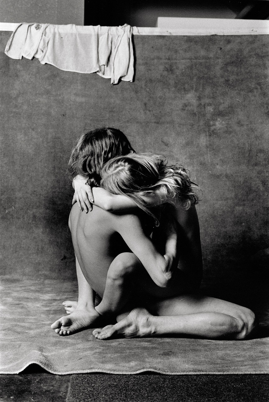
Will McBrideRocky & Julia (1972)

One of the most amazing teachers of my life taught Sociology 101 in community college. (She was breathtakingly brilliant and could’ve taught anywhere but as a committed Marxist, she viewed it as her duty to provide the same degree of academic rigor to students who might not necessarily have the resources to attend an Ivy League institution.)

I still refer back to notes from her class a handful of times every year. This time it was to remember the term cultural lag.

The gist of the concept is technological innovation moves at a much faster speed than cultural evolution. As a result it can take a really fucking long time for society to come to terms with advances in technology.

If you are unfamiliar with McBride, he’s notable for his collaboration with Helga Fleischhauer-Hardt, a psychiatrist, on a picture book designed as a resource to help parents educate their children about sex.

The book was called Zeig Mal! (or, Show Me!) and it included frank discussions about sex accompanying age appropriate images of nude children and graphic depictions of teens and adults engaging in sexual activity.

It was well received in Germany–and received a second printing. But it’s publication in the U.S. was more troubled. It was quickly libeled as ‘child pornography’–and despite the fact that it exonerate in court on four different occasions as not obscene.

However, there was a convoluted back and forth about whether or not distributing non-obscene depictions of nude children was protected by the first amendment. To be on the safe side, the publisher opted not to continue to publish the title in the U.S.

The notion of cultural lag doesn’t strictly apply to McBride–if anything the culture was fine until puritanical prudery arrived on the scene.

There is something potentially valuable to consider here; namely: that as long as we remain unclear on what constitutes pornography and what does not, we’re going to continue to have problems like this.

If you disagree think about teens who are getting added to sex offender registries for consensually sexting nudes to other teens.

The pervasive attitude of puritanical prudes is that education/preparation is implicit acceptance of the activity. (The reason so many idiots are against contraception is truly less out of any well-meaning desire to keep kids and teens safe and more born of the fact that “if we provide free condoms, then they’re certainly going to use them.” It’s entirely about control–no more, no less. Fear and coercion only work so long as they keep you from eating of the fruit of the tree of the knowledge of good and evil; once you’ve eaten, you want to continue to eat–you just have the associated guilt over eating in the first place to work through before you can truly enjoy the feast. (Sadly some people never make it.)

Consider another analogy: of the kids I went to a parochial high school with, only one never struggled with the sudden freedom of self-determination upon going off to college. All of them struggled with binge drinking and addiction except the class salutatorian–whose parents wisely allowed her to have a glass of wine with dinner and an occasional beer here and there from the age of twelve onward.

Similarly, the people I know with the healthiest attitudes towards sex are those whose parents refused to teach their children that some sort of shame surrounded their bodies/nudity and who modeled sexual attraction/behaviors in an open but appropriate fashion.

Or, to put it another way: in my experience if a child can formulate a question on a particular topic they are generally more than ready for an honest answer.

We–as a culture–really need to do better about this kind of thing.

Anyway, I have no idea from what body of work the above image emerged. It would’ve preceded Show Me! by half a decade. But you do have to appreciate the seemingly post-coital intimacy that manages somehow to avoid both sentimentality and salaciousness.

Mario Zanaria –  [←] Frances (2015); [→] Lynsey (2015)

I’m not really on board with the way Zanaria contextualizes his work but that’s not to say I dislike it.

Quite the opposite, in fact–for as many people who toss around the notion of ‘fine art nudes’ as a genre within lens-based media practice, I actually quite like his work.

I can’t help but thinking of the above images as an implied critique of Duane Michals’ Naked Nude.

In addition to that critique there’s an impressive synergy of structure, form, content and style. I love the novel poses–Frances’ dynamic confidence, Lynsey’s seeming reservations coming so close to passing as casual nonchalance.

There’s a sense of interplay with the photography that shines through but also a sense of personal agency in engaging in considerations of the politics of visual representation and identity.

Olivia Locher – In North Carolina it’s a misdemeanor to pee on someone else’s property (2015)

This image is from a series called I Fought the Law. In it, Locher focuses on all those crazy laws you hear are still on the books in various states.

I appreciate the straight faced delivery–the sense of anarchic playfulness inherent in the conceptualization, the panache in execution.

Considering the gleefulness with which this body of work transgresses these laws, I think it ends up mitigating some of the earnest charm of the images. I mean, they were almost certainly shot in a NYC studio–not on location in the states where the actions depicted would violate legal statutes.

I’m not going to be a total Grinch in this case because it does seem clear to me that this is less about the punchline than a rigorous commitment to a well-told joke. (A criticism that can probably be just as easily applied to Wes Anderson, come to think of it….)

John LorenziniTrish (2014)

This is an effing goddamn gorgeous image–which is something coming from me given that my default seeting with regards to studio work is best labeled: ‘intense antipathy’.

From the stand point of scale, it’s interesting that the distance between the tip of her toes and the baseboard is identical to the distance between the top of her head and the top frame edge. (Further, I suspect those echoed distances can be subdivided into three equal parts which are the same height as the space between the lower frame edge and the tips of her toes.

The way the one point perspective of the floor boards recedes drawing your eye toward the woman and then having the beautiful gray background blossom in variegated light is an extremely effective compositional flourish. (Also, the light in most of his other work seems to fall at a very contrived 35-40 degree downward slant. It’s doing the same here but the light is broken up, inconsistent and thus appears more natural.)

That Trish is not acknowledging the camera seems to be a nod towards and awareness of the highly problematic art historical ‘male gaze’. However, there’s some downright maddening inconsistencies with regard to acknowledging the camera/not acknowledging the camera across the work that suggests less underlying subversion and more edits made to foster a personal aesthetic.

And even though I love this image and super wish that I’d shot it, I do have to take the image maker to task–rather pointedly–on two fronts. First, given solely this image, I wouldn’t be inclined to call #skinnyframebullshit. Unfortunately, considering the rest of the work, yeah, it’s used as a means of hyper-stylization. Which is fine but use it consistently. Things get in a muddle when the seemingly suggested strictures governing the use are abandoned for seemingly no reason or rigidly followed to the diminishment of visual effect.

My second objection has to do with the impetus for nudity in this image. I don’t think, for example, that this work is nearly as vapid and frivolous as this image–which features superior lighting but is otherwise vapid and positively seethes pushy/sleazy heteronormative suggestion. Alternately, consider this image which features garbage lighting design and asinine composition but actually conveys a logic behind the nudity it is exhibiting (note: the discarded top and knickers on the arm of the couch and on the floor near the edge of the frame; also, the acknowledgement of the camera)–in this case a semi-coy I want you to see me naked (which is entirely valid but does require a certain responsibility on the part of the image maker to address the legacy of white, cis-male heteronormative entitlement).

Lorenzini’s image is exceptional except there’s no context for her to be seen nude–sell the studying figure and form BS elsewhere, we’re full up here–other than to be seen nude. Thus, although it’s good natured and probably entirely well-intentioned, this image–while extremely aesthetically pleasing and technically prescient, is unfortunately at it’s most basic level: an exercise in objectification.

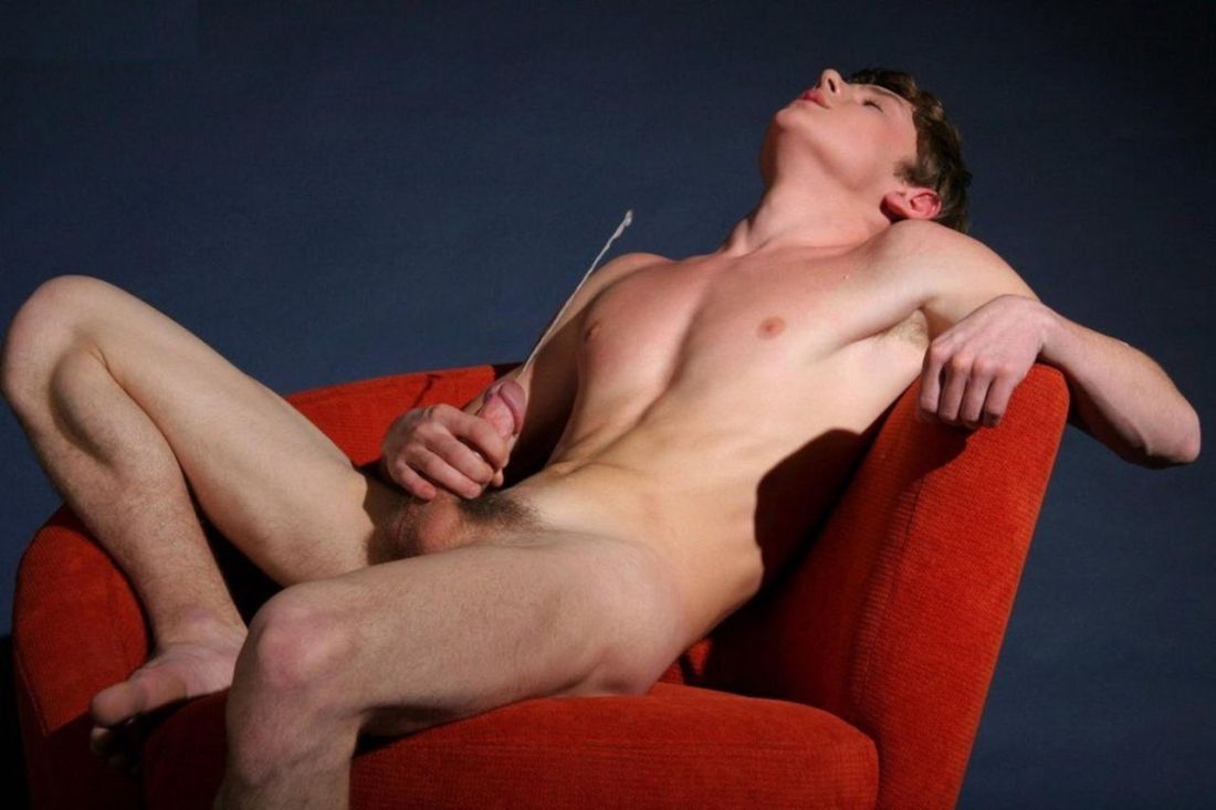
Source redacted – Title Unknown (2010)

I’m into this for reasons.

It is far from perfect. The key light is set to accentuate his skin tone. The magenta and red in his face and chest, respectively are nice and all but the end up getting diminished by the bristling red of the chair. Also, while from the standpoint of color theory blue recedes and red approaches, without balanced dimensional lighting design the effect won’t read in the frame. And that’s not even getting into how the two black voids from the strobe enhanced cast shadow of the chair arm and his left knee are extremely distracting from a compositional standpoint.

This set up could have theoretically worked if only the chair had been rotated three degrees clockwise and the camera retreated two feet.

I lean towards thinking the cum shot freeze frame is Shopped–his pose/muscle tension aren’t in keeping with orgasm. Further, I’m reasonably certain that it should appear more globular and dispersed, not to mention have more of at least a slight arc to the trajectory.

Still the inclusion of a cast shadow from the stream at least demonstrates some thought.concern for continuity.

Unfortunately, the site from which this image emerges creeps me out. (I’ve chosen not to reference it her–but a Google reverse image search will turn it up easily.)

CAH – Cam Damage (2015)

camdamage is an artist. Full fucking stop.

I mean she’s disarmingly pretty and if she’s taken a bad picture, I either missed it or have lost track amidst her steady stream of effing stellar work.

Still, I feel like commenting on her appearance misses more than half the point. It’s like Jon Stewart’s on fleek insight into the media response to Caitlyn Jenner’s transition: Caitlyn when you were a man we could talk about your athleticism, your business acumen…now you’re a woman and your looks are the only thing we care about.

What makes her beautiful is more than just her appearance. If you follow her–which if you don’t then real talk you are abso-fucking-lutely doing Tumblr wrong–you know she is a wickedly intelligent and kind individual, with a sarcasm setting that isn’t just a louder 10 but goes all the way to 11.

At risk of using a meaningless cliche, she’s down-to-earth. Not in that she makes an effort to be some with whom everyone can relate– but that she presents herself as someone who tries really hard but fails what feels like far too many times to justify the investment of time and painstaking effort. She stumbles, admits them, gets back up and tries to roll that giant fucking rock up ye olde hill of impossible climbing once again.

Her work to grow and evolve as an individual, her courage and uncompromising determination shine through in her work in a way for which I know of no precedent with which to compare it.

The saying goes: talent hits the target no one else can; genius hits a target no one else can see.

By that token, Cam’s work signals her as a genius.

(Oh, and this picture is stunning: the vague vignetting effect of the strobe and the way it casts just enough of a shadow to cause her to pop from the background. The skin tone is both natural and gorgeously accentuates muscle tone. The unraveling braids, armband tattoo and perfectly executed eye light are all artifacts of high-end glossy fashion editorial methods in service of presenting something closer to a candid portrait. Just goddamn fucking killer!)