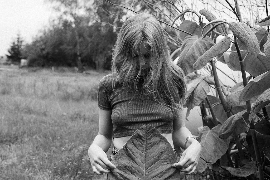
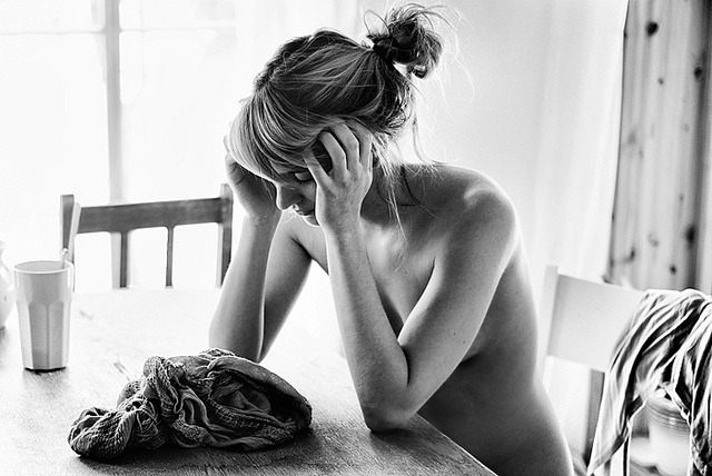
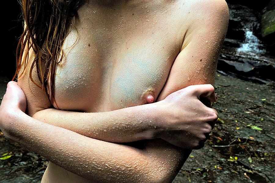
Pola Esther – Untitled Diptych from Mutual Attraction series (2012)

I saved this to my drafts a few weeks back with the intention of pulling together a short piece comparing it with the Sheer Delight editorial Robbie Fimmano shot for Interview Magazine back in March–specifically the variation circulating with the effing brilliant addition of a corresponding color palates.

Only at the moment I’m following a different thread–so I’m calling an audible and running a different direction with this.

For the last month or so, I’ve been working on a piece of fiction. I’m still unsure what form it’s going to wind up taking on but for now, let’s say it’s novel-esque.

The impetus for writing it emerged from two things:

  1. I am extremely alarmed by the increasing prevalence of the notion among many (but especially Evangelical Xtians) that despite being a decisive majority, American freedoms are under attack–you know the type of people who think unironically that being correctly labeled a bigot is somehow more damaging that you know centuries of institutional prejudice;
  2. While I try to live my life in a fashion which minimizes (if not eliminates) regret, there are times when I wonder to myself how my life might be different if I could go back and pass on a little wisdom to my younger self.

The tricky part with that second thing is I usually think I’d want to go back to myself at 19; Yet, lately I’ve realized that I was already too beaten down and cynical then. In reality, I’d probably need to go back 6 years further.

As far as the first thing goes: one of the reasons such bullshit persecution complexes rile me so easily comes as a result of having–much to my then and continued chagrin–attended a parochial high school.

Any attempt to bridge the gap between your adult self and the thirteen year-old precursor is a bizarre experience. What’s a little unnerving to me  is how much this character resembles a girl I actually knew in high school.

Her name was Beckie and she was the closest my school had to the central casting I-don’t-care-what-anyone-says-punk-rock-is-alive-and-kicking teen angst soap opera trope.

She was generally exuberant. Socially awkward but in a charming way that constantly pointed to an individual who was both extravagantly kind and shamelessly wore her heart on her sleeve.

While she wasn’t physically bullied, she was heinously body shamed. Like looking back on it now, it upsets me. She was extremely tall. If memory serves she was the tallest person in her class from 7th to 9th grade.

At my school, you had to walk between classes in a single file line. Thus frequently, you’d end up waiting in the hallway while other people emptied out of a classroom. I remember a boy walking up to Beckie, grabbing the squared neckline of her dress, pulling it out and looking down the front of her shirt and telling her that she should think about putting some band-aids on those mosquito bites. Carpenter’s dream and Pirate’s dream jokes chorused after her wherever she went. (I don’t think she actually owned a bra until 11th grade and then it was a sports bra for the sake of propriety.)

But still, she was kind to everyone.

As I’ve worked on this story, I’m actually finding that I full-blown regret that I never go to know Beckie better. I see how much we had in common then–but I had my head up my ass then. Was focused on the wrong things; things that ended up inflicting woulds that would take years to heal, if they ever did.

I see how much we have in common now: she’s a studio photographer and as much as I’m not fond of studio photography, she’s got some tight chops.

It occurs to me that even though there has always been a part of me not-so-secretly twitterpated by her, I think she’d maybe have been a better person to know than any of the people I associated with then–all of whom are decades gone at this point.

And as I’m banging my head against a wall trying to find someone to collaborate with on a photography project in Iceland this September, I realize that as strange and probably slightly creepy as it seems, the people I’ve been approaching and have largely ignored me–all have something in their work or personality that reminds me of Beckie.

That’s why I’m mentioning this here. I feel like you can look at just about any single image Esther makes and be hypnotized by it. But her diptychs have a way of returning your eye to the image with more attention and greater insight.

Or maybe I’m talking out of my ass…

Pixoom PhotographieTitle Unknown (2015)

If you’ve followed this blog for any time, you are most likely painfully aware of my aversion to portrait orientation in lens based image making.

I refer to it–with profound contempt–as #skinnyframebullshit.

It’s a term I use a lot and I’m always linking to the same article I wrote more than two years ago. So–with the notion in mind that someone seeking to determine counterfeit from legitimate currency always studies the real item instead of the fake–it occurred to me that being as this image is not only stunningly gorgeous but also in no way shape or form #skinnyframebullshit, that it might be time for me to create a positive reference instead of a negative one.

It’s maybe not the best place to start but one of the things that doesn’t directly relate to my hatred for portrait orientation but does inform it is the increasing ubiquity of digital imaging technology. (Again, if you’ve followed me for any time you’ll know that I am obsessively anal about differentiating between digital and analog processes. Yes, they are built off the same chassis but their respective functions are vastly different in practice.)

By now, you all are familiar with shitty Youtube videos wherein due to the shape of and interface of our smart phones you get a preponderance of video with vertical frames. It’s ugly, sloppy and I would maintain a poor reflection of the author’s basic intelligence.

I’ve been pretty active in Internet photo communities since 2006. Back then, folks making work were basing it off the history of lens based image making up to that point. Yeah, you had vertical oriented images but whether or not there was a reason for them to be vertical (i.e. an internally consistent compositional logic) they were the distinct minority.

Of that minority, a plurality featured this sort of self-conscious flipping the physical camera body on its side makes me look more like a photographer. When you do it, you feel a little rebellious.

Now, if you’re a person shooting on film, then you drop what you shot at your lab (or better yet, process yourself); and then you pop your slides or negs down on a light table and have a look-see. The thing you note immediately is that your vertically oriented frames break the flow of your reading your slides. You end up having to flip the filmstrip, contact sheets or whatever. Invariably, this causes you to favor either the landscape or portrait images due to the fact that it’s easier to read images that are in line with however you have the page currently oriented.

I learned quickly that there really needs to be a compelling reason for a shot to be vertically oriented. And with my reluctance to deal with vertical oriented shots, I realized that almost categorically, image makers opt for vertical orientation as a compositional shortcut. Like: oh, hey…what I want to shoot won’t fit this way, I’ll just flip the camera and that’ll fix it. Makes sense. Except one small thing and I’ll state it as a truism–you will always get a better shot by moving your body in relationship to the object or by using a different focal length lens. It’s just a fact.

And if you apply that to the history of photography, it’s interesting to note that most images with vertical orientation are–wouldn’t you know it–within the architectural genre. Why might that be? Well, in relationship to an edifice there are few options with regard to moving in order to achieve the framing you want.

Thus, I maintain rather rigidly that in general, if you aren’t shooting architecture, you can go ahead and shoot that vertical but then maybe move around and shoot the same thing landscape from different positions. I’m confident that all things being equal, you’re going to find you prefer the landscape frames.

One of the first things a beginning photography student hears about is the sacred rule of thirds. As a rule of thumb, it serves–and ensures photography instructors cut down substantially on the godawful wawker-jawed, indecipherable images. But like any rule, it’s nothing more than a general guideline that you really have to understand before you’re allowed to start ignoring it as you please.

Yes, the rule of thirds is an abstraction of the Golden Ratio. And with the tendency to frame the subject at one vertical third line and then leave a great deal of negative space to the left or the right, it does produce appealing images. (Note: how images that are perfectly balanced within the framework of the rule of thirds tend to have the effect of leaving you confused about what you’re supposed to be looking at.)

My theory is that with vertical compositions, the rule of thirds is less useful as a guideline; the expectation of the eye is something more in-line with the golden ratio.

There is only one horizontal line in the above image–dividing the frame top-to-bottom roughly 60/40. Katjuschenka is ever so slightly off-center (consider the mid-line of her face)–balanced expertly by her right knee opening what would’ve otherwise been a repetition of the angle of her arms.

There’s essentially only two colors in the frame–red (hair, skin tone) and blue. Everything falls in line with those tonal hues. Focus is sharpest on her eyes. (And as a dizzying bonus, check out the texture in her stockings. Dayum.)

A creepier photographer would’ve focused on the nipple or at least increased the depth of field so that it would remain in focus. But the decision to do that makes this image about the color and framing. The eye contact is neither coy nor pouting. It’s not flirtatious but it does convey a sense of knowing a great deal that the viewer does not.

This image is breathtakingly exquisite. If you’ve got to go vertical, this is the baseline. Either make it clear that the composition was the only thing that would’ve communicated the magic of that moment or go home with your weak ass #skinnyframebullshit.

Sophie van der PerreSarah (2014)

Overall, I find der Perre’s work perhaps a little too self-consciously editorial/fashion in genre.

I do not mean to suggest it’s bad. It’s just that there’s almost a self-same ubiquity to it and it looks to me like all the rest of effectively executed, even thoughtful but ultimately dull editorial/fashion work I see.

But I do really like this image and a few others in her Flickr photostream. And although I could make easy correlations to Lina Scheynius or Chip Willis, I am more interested in my realization that although I consider Erica Shires to be one of the best photographers working today, der Perre’s work actually suggested the closest thing I have to a criticism of Shires’ work: namely, her didactic use of nudity.

Shires is teaching a workshop in Tuscany this month. And one of the first topics she mentions in her course description is: [s]hooting nudity but being thoughtful about it. Does it make sense? Go beyond the literal.

This sensibility is pervasive in her work. And I feel that now that I know to look for it, a great deal of the nudity in her images comes across as preachy.

It is always a very fine line between leading by example and insisting on leading by example. I feel it’s actually the same margin between showing and telling. But one should never tell where it is possible to show and I think what der Perre does is feature nudity in images that are intrinsic to the images themselves. There’s no question of how it happened or whether it was motivated, it merely is a discrete, moment presented without commentary as-is.

The result is playful without being the least bit coquettish or flirtatious.

Grit Siwonia* (2010)

Siwonia work is squarely fashion/editorial as far as genre goes. But it takes the genres recognizable sensibilities and steeps them in a sort of Shutterstock vision of better living and then filters it all through a precocious awareness of how the Flickr Explore algorithm functions.

Not to knock those skills–they are as scarce as hen’s teeth–but if that were all there was to see, I wouldn’t be arsed with it.

There’s an underlying vitality to the work, though. Something to do with texture, gesture, expression and reverence–all deeply felt/experienced and manifested incisively.

René GroebliUntitled from The Eye of Love series (1953)

Lately, I’ve been pondering darkness.

I know, I know… sounds like rejected Celtic Frost
lyrics; but seriously, another of the many unsavory side effects of the
shift from photography/cinematography to digital imaging is the
redefinition of how low-light scenes are represented.

Overlooking
the immense differences between analog and digital, Hollywood has
established an expectation for how things look at night that whether one
realizes it or not, is irreducibly stylized.

I
get asked all the time by folks to recommend cameras to fit a litany of
expectations which almost always center on a low price point and a
prodigious ability to handle low-light situations. People who aren’t
steeped in the technology seem to expect that there’s a camera out there
that’ll render your concert shots and exterior street at night scenes
as if they were Blade Runner
deleted scenes (overlooking that Blade Runner had arguably the best
production design in the history of cinema combined with the fact that
it was shot by Jordan Cronenweth, i.e. one of the all-time great cinematographers.

Working in low light is a challenge. Unless you’re Stanley Kubrick–who famously adapted f0.7 lenses made by Zeiss for NASA to shoot scenes in Barry Lyndon
with only candles for illumination–the recourse was to just let things
go too dark (I’m thinking here of the all but illegible evening walks
in Akerman’s otherwise masterful Jeanne Dielman, 23 Quai du Commerce, 1080 Bruxelles and the most naturalistic representation of low-light cinematography Kiarostami’s–arguably the greatest living filmmaker–Where is the Friend’s Home?)

At
a certain point, certain (largely European) filmmakers started flooding
night scenes with ambient blue light (likely a way of rendering the day-for-night tradition more visually palatable)–I first remember noticing this in del Toro’s Mimic but Besson’s La Femme Nikita
preceded that and as anyone who has followed the latter’s career, you
know he’s incapable of formulating an original idea (although, at least
he tends to steal from the best).

Then along comes digital with
it’s fundamentally less shallow depth of field which in combination with
the theoretical impossibility of it ever rendering even half the
dynamic range of black that the human eye can read. The tendency has
been to invert things and to, when working digitally, treat white as you
would black when shooting analog. (Orange is the New Black does this super obviously.)

Then
there’s also color grading to consider. Toward the end of the analog
era, what came out of the camera was not even close to what made it onto
the screen. Lighting was modified with magic windows, color graded,
etc.

That’s still done today. But that thing that’s different is
that digital cinematographers aim for an in camera image that is
essentially flat. When you export it, it looks bleached–like one of
those Tumblr’s that adds a soft grunge tag to everything. Subsequently,
the footage is graded. Contrast is add, color is resaturated.

Anyway,
I was thinking what I was going to say about this image last night and
even though I swore I wasn’t going to keep watching it after last
seasons bullshit finale, I was watching the 3rd season premiere of NBC’s
Hannibal–a show that I consider frequently reprehensible but features the best production design
in the history of television. (The digital cinematography is also
astute even if I strenuously disagree on a philosophical level with the
excess with which it resorts to glossy close-up inserts; I’m more in
line with Aaron Morton’s work on Orphan Black
and his precocious consistency with regard to scale and the resulting
compellingly believable three dimensionality of space in his scenes.)

While
I think the artifice from which the darkness in Hannibal’s visuals
emerge befits the ostentatious amorality the show goes to such great
length to foster, I can’t help but wonder what it’d be like if it were
as willing to go real and truly dark like the above image instead of
amending its tenebrism as a post-production filter.

Timur SuponovUntitled (2013)

As someone who has–in fairness–done more than my fair share of drugs, I’m fascinated by synesthesia.

As someone who–and this is true–shops for clothing by going shelf to rack to shelf feeling the material between my thumb and forefinger and only evaluating the style, cut and color after finding something that feels nice against my skin, I think photography has crazy untapped potential to convey a synesthetic sense of texture.

I can’t say this is a good image. It does have a nice tonal range and I appreciate that the image maker has included her entire body without chopping off limbs. The angle of the headboard(?) and foot of the cushions is distracting and although it’s supposed to be counterbalanced by the suffused lights coming through the diaphanous curtains, that strategy is a failure.

But dat texture, tho. The warn nearly threadbare cushions, the knit skirt–look at the way it stretches against her outer left thigh and even the curtains. In fact, if this were film and printed on nice rag based stock, her skin would take on a sense of taut sheen that it only hints at here.

Bronte Sommerfeld – Untitled (2015)

A recurring thought I have about image making is the extent to which image makers are largely motivated by tangential compulsions. Pictures are taken to ensure that moments are remembered, to give voices to experiences which would otherwise pass silently into darkness, etc–it’s not so much about the image as what the image represents.

Whereas, I tend to think of ‘pure’ image makers as those who employ pictures as a sort of map for how they see the world around them.

Those with the former impetus are generally astute practitioners of the latter–but the lesson in seeing is secondary to that which the image bears witness.

I believe it’s easier for an image maker of the former stripe to achieve critical recognition and stature within their lifetime. And although I can’t in good conscience favor one at the expense of the other–the work of the latter strikes me as the path of most resistance.

Sommerfeld’s work seems to be of the latter variety. This image feels as if the image maker saw something in a moment and raised her camera to her eye guided by nothing more than precocious instinct.

And what’s captured is fucking fascinating. The texture of the carpet, the suffused light with soft shadow stretching from the drawer knob insinuating a broader world outside of the frame, the mirror fragments presenting ostensibly naked bodies in a seemingly impossible configuration; the synesthetic texture of the carpet.

The trouble is: with the disembodied reflections presented at the center of frame, the angle of the baseboard, although flattering, sets up an imbalance that is in point of fact too strong to be resolved by the drawer’s vertical line or the drawer’s horizontal in the upper right corner. (Lining the drawer’s veritcal with the frame’s left vertical third would have resolved this but created the problem of losing the knob–something that I think would detract from the image. Thus, the real question is more or less carpet. My instinct screams more–I am and will forever remain a texture whore; but I suspect Sommerfeld would veer in the opposite direction; either way the difficulty of the diagonal baseboard becomes the sole compositional stumbling block in the image and can therefore be summarily addressed.)

Lastly: Sommerfeld is a truly interesting young woman. And if you consider that she made this video as a 16 year old high school student, I’m fairly certain you’ll understand why I would be completely remiss as a curator if I didn’t nudge you, my dear followers, in the direction of her endeavors.

Iwase Yoshiyuki – Untitled (1966)

Yoshiyuki, it seems, was a sake magnate who upon being gifted a Kodak camera set out to document the so-called ama girls who harvested seaweed, shells, oysters and abalone from the cold waters off Japan’s Pacific coast.

This photograph is atypical of his work which frequently featured candid shots of topless divers, water, sand and nets.

It was likely produced as part of one of his ill-advised forays into the fine art nudes. Unlike those awkward, overly self-conscious dalliances re-staging previous scenes in an effort to transform immediacy into technical rigor, this manages to encapsulate Yoshiyuki preoccupations in a manner which transcends the context of its creation and becomes at once somehow both timeless and deeply resonant in its uncomplicated humanness.

Jesús Llaríano head (2014)

As in tune as I can be with logging my own process of reading images, this short circuits everything.

I’m not sure I can explain it without getting a little TMI but it reminds me of being fifteen. (Not that I saw anything like this in the flesh until almost a decade later…)

It reminds me of random, mundane things that would inexplicably trigger arousal so extreme it was actually painful.

I had already been chasing the same oxytocin/prolactin buzz for seven years as a way of smoothing out the jagged edges of my abusive adolescent existence and suddenly it was also effecting some sort of vaguely imagined autonomy over my own body.

As a friend puts it: it’s a real wonder all the masturbation didn’t inflict permanent nerve damage.

So yes: initially seeing this image resulted in me having to release some sexual tension.

Afterwards, I found myself enchanted by the way the image works. Although I’m not sure it’s ever justifiable to employ a frame as a means of dismembering a woman’s body, I can’t technically refute the decision as Llaría observes the dictum of amputating between joints instead of at them.

And there is a notable compositional logic supporting his choice. Note the repeated angle of the elbow which is not the model’s, the line of the lower half of the dresses’ buttons, the way the seam to the left of the lower button line softens the angel to echo that of the model’s right thigh only to have the same angle emerge again in the cocked angle of her right leg.

There’s also the matter of palate: excluding her bush, the image consists of three hues. The rust colored earth figures at the darker end of a spectrum that would include the more magenta tones in her skin; while the white in her slipper and dress are virtually identical. The blue of the dress makes everything else pop.

Let’s not forget texture, either–something about which I am often preoccupied. The skin doesn’t really have texture in this image; except juxtaposed between the dirt and the fabric of the dress the absence of texture becomes a null field. Unlike the ground or the dress you can’t imagine touching the model’s legs but you can recall what it was like to have touched such legs. The visual synesthesia suggests an insistent anti-objectification that subtly reminds that this is no less or no more than what you have always known.

I would be dreadfully remiss for also not mentioning that even though I am not female bodied and if I were I would not be comfortable wearing a dress, I’m more than a little obsessed with the dress.

andre-jblue veins and goosebumps (2010)

Generally, I am against frame line decapitation; however, my interest in synesthesia– esp. visual conveyance of the tactile–overrides that objection here.

This is a rare instance where the tendency for digital to render textures more-or-less plastic-like contributes to the image by blurring the boundaries between beaded water droplets and goosebumps. In my opinion, the ambiguity serves to emphasize the skin.