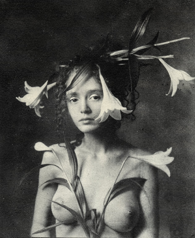
Emil Schildt – Sille (2005)
I am like 97% sure this photograph is a riff on a Renaissance painting since it’s triggering all sorts of drunkenly-wandering-the-Uffizi flashbacks.
Unfortunately, I can’t seem to lay hands on my notebook from then and Google is being less than helpful. (Of course, Google-ing Renaissance painting lillies likely isn’t the most inspired criteria.)
But even if I can’t produce the exact reference I need, I can at least show my work as far as what’s driving my instinct on this one. Consider da Vinci’s Annunciation and portrait of Ginerva de Benci. The curled forelocks and expression in the latter match, even if de Benci is haughty and Sille is merely aloof. In the former it’s both the lilies in the mid-ground and the openness of the composition. (I’m not sure if I’m making this up or if it actually holds true but it seems that the difference between Florentine and Venetian has to do with how crowded the painting is.)
Sille occupies only slight more than 50% of the total space of the frame. It just looks like more–again, similar to da Vinci’s The Last Supper (which you never remember with that much architectural negative space).
And there’s also the smoky inconsistencies in the background texture as a result of Schildt’s use of the Bromoil Process, which is not inconsistent with da Vinci’s refinement of the sfumato technique.
Also, for a real treat check out Schildt’s occasional color work–a little too self-consciously fashion editorial-esque for me but the cutthroat rendering of color is some next level shit.
