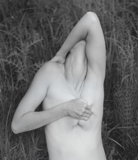
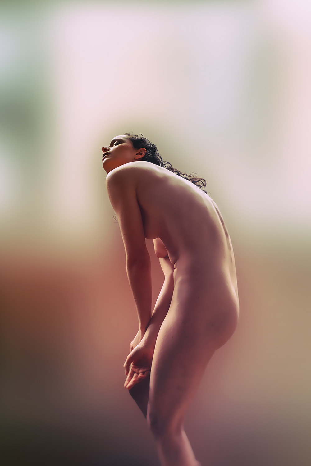
Anna CladoniaVarious Portraits* (2010-2015)

I’ve been thinking about Emily Dickinson a lot lately.

Not due to any connection between It Sifts From Leaden Sieves and the fact it’s snowing balls outside right now. (Although I am hardly oblivious to the synchronicity.)

But, on that note, why do we teach Dickinson to middle schoolers by introducing them to the myriad complexities and nearly infinite scope of her work via the aforementioned poem and A Narrow Fellow in the Grass? It’s no wonder I hated her work until I revisited it in my twenties and immediately fell in love with the work and the incredible woman who made it. (Seriously: the think-question you tend to get asked on first dates about what person living or dead you’d most want to have dinner with, yeah… Emily Dickinson all the way. Even if I have grown to strongly prefer Bishop’s body of work.)

I promise… this seemingly self-indulgent ramble does relate to Cladonia’s devastating photographs–bear with me a bit longer.

My objection to the way Dickinson tends to be taught is that it tends to emphasize the allegorical (nature imagery) over the more metaphorical work. You’d do much better to start with the exquisite, goth-before-goth-was-a-scene I Felt a Funeral in my Brain… Couple that with the fact that the window to Dickinson’s bedroom overlooked a cemetery and even twelve year-old’s can easily grasp the incisive eye which uses words to describe the landscape of a morbid imagination.

However, once you dig into Dickinson–I mean really dig in–one line of hers takes on profound resonance: “my business is circumference.”

It’s an odd claim–especially from a woman who never traveled further than a day away from the house in which she was born. Yet, the acuity of her perception and her openness to the world and experiences in her immediate surroundings taught her in a fashion not unlike that of a storied traveler.

Cladonia exhibits a similarly circumscribed scope. Her photos are ostensibly portraits–largely shot in ramshackle Moscow apartments. But within those narrow parameters there’s evidence of an encyclopedic familiarity with the history of photography.

Beyond the essential Russian-ness of her work, the astute viewer can easily recognize winking references to virtually every Russian image maker I’ve ever posted on this blog–but especially to Igor Mukhin and Evgeny Mokhorev.

But there’s also grace notes from David Hamilton and Duane Michals.

Having and wearing your influences on your shirt sleeve doesn’t necessarily make for good work, unfortunately. But what Cladonia manages is less homage than a point of loving departure–she takes a great idea that resonates strongly with her and makes it her own.

In and of itself–that’s the mark of a truly great photographer. But there’s also the way she embraces and eschews obtrusive image grain, her spare and gorgeous use of autochrome-esque color (I + II). And that’s not even getting into her revelatorily explicit handling of masturbation and sexual expression.

Nothing is original. Steal from anywhere that resonates with inspiration or fuels your imagination. Devour old films, new films, music, books, paintings, photographs, poems, dreams, random conversations, architecture, bridges, street signs, trees, clouds, bodies of water, light and shadows.
Select only things to steal from that speak directly to your soul. If you do this, your work (and theft) will be authentic. Authenticity is invaluable; originality is non-existent. And don’t bother concealing your thievery – celebrate it if you feel like it.
In any case, always remember what Jean-Luc Godard said: “It’s not where you take things from – it’s where you take them to.

Jim Jarmusch [MovieMaker Magazine #53 – Winter, January 22, 2004 ]
(via m-as-tu-vu)

Flora BorsiHome (2015)

Generally–for me–photo manipulation is a turn-off.

It’s not that I find it inherently dishonest or anything like that–in fact, I find the conceptual implications of photo manipulation super intriguing; it’s the fact that it is so rarely attempted by someone with any real sort of well developed craft.

Although, Borsi’s Photoshop approach is almost certainly too clean and minimal for it’s own good–only an inept idiot would dispute that she’s got some goddamn mean fucking chops.

I’d be absolutely in love with this based solely on the interplay of color. (In that regard, it reminds me of Amanda Jasnowski; while avoiding Jasnowski’s tendency to favor high key lighting as a means of compressing shadow density.)

And I’m intrigued by the process. Yes, the orange heat blur is not consistent given the flames. However, there’s no way to get that completely 120% correct, so she adds just enough to sell the drama and then focuses on secondary details. (The subtle bluer around the right shoulder and the careful way the light given off by the flames cast on the body.)

But what floors me is what I see as one of the conceptual notions underlying the image: the burning vegetation recalls the shape of the lungs–and presumably having your lungs on fire is a pretty serious affliction.

Yet, with this degree of Photoshop mastery, Borsi could have made it look as if these were her lungs. She decidedly doesn’t. They appear outside the body.

And I begin to view this as a comment on how damaging it is to effectively set women on fire simply because society has sexualized female bodies.

News Flash

Hello all!

I’m very sorry about the lack of posts over the last ten days.

As a result of traveling I found myself much busier than usual and with much less reliable WiFi connectivity.

My hope is to sneak a couple of quick posts in this week and then return in earnest over the weekend.

I was lucky enough to be able to work with @marissalynnla for several hours! (Spoiler alert: she’s actually more charming and thoroughly fabulous in person and was a joy to get to hang out with her. Seriously, she’s great!)

Anyway, if everything goes according to plan, some of those photos should make an appearance here early next month!

Tono StanoUnidentifiable (2000)

Photography is not–as it were–my first visual ‘language’. I studied cinema for almost a decade before pursuing film making specifically.

Yet, similar to any first language–when I’m having difficulty expressing a thought in my second visual language, my tendency is to fall back on the first.

I had the opportunity to see the forthcoming Terrence Malick project Knight of Cups earlier this week.

It‘s a work by Malick–so all the things you typically associate with his style (multiple characters thoughts illustrated through stream of consciousness voice-over, so gorgeous they’re painful scenes and just a general profusion of beauty). It’s also so inexcusably vacuous, it’s vapid.

The mix of cinematography and digital cinematography is incredible. (Chivo is one of a teeny tiny group of indisputable ‘young’ masters.)

But what’s truly ground breaking about the proceedings are the way the roving camera approximates a dream. Chivo frequently fluidly transitions from one moving shot into another by trailing out of the first and then swinging into the second. By this I mean that you could say that the camera keeps moving without the actor and the motion becomes subjective, almost a POV and then it cuts to another subjective perspect that the actor then enters. It’s exceedingly well done and pulls together compellingly what would otherwise have been unwatchable.

But it’s frustrating: Chivo so frequently works with auteurs who’ve grown intractable in their approach to how and what the cinematic experience should convey (Malick) or godawful hacks who are only celebrated because of abject arrogant public masturbation sold to idiots as audacity married with technical precociousness (Iñárritu, who can kiss my whole asshole).

Sadly, Alfonso Cuarón is the closest Chiva routinely gets to a great artist and even that isn’t enough to push him to greater heights.

Really, I feel like Stano has quite a bit in common with Chivo. His work is consumately well made and presented but it lacks a conceptual clarity that it’s sorely missing.

For example: there are two image makers producing similar work–Dara Scully and Beatrix Mira. Scully is clearer in concept and execution than she is in presentation. Mira lacks Stano’s dynamic compositions but here’s seem motivated by a unifying personal obsession.

Stano’s work just looks cool as fcuk. But when you ask yourself what it’s about or what purpose it serves, the work reduces rapidly to an exercise in style over any sort of discernible content.

Ideally, the work I love most features both style and content but I’ll always taken the latter over the former. And that’s why I think ultimately, Scully and Mira are better artists.

Oh and here’s another example of how not cutting your head out of the frame is possible but still allows for anonymity and makes an infinitely better picture.

The Art of BlowjobTitle unknown feat. Camille Crimson (201X)

So much of porn is an either or proposition. Gay or Straight. Softcore or Hardcore.

It’s not the extremes necessarily bother me. Sometimes I really want something like this as a ‘palette cleanser’.

Usually though I’m more like Goldilocks when it comes to porn in general and straight porn in particular–I want something that’s somewhere in the middle.

Alas, I find myself alienated more often than titillated.

That’s why I want to single this out. Depictions of oral sex in straight porn tend to be either passive and perfunctory or gag-inducing extreme irrumatio.

This appeals to me. Yeah, it does have that even illumination characteristic of porn but there’s some natural shadowing, too; but, it’s a pretty frame. (I’d have liked it even more if the camera was maybe a foot and a half back–but that’s splitting hairs.)

But the aesthetics aren’t what draws me in. What gets me is that these people seem to really want to be doing what they’re doing. He’s thrusting upward and she’s sliding downward. To be blunt–it’s representative of what sex is like when sex is at it’s best: collaborative.

Who knows if the rest of the scene continues this sort of feeling? Either way I’d still be interested in knowing where it’s from… so if anyone has any idea, please pass the info along.

Mikael Jansson – Luca Gadjus (2002)

It’s not exactly the whimsy of this that appeals to me–although I’m not without a certain fondness for it.

It’s more that I like it when people flout social propriety.

It’s like at a certain point little girls are told to stop doing cartwheels in skirts and boys are forbidden from showing any emotion beyond anger or some shade of disaffection.

I like boys who prefer dresses and docs, who cry in public and who if they feel like have no qualms rocking a beard and hair like this.

I like it when girls feel like doing a handstand in mixed company and can’t be arsed to tuck their top into their shorts, who confidently raise their hands high in class in front of the jocks who are almost certainly going to make some stupid remark about unshaven armpits; girls who are game to climb trees in dresses or would never think of saying I don’t have a swimsuit with me in response to an opportunity to go swimming.

It’s not so much the bravery of being your own person in the face of mostly BS expectations; it’s more the strong sense of personal truth the people who do these things seem to categorically possess.

So while this is likely just another fashion add, attempting to sell something based upon something that’s seemingly flirtatious, I read it in a completely different way–for whatever little that’s worth.

Little Liza Jane – Title Unknown (201X)

It seems the person who made this image deactivated her Tumblr–I’m pulling it from @wyyoh‘s reblog of it as part of a photoset.

I may not get this entirely right but I think Little Liza Jane was a frequent Coffee Club submitter.

As you can see from the aforementioned photoset her work while definitely a cut above the typical nude submission kind of lacks variation beyond a certain template.

That’s not to diminish the work at all. She does quite a lot within what I consider to be an aggressively restrictive form. However, the above image really does not to be singled out for it’s stunning display of creativity.

To start, I want to draw attention to the peep hole-esque vignetting. But–for now–let’s just note that it serves to render what would’ve otherwise been an ugly dorm or hostel bathroom, into something that appears as if at least some sort of cursory production design preceded the image.

Use of color has always been a feature in LLJ’s images–even if it isn’t always as readily discernible as it is here. Note: the aquamarine tile, the sea form bath curtain and the drab olive towel; the variation between the tungsten vanity light, the soft-white overhead bulb (seen reflected in the interior of the shower), the wooden door and the orange hand towel.

Together these elements coordinate to render a highly stylized but extremely appealing skin tone–something anyone who strives for a degree of photo-realism working with mixed lighting sources knows is a damn accomplishment.

But this is all superficial compared to the brilliance of the pose, the line of the bra and the way it both accentuates her back and draws attention to the one glint of light you can see between her thighs.

This image is composed in a way so as to underline the point of the implicit nudity while refusing to put it on parade.

But back to the peep hole–the pose and everything else suggest a coy awareness of the viewer. However, the audiences’ gaze is only permitted to see what the subject wants them to see.

Patricio SuarezUntitled (2013)

I’ve posted about Suarez before and I remain just as if not maybe a bit more enamored with his work now.

Spending more time with the work I’ve discovered a conceptual reflexiveness between his tendency to focus on picturesque interiors and a concern for a psychological interiority.

In some photographs the subject acknowledges the camera but it’s rare to feel that the gaze is directed at any audience. Instead, it feels more like the audience is intended to serve as a mirror.

I also can’t help but note how this image feels different than the rest of Suarez’s work. Whereas the rest of the work features mostly woman, in darkened, oneric locations, all of it feels very different than the way so many of the image makers who are producing quasi-narrative work that is a hybrid of portraiture and documentary, there tends to be a feeling of loneliness to it.

I don’t feel that with the rest of the work but I do very strongly with this image. A tenacious melancholia. The image offers no clue as to what might be the cause of that feeling. But it does strike me not that the feeling is incidental so much as a closely held secret that wants to be told but is not sure the telling won’t just bring about more harm.

Truly lovely.

Stef-dPhylactere (2015)

I’m not 100% sure this works as a whole but the various parts are exquisite–the frame, pose, palate and background softened to the point of near delirious illegibility (it reminds me of David Carson’s packaging for // | /’s The Fragile pushed even closer to the brink of disintergration) are all goddamn effing stunning.

I say not 100% because the soft focus is not as consistent as I would prefer. For example: look at Phylactere’s left knee–the fuzziness dominating the rest of the frame seeps too far into the foreground–accentuating the digital post-processing and diminish the dream like colour-fete.

Also, compare the subtly of the separation between Phylactere’s back and hands compared to the rather obvious halo around her head.

Ultimately this is too good to merely serve as an effective proof of concept but not strong enough to stand up to scrutiny on its own.

Either way it’s an ingenious approach to shooting in a dull, over-obviously appointed as such studio space.