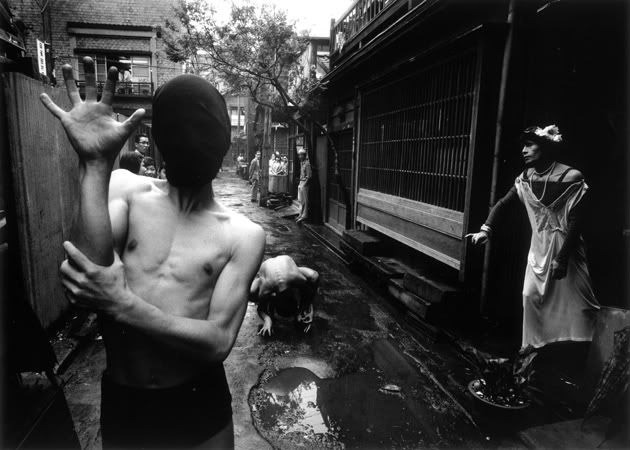
Kelli Connell – Convertible Kiss (2002)

Honestly, I am too profoundly moved by this body of work to offer any sort of worthwhile commentary–it’s just effing exquisitely devastating.

So beyond begging you to spend some time with this work, I’m going to let the artist speak in her own words:

These images were created from scanning and manipulating
two or more negatives in Adobe Photoshop.  Using the computer as a tool
to create a “believable” situation is not that different from accepting
any photograph as an object of truth, or by creating a story about two
people seen laughing, making-out, or quarreling in a restaurant. These
photographs reconstruct the private relationships that I have
experienced personally, witnessed in public, or watched on television.  
The events portrayed in these photographs look believable, yet have
never occurred.  By digitally creating a photograph that is a composite
of multiple negatives of the same model in one setting, the self is
exposed as not a solidified being in reality, but as a representation of
social and interior investigations that happen within the mind.

This work represents an autobiographical questioning of sexuality and
gender roles that shape the identity of  the self in intimate
relationships. Polarities of identity such as the masculine and feminine
psyche, the irrational and rational self, the exterior and interior
self, the motivated and resigned self are portrayed.  By combining
multiple photographic negatives of the same model in each image, the
dualities of the self are defined by body language and clothing worn.
This work is an honest representation of the duality or multiplicity of
the self in regards to decisions about intimate relationships, family,
belief systems and lifestyle options.

The importance of these images lies in the representation of interior
dilemmas portrayed as an external object – a photograph.  Through these
images the audience is presented with “constructed realities”.  I am
interested in not only what the subject matter says about myself, but
also what the viewers response to these images says about their own
identities and social constructs.

Daniel RampullaKa’imina’auno (2014)

I’m on the fence regarding whether or not this is #skinnyframebullshit. The upward thrust of the elbow and the downward pull of the arm in tandem with the strong high-to-low angle of the light certainly establishes a dynamic tension.

I’d give it a pass except for the fact that I think the primary consideration in choosing vertical orientation was as a means of isolating the subject against the improvised background–which appears to be a flannel sheet. Therefore I’m inclined to think the composition echoes the subject out of necessity more than consideration toward a unified reading by the viewer. Namely, I can’t tell if the figure is supposed to be lonely–in which case a wider, empty frame would’ve communicated that point better as in this claustrophobic frame there is a way in which the scant distance between the subject and the background, the light and muscle definition appear tangled up in some notion of physical proximity and embrace. It’s not that it doesn’t work with the image, it’s just that it muddles things given the statue-esque icon insistence of the given perspective.

All things being equal though, I do like this. I feel like there are strong parallels with Patrick Gomme’s work–something I very much want to like but for which I suffer a greater and opposite distaste. (It’s not that Gomme is insincere, so much as the aestheticization of insincerity seems to be the point of the exercise.)

By constract, Rampulla is entirely earnest–maybe even clumsily so.

William KleinDanseurs Crabes (Kazuo Ono) (1961)

Apparently, Klein was known in Japan as a Leica shooter. And although I am extremely dubious that the above image was made with a Leica–with a gun to my head I’d say the bokeh in the background trees screams Nikkor lens–I’m going to run with the notion as it allows perhaps the smoothest segue I’ll manage to a tangential topic.

During my time in Berlin, I was able to see the C|O Berlin Eyes Wide Open!: 100 Years of Leica exhibit. (It’s up for another 45 days or thereabouts–so if you are anywhere close, you really should go to the trouble of dropping it; it’s quite extraordinary.)

Honestly, I have mixed feelings about Leica. The craftsmanship that goes into making them is unparalleled. However, my tendency is to choke whenever things get down to check out; I’m always asking myself: is it really worth paying $10K for a camera with one lens. (Plus, in side-by-side comparisons, I tend to prefer the sharpness of a Zeiss lens to the characteristic Leica lens moody contrast.)

Recently, this opinion has shifted. Largely because Trixie, my Fuji TX-1, is a rangefinder–and truthfully although there’s an ultra-steep learning curve when you come from SLRs, I’m actually finding myself more engaged with what I’m shooting.

So it really was the perfect moment for me to encounter this show as it tipped me over from being morally opposed to Leica to starting to think about how one day maybe I’ll be able to afford an MP…

Anyway, the thing I wanted to mention about the show is that the curation was mad on fleek. Seriously impressive. In a nutshell, the exhibit was laid out chronologically so you could see how the compact portability of the camera evolved from it’s inception through roll out, to the golden age of photojournalism.

Yet, the most fascinating thing was the either penultimate or final (I can’t remember which) descriptive plaque that contextualized the entire history of photography within the microcosm of work made with Leica cameras. I’m going to reproduce it here verbatim:

At a time in which none of the remaining magazines can or wants to afford a permanently employed photographer, yet on the other hand museums are showing photographs, galleries are dealing with photos and corporate collections feed very much on photographic images, the author with an interest in art–nolens volens–has become a model of our postmodernist photo culture. Any overview of the terrain shows six different types of photographers as authors, though the boundaries are of course fluid.

Young photographers still stay true to the genre “Reportage”, even though they now travel with self-assigned commissions, often pursue themes over a long period of time and determinedly rely on their own signature, in order to set themselves apart from the fast food of the electronic media (Paolo Pellegrin, Kai Wiedenhöfer). The “Photographic essay”–traditionally the “Travel report”–as a henceforth critical, formally ambitious exploration of a world in upheaval (Bertrand Meuiner, Klavdij Sluban) has remained just as topical as examination of social themes in the sense of approach that has been defined as “Personal documentary” (Jane Evelyn Atwood, Michael von Graffenried, Gaël Turine) of late. Photographers uses their camera to overcome personal trauma or to simply explore their private environment, creating a kind of “Visual diary” (Paula Luttringer, Alberto García-Alix, Tom Wood). They purposely operate their camera in defiance of the dictates of the instruction manual, and in the spirit of Classical Moderism (keyword: “Visualism”) to formally and aesthetically explore the boundaries of their medium (Andreas Müller-Pohle). Or they pose–while photographing–fundamental questions. For example: What do we do with pictures? What do they do with us? How do they influence our way of thinking, our knowledge? In light of this, existing material is lifted, sorted, reactivated. “Approriation art” is the term of the moment, although a line can be traced from anonymous snapshot to the photographic icons through cinema film (François Fontaine).

I feel like the little of Klein’s work I’ve encountered overlaps in many ways with all six proposed categories. It’s also especially odd in a world where street photography–whatever my thoughts of it might be–is increasingly less formal or even active genre, that Klein chose to focus on the unnerving and nightmarish instead of the synchronous, surreal or strange.

Which I guess is the point I’m quite dancing around: no matter how brilliant categories/genres are, they only ever remain truly useful as long as they serve as a point of departure instead of criteria determining arrival.

Giovanni Littlslr DionisiFull Bloom for Toh! Magazine (2015)

The delicate use of color in these is what initially commanded my attention. Each illustration features an ever so slightly different soft pastel background and the so subtle it’s almost pallid minimalism of the flowers focuses attention on the red to pink gradations evidencing vigorous stimulation.

As far the line work goes it always impresses me when someone can imply a great deal of detail with only the most minimal representation. And while I did immediately appreciate that here, there is definitely more to it.

Note: how the jaggedness of the lines which delineate the outer parameter of the essential form. (The hands in the second image approach a nearly cartoonish level of semiotic implication.) The less vigorous interior lines might, in another work, suggest vagary or something intended to be left open to the viewer imagination. But with these illustrations the unsubtle is the encaustic that enables mere implications to be more easily apprehended.

I read those gentler more seemingly ponderous interior lines as a statement on fragility/vulnerability. It’s a ballsy approach and I think it elevates the work substantially.

Dylanne Leefoundation (2015)

This is essentially monochromatic as everything from the skin tone to the dark red of the wall in shadow at frame right is hanging out in red’s third of the color wheel.

It’s interesting because I’m not entirely sold on the composition. Yes, it functions and has a mostly consistent logic to it. And as much as I’m of a mindset that unless your camera shoots in native B&W whether analog or digital, that no one has any business ever using desaturate to create B&W images, this would actually work as a grayscale image (with only some minimal contrast tweaks).

That begs the question of whether or not color is essential to the image? On an objective level, I would argue it isn’t. However, within the context of Dylanne Lee’s work–who FTR isn’t one person it’s a image making duo from Mexico City–the only thing that consistently defines the work is it’s interest in instilling stolid scenes with a sort of inertia as potential for momentum instead of absence of it.

By that expression, the color makes sense. (And I think someone more fluent with color theory than I am could probably to the imagistic equivalent of diagramming a sentence to demonstrate how the color activates a dynamism that would read as more contemplative in B&W.)

I suspect this may be film. If so, it would benefit enormously from a dye-transfer print, IMO.

Source unknown – Title unknown (XXXX)

The feels this image instigates are hell of conflicting.

Technically, it’s rubbish (#skinnyframebullshit-ery, bizzare vignette-ish blurring and the fact that the image maker assumes a shared cis-male heteronormativity from his audience–suggested by not only the depilated vulva but the fact that the camera’s perspective is slightly elevated and looking down on this young woman.)

Further, I do not enjoy anal play–although I admittedly dabble with it on roughly the same schedule as blue moons occur.

Two things about it appeal to me: First, I appreciate how the intensity of her experience undermines the hegemony of the male gaze; in other words, it’s very difficult to read the dildo here as even an implicit ersatz cock; instead, this is very much a document of–what in my limited experience–appears to be an entirely unfeigned response to physical stimulus. Second, this reminds me of the first time I apprehensively explored my self in a similar fashion.

EDIT: an awesome follower steered me in the direction of what is at least a better quality (if not the original) version of this image.

Sergey Chilikov – From Old Samara cycle (2003)

Two days before departing to Europe, Igor Mukhin posted a digital copy of the flier for a show on at the Schilit Publishing Gallery in Amsterdam.

Of course I had to go–although saying the gallery is in Amsterdam is only true on a technicality. It’s nearly in the suburbs and getting there was interesting on a number of fronts not the least of which was I had to make a private appointment because the gallery hours did not match up with my extremely limited availability during my time in Amsterdam.

From what I gathered, Schilit Publishing is a husband and wife team who work out of their home–which serves as the gallery. This was the first show in which work was displayed throughout the entire house and thus the Russian House exhibition title.

In at least half a dozen ways, I was doomed to dig it. There’s some facet of Russian and Eastern European work that just instinctively appeals to my sensibilities. And really the quality of the work on display was excellent. (I don’t think the work necessarily sat next to other work especially well and I’d aggressively dispute several of the curatorial decisions guiding the installation, but that’s a different story.)

The disappointment turned out to be Mukhin’s work–and it wasn’t a disappointment. (The man is a fucking genius or rare proportions.) It’s just that the focus was more his early street photography and less on his more recent fixation on the transgressiveness of Moscow’s youth culture.) His early work bears an unexpected and EXTREMELY pronounced Cartier-Bresson inflection. (I don’t necessarily consider that a good thing, mind you.) But it’s interesting to see the fight between his instincts of what makes a good image and his exacting approach to form.

But this post is ostensibly about Chilikov–who I was only passingly familiar with before this visit–his prints were just gorgeous. His compositions tend to be chaotic, but he uses the color as a means of parsing the image for the viewer to more easily understand.

For example: here, the attention to skintone and the hint of green in the fence and the very careful rendering of red in the background diminish the mess in the mid-ground.