A & N – Nympho Ninjas Submission (2014)

Diptych ought to be read seamlessly.

The trouble–which in the end isn’t really trouble at all since it allows a far more benevolent interpretation–is that I initially see these images discontinuously.

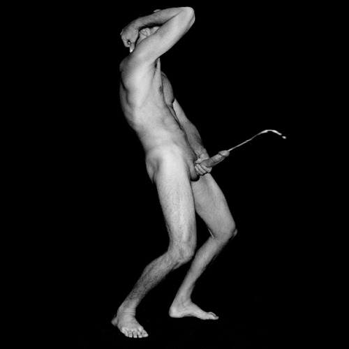
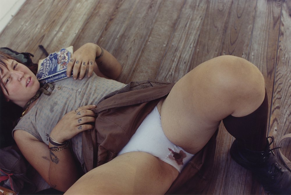
There’s the obvious discrepancy in visual langague. The first frame being one of the most infuriatingly egregious examples of #skinnyframebullshit I’ve posted.

Plus, it is oblivious to the politics of frame edge dismemberment. (To anticipate the counterargument: preserving anonymity is a downright lazy justification. There are literally a thousand ways to obscure identifying features that don’t require decapitation. Yes, it just takes a bit more effort on the part of the image maker…

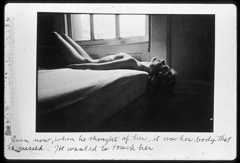
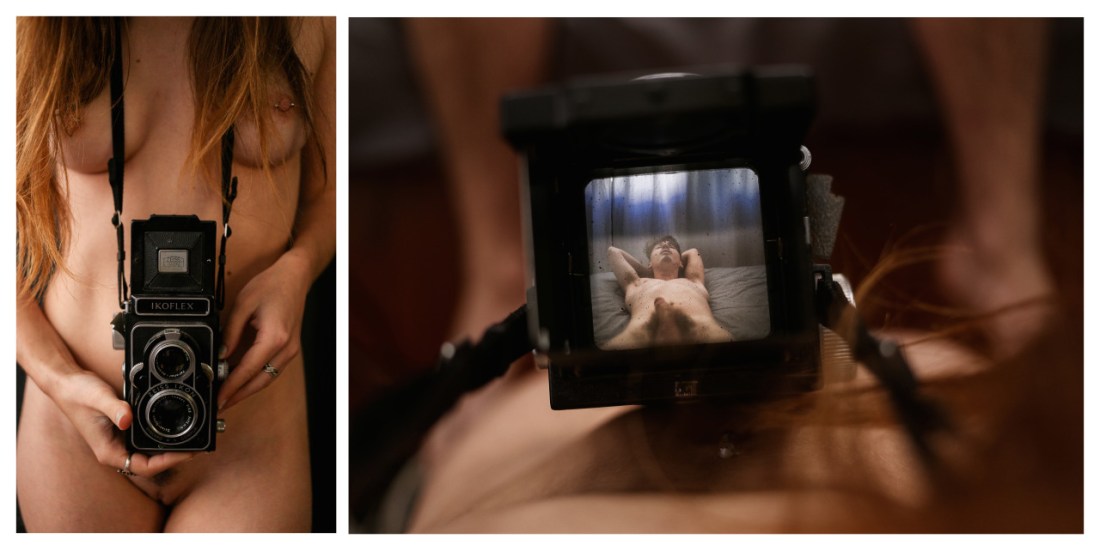
Pairing the first image with the second presents an interesting dichotomy. (It maybe even alleviates the tiniest fraction of the goddamn piss poor decision to opt for portrait orientation in the first image since it allows both images to fit together more intimately within the viewer’s visual field.)

The second image is very nearly perfect. Yes, I have a bias to frame-within-frames and viewfinder peaks but although the second image is great on its own, I think the interplay between it and the previous image are fascinating.

This interplay–as I read it–is a studied subversion of the male gaze.

The leftmost image presents a sample of said gaze; the right explicitly presents the viewer with a female POV.

All sorts of tangents and rabbit trails emerge. But what’s most important is to note that the male gaze is in-built, assumed. It sees the female bodied subject regardless of whether or not she sees–here she literally cannot see as she has no eyes.

Because the initial image informs the following image the female gaze sees but it is seen in its seeing.

(Whether intended or not, the fact that the male bodied subject does not acknowledge the camera is a sophisticated bit of conceptual reflexivity.)

The first frame contextualizes the second. Were one to draw a parallel with art historical tradition and subsequent influence in practice, one would go straight to the head of the class.

In the context of the first frame, the second frame’s richness diminishes the first; underscoring the glaring impoverishment–not to mention bias–of the male gaze..

This is as thoroughly subversive. And it occurs to me that unlike most -isms that take on definition by prioritizing this above that; feminism is a rare ideology wherein the criticism is also a performance of a suggested solution. The act of saying: voice like mine have been silence for centuries, what I have to say is as important as any thing anyone else has to say: therefore I will speak.

Source: Unknown

Um… so, uh… yeah: LOVE THIS. For you know, reasons and stuff.

At the same time: I hate it, omfg sooo much.

For once my objections have fuck all to do with curmudgeonly hyper-criticality. I object because I am devastated.

I have been trying and failing to make a self-portrait that is alarmingly similar to this; really, this and my idea two might as well be fraternally twinned.

But to top a sundae of injury with rainbow sprinkles of insult: this is just flat-out so, SO much better than any of my fumbled false starts and artless misfires.

And although I have no intention of giving up–I’m exactly the sort of fool for whom the prospect of defying impossibility actually serves as compelling motivation.

Of course, motivation alone doesn’t address the fact that I am not getting any younger and I will never be ripped with six-pack abs.

But my phenomenal lack of physical attraction isn’t even the most profound hurdle. This was almost certainly taken by another person. I only have and will likely only ever have–sadly: recourse to the self-timer.

Claire MilbrathGroin Gazing (2014)

There’s room to quibble about the technique–the overexposure/offsetting contributes fuck all to the work; mostly though, this is an intriguingly simply experiment in subverting the assumption of a male gendered gaze.

Without equivocation: more work like this is desperately needed.

Unfortunately and this cannot remain unsaid: Vice Magazine is astonishingly reprehensible.

I am not usually one to moralize. Hell, I believe morality is at best entirely arbitrary in determination. The issue I have with Vice is their sanctimony. They routinely court controversy–not a bad thing in and of itself. But regardless of whether they’re publishing fashion editorials featuring female writers who killed themselves, profiting off journalism featuring wobbly (at best) ethics or continuing to employ fabulously untalented sexual predators like Terry Richardson, they dismiss criticisms–particularly allegations of exploitation–with a sanctimonious don’t-blame-us-for-being-clear-eyed-enough-to-show-you-the-truth.

Yes, there will always be a need for journalist who brave outrage and condemnation to bring truth into the world. All too often Vice mistakes its gleefully transgressive raison d’être for integrity. And it causes them to come off exactly like a fuckwitted privileged straight white male hipster who cracks a racist joke to prove how post-racially aware he is and then can’t understand how anyone could ever think he is a fucking racist piece of shit.

Duane MichalsEven now, when he thought of her, it was her body that he missed. He wanted to touch her. from Person to Person
 (1974)

Quite frankly, Michals’ frustrates the piss out of me. His work is always so goddamn in-fucking-scrutable.

Take this. As with many of his prints, it’s unrefined, sloppy. But it works. And the reason it works had to do with the presentation.

Michals’ tends to present his photographs as a series. He also frequently imposes inscriptions on the image which tend to hijack mere archetypal readings. The inscriptions read like crib notes to the artists more than the audience. Their hurried, seemingly off-the-cuff character enact a strange sort of alchemy wherein the weary, ailing aspects of the image become assets instead of liabilities. 

For example:

This photograph is one of 15 photographs in a series entitled Person to Person which invokes Lynchian account of a relationship’s dissolution. (It’s a little Lost Highway (in structure), a little Mulholland Dr. (in content).

The image I’ve featured is beautiful–in spite of not being on speaking terms with mid-tones. Yet, what’ s interesting is the way the text colors the image with a wistful resignation.

Without seeing another image: the words re-contectualize the photo so that the audience understands that they are envisioning the lover for which the ‘he’ pines. He misses her and wants to touch his lover’s body but cannot. Something happened and they are no longer together.

As you browse through the series, the basic narrative is clearly presented in each frame. And with each additional frame, the story is implicitly re-stated and more details are sussed out.

In the end, although I really don’t want to, I can’t help but like Michals. He’s the type that prefers the prospect of two marshmallows later to one now. But unlike the rest of us, he somehow always manages to have one now and two later.

Mathilda EberhardUntitled (2012)

This is the fourth time I’ve featured Eberhard’s images.

I can’t lie: I am really rather fond of her work. Not all of it is good but there’s never any question as its veracity.

Mathilda Eberhard is always going to show a raw slice of her truth.

I feel as if this manifests in her work in a atypical and anti-photographic way. I am not at all sure how to say it without resorting to nebulous abstractions, so I’ll draw a metaphor: it’s as if image making is not unlike sewing. The thread pierces the fabric passes under it before piercing the fabric again to reappear. The tradition of image making emphasizes the importance of tracing the thread along the surface; and as an image maker you want to offer as vivid a glimpse of the thread as possible. It’s like Eberhard flips over the seam and then focuses on the absence of the thread–an inverted experience of negative time, a focus on the indecisive moment instead of the decisive one.

Personally, I am all about the leaning in brought by narrative tension–I want to know the story. There is no way to extrapolate any sort of story beyond something archetypally human–and therefore seemingly quotidian, mundane.

The thing is: I find myself investing far more into her work than I do with the majority of ‘narrative’ imagery. Perhaps, I have–in my own work–been looking for something in decisive moments that belongs only to the indecisive ones.

Mike BrodieUntitled Frame from A Period of Juvenile Prosperity (200X)

Brodie was born in Arizona circa 1985.

Next we hear from him, it’s 2002. He’s 17 and now lives in Pensacola, FL.

He gets it in his head to visit a friend in Mobile and hops a train–as luck would have it–headed in the opposite direction. He ends up in Jacksonville, FL.

After bumming around for a few days, he catches the same train home.

“[The experience] sparked something and Brodie began to wander across the U.S. by any means that were free – walking, hitchhiking and train hopping.”

In 2004, Brodie found a Polaroid camera stuffed behind a car seat. Sans any formal training, Brodie criss-crossed the States using the camera to document his travels. .

In an effort to stay in contact the transient communities he came into with, Brodie shared his images on various websites; becoming known as The Polaroid Kidd.

When Polaroid discontinued the stock his camera used, he switched to a sturdy camera of 1980’s vintage.

On the subject of his process, he’s said:

Sometimes I take a train the wrong way or… whatever happens a photo will come out of it, so it doesn’t really matter where I end up.

Unwilling to be chewed up by the pressures and expectations of the art market, in 2008 Brodie ceased making photographs.

He graduated from the Nashville Auto Diesel College (NADC) in 2012 and now works out of his silver ‘93 Dodge Ram.as a mobile diesel mechanic.

A Period of Juvenile Prosperity was published in early 2013 by Twin Palms.

(Note: there are two biographies for Brodie–his publisher’s version and his personal website’s. Both feature a wealth of information but are bogged down by choppy, artless prose; the versions are riddled with contradictions. The preceding text is not original; All I did was to reconcile the information contained in both versions in order to present it with as few changes to the original language as possible. I repeat: the preceding text is not original.)

[↑] Peter Kaaden – for C-Heads (2013)
[→] Unknown – Edit of Billy Kidd’s Cora Keegan (2011)
[↓] Lina Scheynius – Bandeau by Yves Saint Laurent (2010)

As far as curation-and/or-criticism-as-art, I am in the same boat as Thora Birch in Ghost World’s art class scenes.

The juxtaposition of the these three found images is an exception that proves the rule.

It’s one thing to re-purpose objects, materials and imagery. It is another entirely to effectively ground them in a new, full-functioning context.

Yes, there is a similarity in style and gaze informing the three independent of each other. And yes, they do sit side-by-side like well-behaved children at the dinner table.

What makes them work together is the Photoshop intervention–the addition of the dangling tampon string which does not feature in the original image.

Simple but startlingly affecting.

Jenny BootSauvage! for Kalblut Magazine (2013)

I won’t even pretend I understand the lighting design here. A key light aimed at the background slightly to the right of the model’s shoulder? No fill light? Her body blocks roughly a third of the light and there is almost no gradation between mid-tone detail and a complete absence of shadow detail.

It doesn’t look great but it’s not objectively terrible either. Yes: shifting the light back two feet would smooth the transition from midtone to shadow while also emphasizing her expectant stare and bringing out the green in her eyes.

I’m far more interested in the model–who is she?–than anything with fuck all to do with the photographer. Her pose, posture and the ambiguous position–somewhere exactly halfway violence and restraint–of her left hand.

Together it’s almost enough to make me overlook the seeming technical ineptitude and flagrant #skinnyframebullshit.

Almost…

Erica ShiresUntitled (200X)

Sally Mann is perhaps the contemporary artist most associated with collodion wet plates processes.

There’s a scene in the wonderful HBO documentary What Remains; while preparing a plate, Mann mentions that collodion was originally used as a means of closing up wounds.

It’s an unsettling caveat from a woman who spent the majority of her most ambitious work photographing the specters of death.

There is always too much reverence with Mann’s work to tolerate even the slightest waste.

(Will Graham would say: this is my design.)

There’s no doubt Erica Shires is good. The question is: how good is she?

Her colors pop without ever supersaturating. Her compositions are at once rigorously formal and effortless. She presents her subjects with a studied yet unassuming intimacy.

If there were a list of the best 40 photographers under 40, the viability of the list could be judged based on whether or not Shires’ appears in the top 5. (Any list where she doesn’t would be utter bollocks and for whatever my opinion is worth, the top spot belongs to her.)

Emma HardyPersonal (Date Unknown)

I want to talk about this photo over drinks into the wee hours– it’s really, really exceptional.

Trouble is, I’m having on of those every-idea-seems-inspired-until-I-put-it-to-words-and-everything-turns-straight-to-shit sort of days.

Also, part of the problem may be every time I look at this, I flashback to being 11 or 12 and chasing Hannah around the corner of my grandparents house in Vermont.

Hannah, is a year and a half my junior. I’ve always thought of her as a tomboy–able to easily outrun even my older athletic cousins. The only thing I can do better is scurrying up trees and she’s always grudgingly appreciated that fact.

I’m chasing her but I’m hyper aware of color: her white bare feet, green-green grass, light-weight lavender sundress fluttering around the flesh-tone blur of her pumping knees; a long wake of brown-blond hair trailing behind her.

I’m too far behind to catch her and as if she’s read my mind, she smiles over her shoulder mischievously.

She stretched her arms over her head, splaying her blue lacquered nails against the summery sky. Her step stutters; her body pitching forward.

Her body follows her arms. I notice her toes are painted the same color as her nails a second before I’m staring at her underwear–cornflower blue trimmed with cadmium yellow.

It’s not that I’m trying to look up her dress, there’s just nowhere else to look. I am suddenly painfully aroused.

Her dress slips as she nears the apex of her flip, turns inside out and falls down around her chest.

She floats there for a split second–it feels as if we are both floating outside time. There’s orange sun on pale skin, cornflower blue and cadmium yellow.

She pushes herself to keep momentum and is on her feet again, looking back at me–her cheeks reddening a little (as if her mom has already impressed upon her the importance of being lady-like and not showing boys her underwear).

But I can tell she’s only embarrassed because she is supposed to be ashamed and simply isn’t.

She waits until I am almost within reach before she bolts again. Glancing back only long enough to ensure I’m still following her.