
Source unknown – Title Unknown (201X)
“Let my lusts be my ruin, then, since all else is a fake and a mockery.” –Hart Crane
Source unknown – Title Unknown (201X)
“Let my lusts be my ruin, then, since all else is a fake and a mockery.” –Hart Crane

Ariel Rosenbloom – Untitled (2011)
I can’t endorse Rosenbloom’s work across the board. Her use of color is slap dodge–running a gamut from dull to loud-mouthed gimmickry. Her B&W work is better–but still telegraphs a blueprint-rather-the-building awareness.
However, short falls aside, there is at least three consistently challenging aspects to her work.
The framing in this image doesn’t exactly fail but it’s clunky. What works is the meditative expression and drape of the skirt over the edge of the cellar door.

Miguel Villalobos – Deer Slava (2008)
Like anything else photography has loosely defined genres, i.e. street photography, fashion photography, landscape photography, etc., etc.
There’s Ansel Adams–a stollid landscape photographer; your street photographers–Cartier-Bresson or Winogrand; and portraitists a la Arbus.
Additionally there are those artists who migrate between genres over the course of their career–probably the best example being Emmet Gowin, who started out as a portraitist who subsequently took up aerial landscapes of the American west as area of focus. Similarly–and ultimately unsurprisingly given her noted affinity for Gowin, Sally Mann has sort of been all over the place.
What’s interesting about these authors whose work shifts over time is that although the approach and overall aesthetic remain more or less constant, there’s always a lot going on between how they see and how they represent what the see. In other words, we recognize them by their creative trajectory rather than their constancy of vision.
What I find stunning about Villalobos–besides his bold use of dynamic black and white with a downright confrontational use of flash, is that although he favors edgy portraiture… there’s a consistency of seeing across his work regardless of genre.
His work seems to exist as if perpetually experiencing the trough between crests on a slightly sinister acid trip.
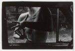

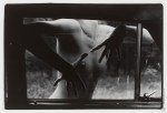
Agresívne prsty IV, II, I, III [from top to bottom] (1987)
The intended order of these images is constructed around how far the window is rolled up.
Those of you who’ve grown up entirely in the age of power windows are probably less familiar with those old manual monstrosities that one had to roll up by hand. You’ve also probably not fought with bitter siblings trying to lock you out of said vehicle by rapidly rolling up the window. If you put just enough weight on the window, the clutch or whatever it is that raises the window will slip and the window inches further open–this can be all you need to force your way into the vehicle.
…
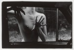
Honestly, I prefer this ordering of the photos. Ignoring how far the window is rolled up, note how in this presentation the framing tracks from right to left across the four frames. It renders a set of images that would otherwise be inextricably entangled with a Repulsion-era Polanski-esque psychosexual paranoia into something more ambiguous/nuanced, a sort of meditation on movement, gesture and memory in the stream of space-time.
Top notch curating right here.
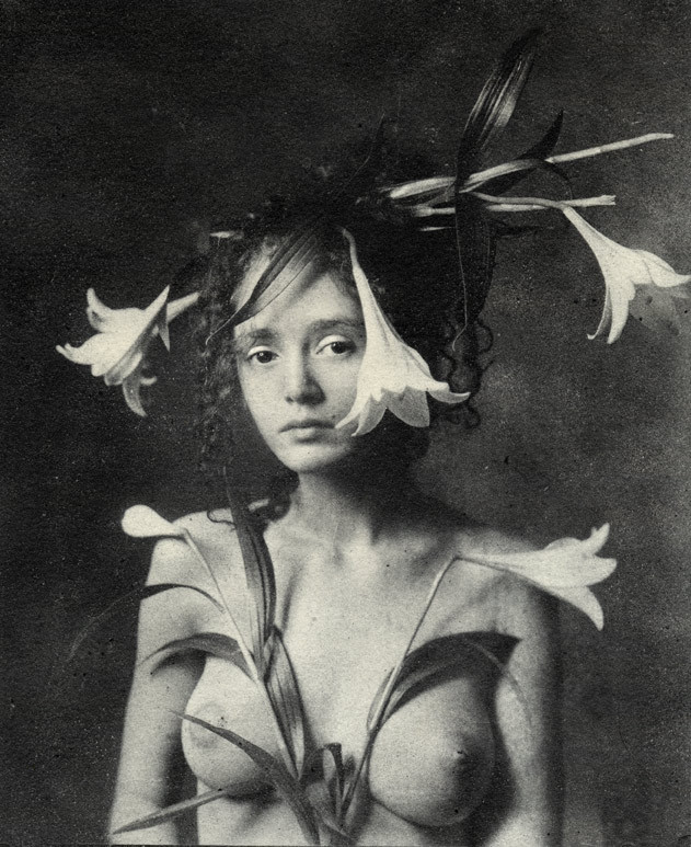
Emil Schildt – Sille (2005)
I am like 97% sure this photograph is a riff on a Renaissance painting since it’s triggering all sorts of drunkenly-wandering-the-Uffizi flashbacks.
Unfortunately, I can’t seem to lay hands on my notebook from then and Google is being less than helpful. (Of course, Google-ing Renaissance painting lillies likely isn’t the most inspired criteria.)
But even if I can’t produce the exact reference I need, I can at least show my work as far as what’s driving my instinct on this one. Consider da Vinci’s Annunciation and portrait of Ginerva de Benci. The curled forelocks and expression in the latter match, even if de Benci is haughty and Sille is merely aloof. In the former it’s both the lilies in the mid-ground and the openness of the composition. (I’m not sure if I’m making this up or if it actually holds true but it seems that the difference between Florentine and Venetian has to do with how crowded the painting is.)
Sille occupies only slight more than 50% of the total space of the frame. It just looks like more–again, similar to da Vinci’s The Last Supper (which you never remember with that much architectural negative space).
And there’s also the smoky inconsistencies in the background texture as a result of Schildt’s use of the Bromoil Process, which is not inconsistent with da Vinci’s refinement of the sfumato technique.
Also, for a real treat check out Schildt’s occasional color work–a little too self-consciously fashion editorial-esque for me but the cutthroat rendering of color is some next level shit.

Ying Ji – Prisoner of Childhood (2013)
Clichés are such because they manage to articulate the sense of an otherwise difficult concept with simplicity.
It’s become a cliche to explain cinema in terms of dreams. It is absolutely true that cinema leans heavily upon the grammar of dreaming: locations shift in the blink of an eye, time passes seemingly unmarked–you can even have dreams with in dreams (dream sequences).
In fact, I remember reading an essay as an undergrad which repeatedly referred to the fact that the screen in a cinema sweats. In that same essay, the writer commented on how it was either Godard or Dalí, who noted that the audience even approaches cinema in much the same was as they approach dreams: by descending into the darkened theater and staring upward at the flickering images.
If they are so effective at communicating a complicated idea in a simple fashion, why then are writers so aggressively admonished against their use? Well, to employ a ready cliché: there’s more than one way to skin a cat. In other words, only looking at a complex notion from one angle predisposes the interrogator to seeing said complex notion in only one way.
That’s where I think understanding cinema as founded open a language that closely parallels dreams serves, but at a cost.
The question that best illustrates the problem is: who is dreaming? One character, each and every characters, the audience, all of the above? However, we frequently see the dreamer in the dream and when was the last time you saw yourself in a dream. (And in dreams mirrors do not function normally.)
We term dreamlike elements in cinema oneiric. However, that ignores the previous question and reduces the surreal or fantastic to subconscious phantasm.
I don’t have an answer to the questions I’ve raised. I just know that with forms like establishing shot, shot reverse shot… we’ve slowly moved away from an unconscious awareness of a single, discrete perspective monitoring the action to this sort of quantum deity that is capable of being everywhere all at once. This is decidedly not how dreams function–even when you die and manage to stay in your dream, your perspective remains constant until you inhabit another body.
This is one of the reasons I am so totally enamored with Tarkovsky. His perspective is infallibly consistent–with the exception of Ivan’s Childhood and that ever so-slight frame rate ramp in Mirror.
There’s also Parajanov. Whose Color of Pomegranates is beyond dispute as one of the all-time greatest masterpieces of the cinema. It’s not just that I suspect that the objects by the woman’s feet are pomegranates, Ji’s work is certainly less compositionally formal but there is absolutely an overlap in the use of symbolism, as well as the carefully crafted perspective.
Also, although I haven’t studied Parajanov as extensively as other filmmakers–honestly, I find his pastoral musicals unwatchable–I somehow feel that Ji’s clumsily earnest but surprisingly unselfconscious and thoughtful artist’s statement would’ve appealed to him.
If nothing else, her ability to talk about what she is doing with her work and what her work actually represents show a great deal more alignment than most artist’s her age.

René Groebli – Untitled from The Eye of Love series (1953)
Lately, I’ve been pondering darkness.
I know, I know… sounds like rejected Celtic Frost
lyrics; but seriously, another of the many unsavory side effects of the
shift from photography/cinematography to digital imaging is the
redefinition of how low-light scenes are represented.
Overlooking
the immense differences between analog and digital, Hollywood has
established an expectation for how things look at night that whether one
realizes it or not, is irreducibly stylized.
I
get asked all the time by folks to recommend cameras to fit a litany of
expectations which almost always center on a low price point and a
prodigious ability to handle low-light situations. People who aren’t
steeped in the technology seem to expect that there’s a camera out there
that’ll render your concert shots and exterior street at night scenes
as if they were Blade Runner
deleted scenes (overlooking that Blade Runner had arguably the best
production design in the history of cinema combined with the fact that
it was shot by Jordan Cronenweth, i.e. one of the all-time great cinematographers.
Working in low light is a challenge. Unless you’re Stanley Kubrick–who famously adapted f0.7 lenses made by Zeiss for NASA to shoot scenes in Barry Lyndon
with only candles for illumination–the recourse was to just let things
go too dark (I’m thinking here of the all but illegible evening walks
in Akerman’s otherwise masterful Jeanne Dielman, 23 Quai du Commerce, 1080 Bruxelles and the most naturalistic representation of low-light cinematography Kiarostami’s–arguably the greatest living filmmaker–Where is the Friend’s Home?)
At
a certain point, certain (largely European) filmmakers started flooding
night scenes with ambient blue light (likely a way of rendering the day-for-night tradition more visually palatable)–I first remember noticing this in del Toro’s Mimic but Besson’s La Femme Nikita
preceded that and as anyone who has followed the latter’s career, you
know he’s incapable of formulating an original idea (although, at least
he tends to steal from the best).
Then along comes digital with
it’s fundamentally less shallow depth of field which in combination with
the theoretical impossibility of it ever rendering even half the
dynamic range of black that the human eye can read. The tendency has
been to invert things and to, when working digitally, treat white as you
would black when shooting analog. (Orange is the New Black does this super obviously.)
Then
there’s also color grading to consider. Toward the end of the analog
era, what came out of the camera was not even close to what made it onto
the screen. Lighting was modified with magic windows, color graded,
etc.
That’s still done today. But that thing that’s different is
that digital cinematographers aim for an in camera image that is
essentially flat. When you export it, it looks bleached–like one of
those Tumblr’s that adds a soft grunge tag to everything. Subsequently,
the footage is graded. Contrast is add, color is resaturated.
Anyway,
I was thinking what I was going to say about this image last night and
even though I swore I wasn’t going to keep watching it after last
seasons bullshit finale, I was watching the 3rd season premiere of NBC’s
Hannibal–a show that I consider frequently reprehensible but features the best production design
in the history of television. (The digital cinematography is also
astute even if I strenuously disagree on a philosophical level with the
excess with which it resorts to glossy close-up inserts; I’m more in
line with Aaron Morton’s work on Orphan Black
and his precocious consistency with regard to scale and the resulting
compellingly believable three dimensionality of space in his scenes.)
While
I think the artifice from which the darkness in Hannibal’s visuals
emerge befits the ostentatious amorality the show goes to such great
length to foster, I can’t help but wonder what it’d be like if it were
as willing to go real and truly dark like the above image instead of
amending its tenebrism as a post-production filter.

Ao Kim Ngân [aka yatender] – Untitled (2014)
A healthy human body can forgo eating for roughly a month and a half.
Dehydration will kill you in under a week–and this assumes a cool ambient temperature and minimal activity.
Hunger can be deferred; thirst commands an immediate response.
That’s the distinction that occurs to me browsing Ngân‘s work.
Her light fall series is obviously homage to Lina Scheynius’ preoccupation with documenting light. While the above is likely prefigured by Traci Matlock‘s mirror self-portraits.
Both Scheynius and Matlock are endlessly talented photographers. However, in a sense, in the realm of internet famous image makers, wearing such influences on one’s sleeve is potentially problematic.
That’s where Ngân distinguishes herself from thousands of other upstarts: her photos possess an unusual gravity. To get a feel for it, check out the stuff she’s shot of dancers in Ho Chi Minh City; not the way her single, static frames bristle with a sense of flowing, dynamic momentum.
Her personal work features less emphasis on momentum and more on stillness. In that way, it’s in line with Schneyius; however, unlike Schneyius there is a very profound sense that the stillness is in itself requires taxing concentration, is an exercise in willpower.
And this is where we get back to hunger vs. thirst. The work Ngân emulates is–in its sexual politics–interested in the overlap of representation and identity as a means of not only authorship but also as a relationship between the female gaze and the visualization of something not unlike hunger.
The lines between material and flesh in the image above, the delicate touch of the obscuring flowers here and the light on the knees, the position of hands and the texture of the dress and sheets here.
The subverted eroticism in the work is too intensely rendered, too pervasively interpenetrative to fit the framework of hunger. Even thirst seems entirely too willing to wait for fulfillment. This works walks a razor wire line of hope and frustration stretched between expectation and not fulfillment but forever expanding expectations.

Andre-O – Untitled (2013)
I’m usually super skittish when it comes to images which amputate, decapitate or otherwise maim bodies in the imposition of a frame on a scene.
What makes me uncomfortable is the history of using the frame to decontextualize. A body in space becomes disembodied by way of what is included vs what is excluded. You have a veritable litany of images wherein bodies are essentialized to a metonymy–where a part becomes an objective referent intended to represent the whole.
My eyes practically bleed from the repetition of images wherein the autonomy of the subject is de-emphasized as a result of the simple fact that his/her/zir is rendered immobile by the removal of feet, legs.
I admit amputation isn’t always dehumanizing/violent; however, I consider an image that manages it is the exception that proves the rule. (Decapitation is. Always. Do not cut your subjects head off at the neck. Ever. There are literally ten thousand other (more creative ways) to preserve anonymity.)
This image doesn’t bother me. In fact, I’m rather fond of it–surprising given how fucking irredeemably terrible the rest of the image makers work is.
What makes me okay with this image–I think–is the relationship of her right knee to the lower left frame edge in tandem with the fact that she is leaning into the focal plane with her left shoulder and her head is counter balancing away from the camera. (Here I’m okay with the partial decapitation because it fits logically within the composition. Further, the exaggerated lulling of her head is more than a little reminiscent of this study of Bernini’s masterpiece Ecstasy of Saint Teresa.)
I’m doubtful she’s actually masturbating but unlike many other O-faced imagistic insinuations of similar ilk, the dynamics of motion are consistent enough that she could be.
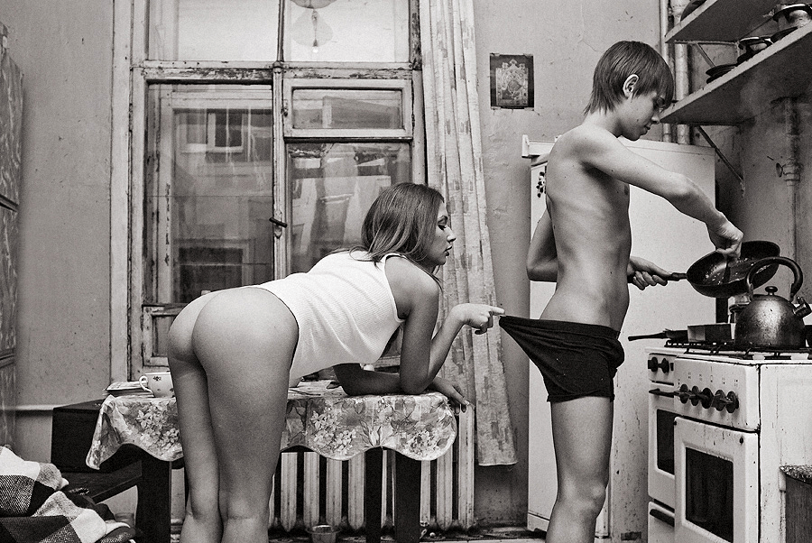
Igor Koshelev – Утро доброго дня (2010)
My Russian was never exactly, how you say: хорошо and the title of this seems untranslatable in an idiomatic sort of way. Best guess, it means something along the lines of the way you might pass a neighbor on the street and as if to indicate the pleasant weather, you were to say: looks like it’s gonna be a wonderful day.
…
I like the way the title functions here. It doesn’t add anything–only reifies what’s there. It’s the way a narrative image should be titled. Not that this is a narrative image, mind you but it’s at the very least on the right track: you have characters, setting and an inference of what’s happened previous and what will almost certainly follow (i.e. this is a new couple who’ve probably been up late into the night fucking and are about to digress into a diversion that will result in eating their breakfast cold).
There’s too many questions for me to suspend my disbelief enough to accept that this is representative of a narrative. I have no idea if this is her place or his. My suspicion is it’s neither–it feels like a while the parents are away the kids will play sort of scenario; yet there is nothing in the image that speaks to that question. (Also, I’m reasonably willing to bet this image was not taken in the morning. You stare at B&W negs long enough and you start to pick up subtle tones and textures. Gun to my head, I’d swear this was shot on an autumn evening in a decidedly northern latitude.)
…
This is really the only image of Koshelev that is tolerable. The rest are complete garbage–like truly fucking terrible–which is odd considering despite it’s flaws, this would seem to suggest that this might be the early work of a wonderful photographer.
