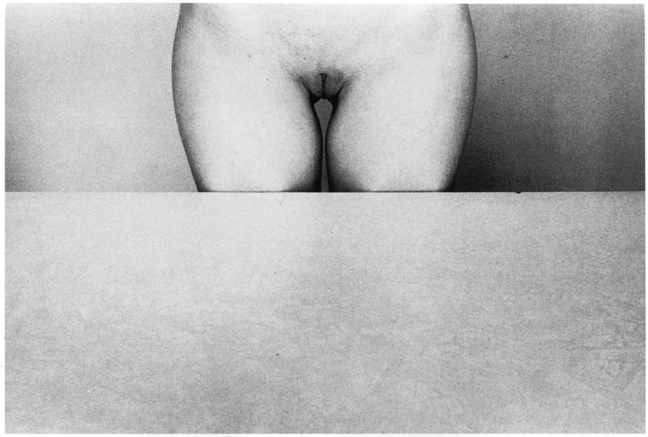
Marcel MeysLeda and the Swan (1920)

I have a very long list of scholarly essays I have half a mind to write. I know I’ll never write them but I think the concept is vital enough that someone should write about it–even if it’s not me.

One such essay has to do with understanding the mechanics or artistic influence using figurative painting as a microcosm. I think it’s interesting that it starts out as a system of patronage–artists accept assignments to depict certain stories and thereby practice their craft.

If you’ve ever spent any time studying 13th through 18th century painting–or spent an afternoon ambling drunkenly around the Gemäldegalerie (have done; plan to do again)–you know that regardless of historical merit, a fair portion of it is BORING AS FUCK.

Yes: there are exceptions wherein the practitioner’s craft is so clearly some next level shit that it shifts the way that myth is depicted henceforth. (Giotto and Masaccio being goddamn exemplars.)

Then there’s those that add not only staggering craft but who also manage to strip away any sort of superfluous decoration and get to the dynamic core of the image. That’s abstract… think of it this way given the established trope the artist finds a means of not only presenting the subject in a new, dynamic way but they do so in cuh a way that the render the title unnecessary. You look at the image and you know down in your bones, the story behind it.

My favorite example of this visionary work is Bruegel‘s Landscape with the Fall of Icarus.

But there’s also work that alludes to mythology in order to clarify or enrich itself. I had an example that was a painting but as I’ve been writing this I may have been drinking rye whiskey and now I’m just blasted enough that the only example I’m able to summon to mind is the fact that Ellen Page’s (who is fucking incredible, by-the-by) character in Inception is named Ariadne.

As with this example, the majority of such efforts end up knee jerkily hipster. But there’s the further complication when we are dealing with analog photographic or digital imaging processes. Joel Sternfeld did a a great project called On This Site: Landscape in Memorium that commented on how text informs images and images inform text.

I find this image to be an example of this last kind of image. I’m not the title necessarily detracts from the work… if you know anything about the history of the depictions of the story of Leda and the Swan then you can appreciate it’s cleverness.

My trouble is that I think the harkening of the title back to mythology diminishes the fact that this image is more than ninety years old but still looks as if some analog fetishist Tumblr photographer collaborated with an up and comping Tumblr model to make it.

Daniel KlaasJoanna (2014)

The part of my brain that thrills in voyeurism enjoys portraiture. It’s a bit like a two-way mirror: I can watch without being seen.

But something about it is vaguely unsettling. I’ve been trying to work it out and I think it boils down to conceptual concerns over the negotiation of identity via depiction in visual representation.

That’s an annoyingly academic, overly verbose way of saying: at its most fundamental level portraiture establishes a thorny, four-way intersection between how the subject sees them self, how the subject wishes to be seen, how to photographer sees the subject and the how the photographer’s work is seen by the viewer.

Portraitists walk a razor wire tight rope between bearing witness and trading in what is effectively undeserved intimacy–i.e. the objectifying tradition of thinking I know because I have looked closely and seen.

Off the top of my head, Ryan Muirhead and Lynn Kasztanovics are the two photographers who manage to re-contextualize portraiture into something that testifies to the truth in the transaction of at once being, seeming, being seen and the politics of depiction while fostering subjects enigmatic non-object-ness. Muirhead does it with a mastery of craft and attention to the holy moments between defensive pretense and unguarded openness to the world; Kasztanovics collaborates with those she knows and trusts–her informality and the proximity to her subjects creates something not unlike the discomfort of someone sitting too close on public transit whom, contrary to all reason, you find yourself fighting the urge to reach out and caress their face.  (Lina Scheynius and Traci Matlock also fuck with portraiture in fascinating ways but both seem less interested in working within the form than transgressing it’s boundaries.)

Back to Klaas: he’s a Melbourne based photographer who favors analog photographic process. And I am not overly fond of his work but this image is quite unlike his typical milky exposures and rendering pose as contrived sculptural element. Instead, it reads as a sort of record of a moment in which the confluence in a body of subject and objective experiences of reality was quietly observed.

So there’s that. But also, there’s also fascinating technical considerations: the mid-tones are relegated to the background wall, couch and Joanna’s face. Everything is super contrasty with either deep, rich shadows or highlights pushed to the edge of blowing out.

Depth of field dictates the way the eye scans the image–It reminds me of mrchill, in that regard– and emphasizes her enigmatic expression, as if she is calm, comfortable, perhaps even a bit contemplative. (Note: the grace notes in her hand placement; probably my favorite part.)

Sanders McNewFinancial Services, Minnesota (2009)

If you wish to shoot deliberately, to front only the essential facts of image making, and see if you can learn what it has to teach then go out into the landscape, I say. Take your square format, studio portraits and milky white backgrounds and shove them up your ass.

Except… well, sometimes I’m wrong and it’s a rare image that can not only make me admit I’m wrong but that makes me completely rethink my objections.

The focus here is on Brooke Lynne–she’s either trying on a new pair of glasses or nervously adjusting the pair she’s worn for months. There’s something both hyper posed and yet off-balance to it.

A milky white background typical decontextualizes the model emphasizing physicality. But although the backdrop certainly accentuates the shape of her body, the lighting and the simultaneous stylization and awkwardness of her posture emphasize shift attention to her gesture.

In most portraiture work in this style, I always feel as if the decontextualization is an effort to isolate the model; an invitation to objectify her.

This feels quite the opposite. LEss that there is no background than any background complicates matters unnecessarily.

In fact, browsing McNew’s Flickr leaves my head spinning at just how diverse a body of work given reasonably limited operating parameters.

Duane Michals – Naked Nude (1982)

While the title is a riff on John Berger’s distinction between ‘naked’ (i.e. the natural state of the body) and ‘nude’ (i.e. the conventionally stylized art historical objectification of nakedness) in the seminal Ways of Seeing, I’m always suspicious when someone like Michals telegraphs that he’s aiming for the broadside of the barn.

Despite the simple elegance of the image, I feel like there’s an underlying middle finger being given to the notion that photography as an art is fundamentally more prone to essentialist objectification due the the inclusion/exclusion parameters of the frame edges.

Upon first seeing this I immediately flashed back to a college discussion on Piaget vs Vygotsky–specifically: the supposed necessity of object permanence in order for a child to learn language.

I never grasped the salient tenants of their disagreement but the general principle of object permanence applies here. At a certain point in our development–I believe Piaget would say it happened at one particular point, whereas Vygostsky insisted it was a recurring evolving process of increasingly sophisticated awareness–we learn that the toy our mom is hiding behind her back still exists even though we are unable to see it.

It seems Michals–who to my mind is a metaphysician first and a photographer second–is pointing out that we’ll allow that this woman’s legs continue below the table and even extend beyond the lower frame edge but politics insist we acknowledge that she is severed at the waist by the upper frame edge.

Using the table to create a frame-within-the-frame creates a tableau that it’s easy to dismiss as essentialist–reducing the female body to symbolic genitalia.

That this image doesn’t come off like that is a result of the clever composition, but I think contrary to Michals’ assertion–I’m pretty sure he’s a card carrying Cartesian–it’s the context of the image which dispels any trace of a sexist agenda. First, it is of an especially high quality, it’s self-consciously aware of the relationship between an out gay photographer, a nude model and an audience with the expectant male gaze default setting that will respond either salaciously, with disappointment or with critical censure.

The rightness or wrongness of thesis is irrelevant due to the masterful grasp of the totality of context.

Allison Barnes –  [↑] July 30: Incision (2012); [←] July 23 (2012); [→] Bruised Vein from Neither For Me Honey Nor the Honey Bee (2014); [↓] July 24 (2012)

Little else drops me down a k-hole faster than stumbling upon a photographer whose work thoroughly engages me.

I spent a good part of yesterday pouring over Allison Barnes’ work. Given her proclivity for shooting analog large format almost exclusively, this shouldn’t be a surprise.

What surprised the fucking shit out of me was how far off base my initial impressions were.

For better or worse, I think everyone tends to start from what they know based on their experience. Barnes initially struck me as a photographer preoccupied with Francesca Woodman, Sally Mann and Ana Mendieta.

Following those markers leads down lush verdant path passing interesting scenic overlooks; but sooner or later each dead ends, leaving you to retrace your steps and then begin again from the beginning.

What’s strange is it almost feels like these false trails are supposed to be followed–as if in following them to their end the work is teaching the viewer how to see it, as if initial misunderstanding is somehow integral to any sort of eventual understanding…

It’s this that dismisses perfunctory correlations with Woodman and Mann–both being more caught up in aesthetic interrogations of the trilateral relationship between author, subject and audience, how that relationship manipulates objectivity.

The Mendieta trail does stretch further than the others but in the end Barnes veers away from carefully manicured feral confrontation for something not exactly patient or even contemplative so much as the expectant stillness of someone willing to wait for you to get the ever-so-clever joke in the otherwise grave conversation.

Chris LowellUntitled from N. America series (20XX)

If you have any investment in entertainment that passes the Bechdel test then you likely know who Chris Lowell is already. Remember Veronica Mars? Remember how amazing the first season was? Even the second season–despite its flaws–was a cut above most serial dramas. Then came the inexcusably awful third season.

Well, Lowell–who played Veronica’s college boyfriend Piz–was among a clot of reasons the show suddenly started sucking shit through a tube.

All this is relevant only insofar as it suggested a way of responding to a raft of questions I have about his images.

On a certain level, I want to like his work. His compositions are logical, exploiting the inherent dynamism of strictly observing the rule of thirds. I see some of my own compositional tendencies mirrored back at me.

What sets me off is the framing of the work as ‘fine art photography’. Yes, it’s a term that I am ambivalent about at best but its inclusion here catalyzes my various impressions into something unflattering.

In the absence of titles and any sort of framing statement, there is only the skeletal suggestion of the respective continent on which the images were made. This seems to imply the images are clear and self-contained enough to carry their own weight.

They are all pretty; some even alluring even but they do not stand on their own as-is.

Consider the above image: the strobe blown foreground contrasting with the carbon black night is compelling. And I get that the image maker is riffing on Yves Klein’s Leap into the Void.

Beyond that nothing is clear: the void in the latter has been transformed from a French street into a literal void.

Is this–as Leap into the Void was–preoccupied with questions of photomontage? (If so, the stakes are lower here; it’s child’s play to composite a figure over a single, seamless solid color.)

Is the figure going to land on a trampoline or a pool? What’s with the screened in tree house/porch?

Whatever fine art photography entails–and really who the fucking hell even knows what that is–a fine art photographic image MUST demonstrate an unambiguous bearing toward its audience. (And that bearing may be ambiguity.)

In most cases the photographer get’s their ass out of the goddamn way. Yes, the Cartier-Bresson’s style is as singular as a fingerprint. Ultimately though, he’s less concerned the polemics of his own style as he is in seeing the world as a stage waiting to be wondrously set through the lens of his camera.

Stephen Shore takes things a step further by de-emphasizing any stage setting in favor of images that seem like in a accidental and miraculous moment the world offered you (the viewer) and you alone a magical glimpse of its underlying symmetry/meaning and purpose. Alternately, Eggleston gives zero fucks about his audience. He was a terrorist who wanted to profane gallery walls with an extravagantly unrestrained profusion of colors that served no other purpose than to slavish ornament mundane existence.

Meanwhile, the relationship of Lowell’s work seams to at best position him–as it were–beside the viewer. He watches them watching, hoping against hope that they’ll tell him they like it. Waiting for the proper moment to interrupt them and inquire: what do you think? Is it okay? Do you get it?

I don’t mean abandon such harsh criticism at Lowell’s doorstep like flaming bag filled with dog shit. I point this criticism in my own direction. I think what original drove me to pick up a camera was the belief that since I was terminally unrequited and undesirable that maybe it might be possible for people to love me through my work.

Such isn’t at all a bad initial impetus–but as long as the artist’s drive is governed by it–’art’ if it happens will be more a happy accident than a summation of any progress or growth.

Petra DolezovaUntitled (2011)

Have you ever come awake too soon from a beautiful dream? I’m talking one where you immediately roll over, screw your eyes shut and focus every bit of energy on descending bacl into it again?

If you can recover it, it’s never quite as vivid as it was the first time around. like a dream seen through gauze, in a mirror.

It’s a feeling not unlike the thread that runs through Slovakian-born, Dutch educated Petra Dolezova’s stunning work.

I’d very much like to share some of my impressions but her work truly deserves at least initial contemplation. So please, do the internet equivalent of closing the text around your finger and go through her entire Flickr photostream. Treat each image the way you would a savory mouthful of food, chew slowly, twenty times, before swallow. (I’ll still be here when you get back.

Oh and may I suggest a sonic pairing, this 1997 vintage Labradford enhances the oneiric grace notes rather well.

I keep fighting a strong urge to term Dolezova’s work ‘minimalist’; except as much as I’ve studied both art history and critical theory, my understanding of minimalism is a bit like those words that are their own opposites.

On the one hand–and I think this constitutes more of the general denotation: minimalism suggests a diminution of ornaments (necessarily entails additional, implicit emphasis of form). One declare Philip Glass and architecture with clean lines to be ‘minimal’.

On the other hand, there’s a tendency to think of minimalism as something additive. I add this line or that curve to negative space–the relationship of the line or curve to such space is minimal. However, if you invert it and consider empty space as the locus of meaning, the what appears maximal is actual razor sharp in its subtly and nuance. (Silence is a sound; melody is sometimes what is excluded.)

And that’s glossing over questions of conceptualization, concerns over execution.

I think my instinct to label them minimalist has to do with the way the presence of each image all but extends to the viewer the key to its own undoing. As if the image is less witnessing document and more kataphasis/apophasis perpetual motion machine.

As if there is no author [praxis] in which theory and practice are fused; as if there is no sayer to impose two words when one will do–all that is unnecessary or extraneous has been removed; there is only the image.

P.S. PH Magazine did an interview with Dolezova a few years back. The questions are underwhelming but it’s difficult not to admire her straightforward and meticulous responses.

Iwase Yoshiyuki – Untitled (1966)

Yoshiyuki, it seems, was a sake magnate who upon being gifted a Kodak camera set out to document the so-called ama girls who harvested seaweed, shells, oysters and abalone from the cold waters off Japan’s Pacific coast.

This photograph is atypical of his work which frequently featured candid shots of topless divers, water, sand and nets.

It was likely produced as part of one of his ill-advised forays into the fine art nudes. Unlike those awkward, overly self-conscious dalliances re-staging previous scenes in an effort to transform immediacy into technical rigor, this manages to encapsulate Yoshiyuki preoccupations in a manner which transcends the context of its creation and becomes at once somehow both timeless and deeply resonant in its uncomplicated humanness.

Bienvenido Cruz2.7323 (2014)

Have you seen Cruz’s Hell Is Other People 2 series yet?!?!! It’s so v. very fucking fabulous.

In fact, it’s so fucking fabulous that I’m forsaking the rule where I never post more than one .gif for every ten still images to post this.

The ramped grade along the back drop, tonal separation between the edge of the table and the wall and Ms. Damage’s pose/expression are pitch perfect.

The drumming fingers contribute unexpected movement while hinting at a sense of frustration but there’s something whimsical, perhaps even playful about the movement in such a stark image.

I don’t want to date myself–but hey, no one else appears interested so I suppose I might as well: this image reminds me of that Far Side where a guy sitting at a table is juggling several rubber balls with his left hand; covertly, his right hand scrawls on a sheet of paper: Tonight I strike…Death to the Left Hand! Death! Death! Death! The accompanying caption reads: Innocent and carefree, Stuart’s left hand didn’t know what the right was doing.