Jesús Llaríano head (2014)

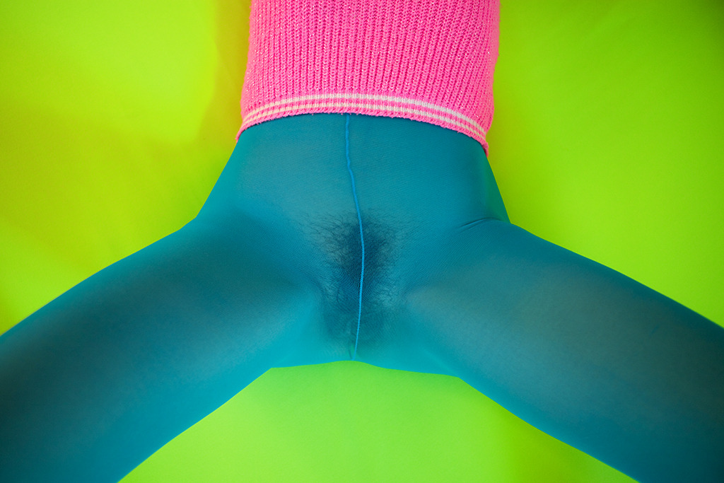
As in tune as I can be with logging my own process of reading images, this short circuits everything.

I’m not sure I can explain it without getting a little TMI but it reminds me of being fifteen. (Not that I saw anything like this in the flesh until almost a decade later…)

It reminds me of random, mundane things that would inexplicably trigger arousal so extreme it was actually painful.

I had already been chasing the same oxytocin/prolactin buzz for seven years as a way of smoothing out the jagged edges of my abusive adolescent existence and suddenly it was also effecting some sort of vaguely imagined autonomy over my own body.

As a friend puts it: it’s a real wonder all the masturbation didn’t inflict permanent nerve damage.

So yes: initially seeing this image resulted in me having to release some sexual tension.

Afterwards, I found myself enchanted by the way the image works. Although I’m not sure it’s ever justifiable to employ a frame as a means of dismembering a woman’s body, I can’t technically refute the decision as Llaría observes the dictum of amputating between joints instead of at them.

And there is a notable compositional logic supporting his choice. Note the repeated angle of the elbow which is not the model’s, the line of the lower half of the dresses’ buttons, the way the seam to the left of the lower button line softens the angel to echo that of the model’s right thigh only to have the same angle emerge again in the cocked angle of her right leg.

There’s also the matter of palate: excluding her bush, the image consists of three hues. The rust colored earth figures at the darker end of a spectrum that would include the more magenta tones in her skin; while the white in her slipper and dress are virtually identical. The blue of the dress makes everything else pop.

Let’s not forget texture, either–something about which I am often preoccupied. The skin doesn’t really have texture in this image; except juxtaposed between the dirt and the fabric of the dress the absence of texture becomes a null field. Unlike the ground or the dress you can’t imagine touching the model’s legs but you can recall what it was like to have touched such legs. The visual synesthesia suggests an insistent anti-objectification that subtly reminds that this is no less or no more than what you have always known.

I would be dreadfully remiss for also not mentioning that even though I am not female bodied and if I were I would not be comfortable wearing a dress, I’m more than a little obsessed with the dress.

Maurycy GomulickiMINIMAL FETISH_9895 (2010)

This is problematic for the same reasons I took this gorgeous Kodachrome to task.

It’s a teensy bit off balance– the angle of the legs in relation to the lower corners and the uneven grading of the pistachio backdrop; however,  I’m unsure whether it’s a lazy approximation on the part of the artist or an expectation that viewer will get the jist instinctively round it up.

Don’t get me wrong, the interplay of colors is LOVELY. (So much so that when it disappeared from my likes before I could post it, wyoh enacted some of her ‘net wizardry and tracked it down from little more than my muddled recollection of it.)

Gomulicki is trained as a designer and painter. His work is fixated on both documentation and vibrant-to-the-point-of-surreality color palates. And I can’t look at this or any of his images without relating them to amandajas’.

I don’t think it’s difficult to see why: Jasnowski is an image maker preoccupied with image making as a mode of design, after all; and she deploys a strikingly similar palate in her work.

But that connection triggers another question: what is the relationship/where is the boundary between image making & design?

And how does any answer inform the question of the purpose of color in image making practice?

Chih-Han HsuIMG_4363 (2009)

I know it the young woman in the fuchsia dress is almost certainly wearing some adorable undies beneath her dress and her genitals are not especially near her friends mouth.

Regardless, I would do almost anything to switch places with the young woman in the white dress.

From the standpoint of image integrity, I am not at all fond of the way her legs are cut off by the bottom frame edge. And despite the the careful balancing the inside of retaining wall with the vertical sidewalk seam, there is no reason whatsoever for #skinnyframebullshit.

The reason this image works are the supremely digable little detail flourishes: dark nail polish against the greywhite concrete, the ring on the girl in the fuchsia dress’ left middle finger that draws attention to her left knees delectable skin tone and how she is kneeling on the other woman’s hair.

I am not sure the funereal hands crossed over her chest is the most convincing pose. Her hands could be any number of places, doing any number of things depending on the degree of comfortability of the two models with each other.

But really the image works mainly because of the ambiguously coy Mona Lisa smile which could just as easily be read as look at this transgressive thing I am allowing myself to be seen doing or this is the first time I’ve let another girl taste me and it feels so much better than I had ever imagined it could.

Anastasiy Mikhaylov [AKA Estergom] – *** (2013)

Mikhaylov’s images look as good as digital B&W can be expected to look–awful when compared with analog B&W–and are ordered according to crisp compositional logic.

I nearly had a heart attack and died from not-surprised when I learned Mikhaylov was trained as a cinematographer.

If photography is English, then cinematography would be English spoken with a nearly impenetrable Scottish inflection.

Seeing Mikhaylov’s work is like running into someone who speaks with the same accent. Someone whose words you understand in a nearly prelinguistic fashion.

In other words, the familar pretty-pretty and consistent evocation of scale attracting my eyes like ball bearings to a magnet.

Cinematographers are as a group less than astute when it comes to the nuances of conceptual art. (Two prominent exceptions that spring most readily to mind are Sven Nykvist and Harris Savides.)

Yes, echoes absolutely exist in relation to matters of visual storytelling and figuring out how to inveigle unruly images to sit politely side-by-side around the table like some many birthday party kids cracked out on sugar rushes. But I think there’s an inherent notion of what a photographer does that gets instilled in us; it transitions a bit too easily into an explanation of what photography entails.

For everything Mikhaylov does well, there’s always a corresponding deficiency. The most obvious is his inconsistency in including/eschewing eye contact. There’s no rhyme or reason to it unless you step outside any critical space and instead start from an acritical exposure to visual culture. In other words, don’t ask why does this look the way it does; begin instead by insisting this is what an image should look like.

There’s some overlap with an Matt Singer penned op-ed over at The Dissolve earlier this week in which he compares and contrasts the visual indelibility of the latest Spider-man blockbuster and Jonathan Glazer’s gorgeous and incomprehensible Under the Skin.

Referring to yet another essay by HitFix’s Drew Mcweeny, Singer notes:

McWeeny concludes his essay by imploring Hollywood to “make the stakes more personal” while “telling good stories that also happen to be amazing to look at.”

Pretty-pretty is all well and good but it is ultimately not enough. Something more is needed. In the above image, for example: it’s a matter of tone–a cishet male positing lipstick lesbian schtick as same-sex attraction.

Ultimately, despite it speaking my language convincingly, I feel like this is an image that is comparable to a seedling needing partial shade that was planted in direct sunlight. It’ll grown, but it’ll need extra attention.

Technical merit isn’t enough. And it irks me that the extra care it requires needs hinges equally on the artist’s ego and the irrigation of lusting arousal as the only viable means of fully intoxicating the viewer.

D. Robert StanleyEmily (2010)

I appreciate the effect this is chasing; an ex post facto insinuation wherein the moment portrayed implicitly addresses the events immediately preceding it:

  1. The image maker stares out across an empty parking lot, a Leica M8 dangling from a strap around his neck;
  2. He hears the screen door opening to his left. A young woman–not wearing a stitch, presumably his companion–stands in the doorway, a cigarette hanging from her mouth and fumbling with a book of matches;
  3. Registering the base elements of An Image, the image maker sights through the viewfinder while pivoting, rocking focus hard right then slow left as the match head flares, drifts upward;
  4. As the flame touches cigarette tip, he triggers the shutter.

Although I am tempted to refute the assertion that this is a ‘narrative’ image–it’s not; there far are more urgent fish to fry.

Here: I want to point out once again that I dig the idea underlying this. I really do.

I am bothering to reiterate that point because I am afraid what follows may really harsh the image maker’s buzz.

First, I am very sorry but this is not a portrait. Welcome to Name That Genre, I am your host Jon Rafoto. And oh, I’m sorry you said ‘portrait;’ the answer we were looking for is: street photography. (EDIT: Unfortunately, I got a ahead of myself here and started playing fast and loose with the terms. What I meant is that the perspective of the image is closer to street photography than portraiture but I conflated how with the what and that led me to attribute (wrongly) the content to the genre of street photography. This was a mistake.)

See: a portrait preferences the subject over their surroundings. This preferences the surroundings over the subject.

Sure, I’ll see the ’environmental portrait’ call and raise with a ‘the tendency of a sitter in a portrait to acknowledge the camera’.

All that doesn’t even matter though because in this case I am holding pocket aces in ‘the camera that made this image was hand-held’. Now, that’s not to say portraits can’t be hand-held, they certainly can. But the failure to square the frame against the verticals of room 20’s door jamb to and the rightmost window edge is either shoddy composition or an effort to emphasize the pivoting pan of the photographer–suggestive of street photography.

Further, squaring the frame would have made the questionable compositional logic gallingly obvious.

That being said there are some insightful inclusions. There is an effort to include the texture of the roof as a compositional feature. As is, it doesn’t play. But the instinct to include it was excellent.

What was needed was either for the photographer to take two steps back and square the frame. Or to have a half-step left and squatted down. The former option would have shifted things even more toward street photography, the latter would have shifted it closer to portrait.

Both would have had the additional benefit of not bloody making the most annoying newbie mistake in the book–if you have to amputate with the frame edge do so in between and not at joints.

Mathilda EberhardUntitled (2012)

This is the fourth time I’ve featured Eberhard’s images.

I can’t lie: I am really rather fond of her work. Not all of it is good but there’s never any question as its veracity.

Mathilda Eberhard is always going to show a raw slice of her truth.

I feel as if this manifests in her work in a atypical and anti-photographic way. I am not at all sure how to say it without resorting to nebulous abstractions, so I’ll draw a metaphor: it’s as if image making is not unlike sewing. The thread pierces the fabric passes under it before piercing the fabric again to reappear. The tradition of image making emphasizes the importance of tracing the thread along the surface; and as an image maker you want to offer as vivid a glimpse of the thread as possible. It’s like Eberhard flips over the seam and then focuses on the absence of the thread–an inverted experience of negative time, a focus on the indecisive moment instead of the decisive one.

Personally, I am all about the leaning in brought by narrative tension–I want to know the story. There is no way to extrapolate any sort of story beyond something archetypally human–and therefore seemingly quotidian, mundane.

The thing is: I find myself investing far more into her work than I do with the majority of ‘narrative’ imagery. Perhaps, I have–in my own work–been looking for something in decisive moments that belongs only to the indecisive ones.