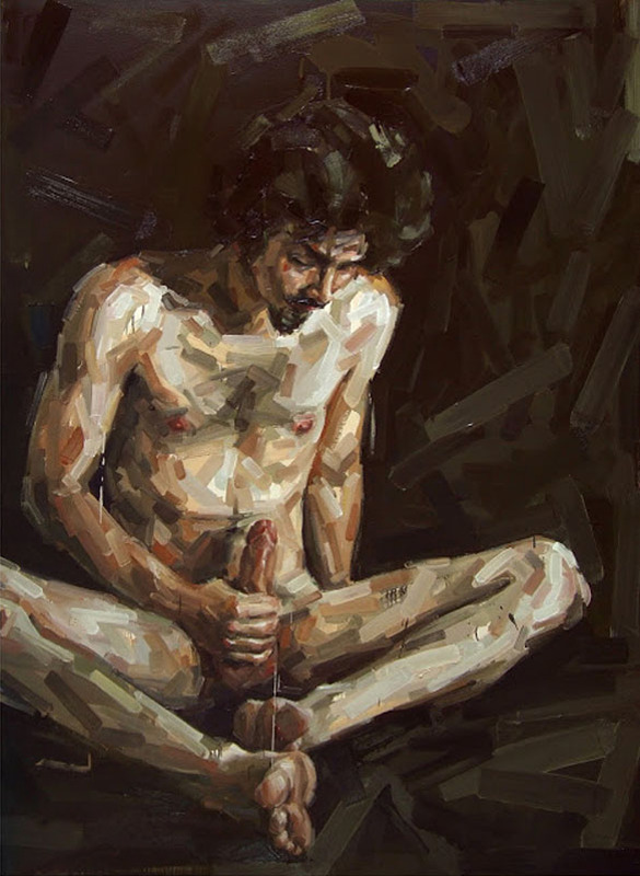
Fabio BaroliEsto és peor (de Cristo à Tepes) from Apropriações Textuais series (2008)

I’ve featured a Baroli painting once before even if I didn’t know to whom to attribute the work at the time. (It remains one of my favorite images I’ve ever posted.)

Even though most of the attention he receives is due largely in part to the erotic/transgressive work, he has produced a broad spectrum of work.

These images (here, here, here and here) pull together a sort of comic book style confrontation with Chuck Close pastiche.

In other works, there’s the unmistakable flavor of Degas.

The unifying thread with these various approaches is likely a simultaneous attraction to and revulsion from the simple, direct compositional dynamics of murals. For example, although Diego Rivera tends to pack as much detail in his frames as possible, if you focus on the way Rivera presents individuals distinctly within the visual milieu, you’ll recognize their echo in Baroli’s rendering of his subjects.

Honestly, I’m so enamored with his preoccupation with genitals and masturbation as motifs, that it’s difficult for me to step back and look at the work critically. If I do that, however, there’s some weird stuff going on. The linear application of paint–which often reminds me of band-aids, tends to remain broad and nebulous around the edges, become more refined as the shape of the subject is defined.

The use of layering and color is masterful. You can tell that the application is not just suggestive of an understanding of color theory, it’s a short of showing the seams of how painters achieve such sublime colors; however, the more bandage-esque suggestive of tonal accuracy fades when Baroli reaches the genitals of his figures. (Or, at least as far as penises go. His depictions of vulvas are really abstract.)

It’s clear that he is interested in the notion of the relationship between physicality and visual representation as well as sexual and individual identity. He’s obvious invested in fucking with those boundaries.

Also, there seems to be a certain perhaps reflexivity between his conception of genitalia and sexuality that could further perpetuate the sexualization of bodies. I’d wager he’s aware of this; and I see his preference for depicting erections as a likely effort to preempt such criticism. However, I’m not 100% convinced it succeeds.

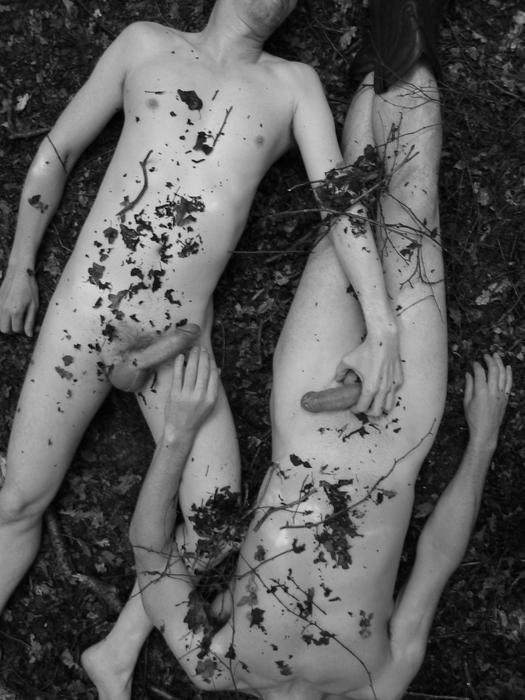
As much as a dig the emphasis of solidarity of experience over embodiment in

Sujeito da Transgressão #4, it feels as if it’s predicated on an implicit gender bias that doesn’t necessarily turn me off of the image but renders me uncomfortable because the work still very much turns me on–if that makes a lick of sense to anyone other than the voices in my head.

Source unknown – Title unknown (201X)

When an image is founded upon a solid idea, it’ll with stand a great deal in the way of poor execution without losing efficacy.

This is total #skinnyframebullshit and the production design was clearly meant to be Botticelli-esque but ends up looking half-assed. Further, even though equipment limitations probably resulted in both boys being decapitated by the frame and I’m guessing preserving anonymity was important, lopping off their heads is just ugly.

What I like is the intimacy of it even though it is very much in public. But what really flows like an electrical current through this image is the way they are both almost grasping each other. :::shivers:::

Eric PhillipsUntitled (2010)

As far as motifs go, decontextualized bodies in tinted bath water will forever remind me of Chloe Killip’s utterly breathtaking, Besher-esque typologies.

This image hails from a series called Washable Sins and three or four of the images wouldn’t have appeared out of place in Killip’s project–which is (I assure you) to pay Phillips’ work quite the compliment.

However, as much as I like this image–it’s a sterling example of how a dick pic can be classy in execution–my immediate association sends me in rather a different direction than Washable Sins; and if I’m honest, unfortunately, the sort of glossy homoeroticism Phillips work insists upon is neither as interesting or edifying as Killip’s precocious presentation.

(Also, if I’d only seen this image I’d be willing to give it the benefit of the doubt w/r/t whether or not it qualifies as #skinnyframebullshit; having seen the rest of the project, Phillips is a profligate skinnyframebullshiter.)

Source unknown – Title Unknown (date unknown)

This is meant to resemble the Pietà, a work–predominantly represented sculpturally–wherein the Virgin Mary cradles Jesus Christ’s crucified body.

In general, I’m not into religious art–it’s largely redundantly boring and although I realize the majority of it was conceptualized as a means of earning a living through the practice of one’s art while also encoding religious work with a humanist undertow.

Pietàs are a notable exception–there’s just something viscerally affecting about them.

It took seeing this image for me to realize why I dig Pietàs: art historically the aren’t exactly erotic in form of fashion but they are decidedly physical. Christ’s musculature assuming a taut not of will but driven by the pull of his body’s weight by gravity. The duality of the Virgin’s attention to both the emptiness of the vessel as well as the vessel itself.

If the Virgin did cradle her son’s body after he was taken down and before he was put into the tomb, he almost certainly would have been naked–after all  Mark 15:24 notes the soldiers guarding him gambled for possession of his garments.

With Pietàs there is always a feeling that the cloth in which Christ’s junk is shrouded, was a concession to the holy patrons that commissioned the works and less an interest of the artist.

So while I don’t think the above is well executed–I am entirely enamored with it as pushes the erotic undertow to the fore. (I think there’s a great deal of room to explore various erotic notions with this form: la petite mort, angel lust and any number of other coded references. (One of my favorite erotic Pietàs is by the incredibly talented Paula Aparicio.)

Further I think there’s a winking bit of blasphemy to this as Jesus–if he actually existed as a legitimate historical figure–was a 33 year old man with a 36 hour refractory period. Whereas, the gentleman pictured above is already risen again.

fotocrackertwo young men in bed (2015)

This is waaay overexposed–note the highlight at top center is indistinguishable from the white frame. Also, again–intermittently–along the upper right edge.

Same thing with the man kneeling on the bed–his skin is effectively three tones–shadow with no detail, overexposed with minimal detail and overexposed.

It’s a clumsy visual metaphor–shadow becoming light; probably due to the use of a high contrast Polaroid stock. (Although, I very much dig the mussed sheets being the only part of the frame with any trace of mid-tones–another visual metaphor and one that actually functions.),

As dynamic a sight as the the lad’s erection appears, I feel that the extreme contrast detracts from the enthralling composition. I mean ditch the painting on the brick wall and offer a more balanced exposure and this would be a world class photograph.

Which is not to say I don’t like it as it is–I’m just interested in the texture of the scene and the aesthetically wondrous hard-on and this prioritizes the latter over the former.

Nobuyoshi Araki Untitled (19XX)

After college, I moved to Greenpoint, Brooklyn. I’m not talking McGuinness & Nassau, either. We’re talking practically under the Kosciusko Bridge.

It was a 15 minute walk to the Nassau G and either 13 or 18 (depending on traffic) to the Graham L.

By New York standards, my room was enormous. But I shared a wall with a Dave Grohl wannabe sax player who constantly practiced atonal three note arpeggios at odd hours.

I was only working part time and after commutation expenses, it was a struggle to make rent each month.

At the time, my significant other was in a similar place. We spent a lot of time walking–which really and truly is the best way to get to know this city. We’d hang out at hip bars sipping a beer between us. Anything that was free and appealed to our mutual creative predispositions was a draw. But if you’ve spent any time in this city, you know it’s not a place you want to be poor.

It took us two months to discover the New York Public Library. Not the one with the Lion’s guarding the stairs but the one that’s caddy corner and a block down. Over the next few months, we spent hours there pouring over their photography section.

We scanned work the likes of Steiglitz, Friedlander and Goldin.

Thing was–and I swear I’m circling back to the image above, hang in there–the selection lacked any sort of breadth and instead focused on an obsessive depth. The number of fucking Araki’s books exceeded a plethora to the exponent of plethora.

I remember three things about the work:

  1. An image like this except with an orange and black flower with petals more like a daisy and Araki himself squatting beside the suspended model.
  2. It was the only thing besides Goldin where sexuality figured in any denotative fashion in the photos,
  3. I preferred Goldin even though I found her work exploitative.

My opinion w/r/t Goldin has evolved rather dramatically; my thinking w/r/t Araki has, yes, shifted but it’s less pronounced and far more complicated to explain.

See: on a purely formal level his work is on-point. His compositions are impeccably executed and his work is hugely influential: would Wolfgang Tillmans be a name anyone knew if Araki hadn’t shot highly styles hair and eyes? Probably not. (Also, the shit he shoots that subtly skewers skewers fake sets in high profile fashion shoots–looking at you, Tim Walker–are about as good as polemical provocations get.)

I can’t even really argue that Araki should pursue more aggressive edits. If he’s published it, it’s almost certainly publication worthy. My primary continued objection to his work (beyond the aggressive heteronormativity of it) has to do–synchronously enough–with an idea I encountered more or less concurrent with my first encounter with the work: William Ian Miller’s The Anatomy of Disgust. In it he attempts to analyze why humans experience feelings of disgust.

One of his points is that profusion is–almost counter-intuitively–a potential locus for disgust. I don’t completely recall the rational underlying this assertion but it absolutely serves in application to my queasiness regarding Araki: there’s too much that’s too good.

The thing that’s especially galling is the fact that almost seems to be the point of the exercise. And I’m no less sure how I feel about that now than I did eight years ago.

Sebastién GherrëFeña (2011)

If I have a weakness when it comes to image making, it’s audacity. Show me an image with the same couldn’t-give-a-fuck-less single-mindedness seen in that iconic image of Johnny Cash and I’ll be happier than a pig in shit.

The stumbling block with audacity is not unlike the problem with punk rock–the feral burst of righteous fury is usually usually at it’s best when it’s both absent discipline and especially clever.

Thing is: making good art requires at least some concerted discipline and cleverness is all too often willing to rest on its laurels which in turn predisposes cleverness to providing the impetus for a lot of bad art. [Consider a spectrum from clever (Andres Serrano) to smart-feigning cleverness (Arvida Byström) to smart (Laurence Philomene).]

With the above image, I adore the underlying idea: lotion as lube as foreshadowing of masturbatory ejaculation. Unfortunately, the execution–context eliminating close-up, unmotivated middle-of-the-road strobe and soft focus–is just fucking sloppy; detracting–woefully–from an otherwise promising image.

Source unknown – Title Unknown (201X)

I have objections to this–namely, the camera’s proximity to the action implicates it as a participant/not strictly an observer. The image would’ve been improved dramatically by moving backward say two feet. (Further, you know, DoF could’ve been a little more thoughtfully implemented and a series of unfortunate Photoshop decisions might’ve been avoided.)

Still, the image is super hot and not just because of the graphic penetration. (Also, it bears mention that I am super supportive of this as a depiction of safe sex that doesn’t come off as perfunctory, forced or trite.) I think it appeals to me because there’s enough context to suggest that this is a public environment. But something I’m realizing more and more about myself is depictions of sex that are salaciously focused on reproductive organs just do not do it for me. I want to see an effort to communicate physically the unsayable intensity of passion. Her the kiss is what sells the image and it in no small part reminds me of another equally arousing (though non-pornographic) photograph by Lina Scheynius.

Yesterday’s PornTitle unknown (2014)

Puritanical responses to nudity and/or sexuality are an enormous pet peeve of mine.

But I have a very special hatred setting reserved for failing to inquiring as to whether the pic was requested or consent was sought and received before it was sent and instead applying the default, knee-jerk response: no one wants to see that.

Um… saying no one wants to see peen is completely fucking untrue. What no one wants is seeing shitty picks that involved little thought beyond having a hard on and a camera nearby.

(Also, while we’re on the topic bear in mind saying no one wants to see that not only implicitly dictates (pun semi intended) an insanely narrow view of sexual propriety but is also hugely problematic as this is entirely disproportionate to the typical response when women who post nudes or have their nudes leaked face a staggering gambit of slut shaming, body shaming and myriads of other forms of harassment, not to mention threats and the long term consequences of losing employment or narrowing future options.)

With that in mind I present this as a sort of gold standard template of what a classy cock shot entail:

  1. A dick pic doesn’t have to be fine art but quality never hurts–this image is effective because it presents a decent tonal range between shadow and highlight while also featuring three distinct, effectively rendered textures, i.e. wall paper, sweater and skin. (Plus, the sweater adds a somewhat feminine note which juxtaposes well with the more phallological content.)
  2. Anytime a frame includes genitalia, the inclusion is already charged. Placing the genitals at the center of your frame isn’t just preaching to the choir, it’s screaming in their face while beating them around the head and shoulders. Here: the left hand directs the cock out of the center of the frame. This dodges the common trap of thinking images magically become 3D when others view them or worse the tendency of treating the aperture as little more than another fuckable orifice.
  3. Avoid the oh my god! look at how huge I am trope. This image is preoccupied with that but I am willing to overlook that due to the sublimation and also because the small triangular sheen of reflected light his corona makes my molars feel all itchy.
  4. Another great strategy is decontextualizing the dick or finding a way to present it in a more mundane and natural setting. This image isn’t concerned with that but this does both interestingly.

Thus before you send/post that shot ask yourself how does it compare to the above. If it pales in comparison, maybe think about hitting delete. If it’s on the same level or better, go forth and conquer.