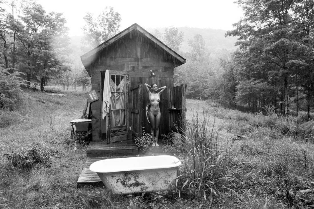
Stef-dPhylactere (2015)

I’m not 100% sure this works as a whole but the various parts are exquisite–the frame, pose, palate and background softened to the point of near delirious illegibility (it reminds me of David Carson’s packaging for // | /’s The Fragile pushed even closer to the brink of disintergration) are all goddamn effing stunning.

I say not 100% because the soft focus is not as consistent as I would prefer. For example: look at Phylactere’s left knee–the fuzziness dominating the rest of the frame seeps too far into the foreground–accentuating the digital post-processing and diminish the dream like colour-fete.

Also, compare the subtly of the separation between Phylactere’s back and hands compared to the rather obvious halo around her head.

Ultimately this is too good to merely serve as an effective proof of concept but not strong enough to stand up to scrutiny on its own.

Either way it’s an ingenious approach to shooting in a dull, over-obviously appointed as such studio space.

Tim BarberUntitled [rain/shower] feat. Kaya Wilkins (2013)

I’ve probably seen this image at least three dozen times but today is the first time I noticed that it’s raining.

A good part of why I’ve never noticed is that the most circulated version features compressed contrast and lower resolution.

As a result, I checked out Barber’s work and discovered that not only is it of an especially high quality, it’s also categorically interesting. He’s rigorous about formality of composition while showing a rare ability to make color vs. absence of color integral to the image.

Further there’s something about his work that transforms rather typical, nearly-prosaic scenes into something that feels autonomous, distinct and thoroughly singular.

The above image was included in a 2014 show at Capricious 88 in NYC’s SoHo.

In relations to that show, Barber claims:

I’m interested in the slippery
narratives that my photos can communicate, and a good narrative always
involves relationships of some kind […] Photographs can be so literal, but I’m
more interested in them as entry ways rather than finales; windows on a
wall, question marks. Another way to put that is I’m less interested in
what they are about then what they could be about.

And while I don’t think he has an especially good grasp of what narrativity actually entails, there is a strong sense that this image “could be about” a sort of Thoreauean search for existential vitality.

In the same breath, however, there’s an undercutting of that notion: the absurdity of showering in the rain; the out of order sign on the cabin–a sort of winking glance toward the ‘backwards-ness’ inherent in the proposition.

I could never abandon the hustle and bustle of big city life but there is a part of me that craves departures, ruptures and disjunctions with that life. Is it too much to want to stand naked on your front porch drinking coffee and staring off into the forest or to bathe in the falling rain?

Barbara NitkeBathroom Kiss from Kiss of Fire series (1995)

I have mixed feelings about Nitke.

Besides her stated aim of “find[ing] the humanity in marginal sex,” her work all features a clinically dispassionate eye.

This allows the viewer to bear witness to an awkwardly tender moment such as above. Her presentation of action as jarring, motion blur and off-kilter compositions have become endemic in the work of image makers interested in both fine art and BDSM documentation (I’m thinking here specifically of Aeric Meredith-Goujon and his ilk.)

What irks me is the insistence upon conceptual layering for the pornographic to receive art world credibility. It’s almost like for something to be deemed Capital-A Art, the pornographic has to be somehow mediated and/or commented upon by the work.

Let me give you an example: I’m beginning to consider (with some level of seriousness) pursuing a PhD in Art History. What I am interested in is studying the dichotomy between Art and Porn throughout history and then insofar as it can be reconciled suggest transgressive art as an art historical current seeking to point toward a synthesis between these two allegedly opposite poles.

Invariably when I’m talking to academics–trying to sort potential recommendations, seeking advice w/r/t receptive/non-prudish programs–invariably people ask me why I’m so interested in Jeff Koons or throw Noam Chomsky at me.

I detest Koons. And my favorite incident in Miriam Elia’s indispensible We Go To The Gallery relates to Koons–it’s the perfect take down of his vacuous work but it also serves as a damning critique of why the ‘art world’ tolerated his’ short-lived foray into porn with his Italian porn star partner.

(As far as Chomsky goes, I’m not even going to address it because people far more eloquent than I’ll ever be have already pointed out how it’s bullshit to code switch from critiquing capitalism to a feminist perspective without acknowledging the overarching shift in context. Chomsky’s is allowed to find porn distasteful; he’s not allowed to use his status as a notable (white, cishet male) Academic to attribute unassailable factual status to his own poorly considered concern fapping.)

I guess my point is simply: the subject of Art is inherently relateable to the human experience. Sexuality (or asexuality) is a facet of the human experience. Therefore it is well within the purview of Art to consider it.

I object to the pretense of bending the work into conceptual pretzel shapes to earn a distinct of being meritorious. I want more de Sades, Bellmers and Batailles; fewer Gaspar Noés.

Tor Larsson – Fifteen 15 (1974)

I have no idea what the story is with with these images. (I very much want to know more/everything about them–so if you know anything, please share.)

I have half a mind to use them a prophylaxis against Clark and McGinley’s youth and beauty. And, I mean–yes, the above photograph is #skinnyframebullshit and not especially technically accomplished, but, at least, it embraces what it’s ostensibly about contrasted with Clark and McGinley’s constant equivocation. It’s like I always feel with maybe not as much Clark but McGinley feels like this sort of fragile fairy tale that will wilt or collapse under too much scrutiny.

I mean… maybe it’s just me–after all I was raised in an insanely regressive Evangelical environment but the stories my non-Xtian friends tell about discovering their sexuality are a great deal less curated.

Everything about this feels if not authentic then perhaps at least grounded. There’s a playfulness that serves as a sort of lubricant against what would otherwise been an arousal killing gravitas. I love the way that her sticking her tongue out conveys both a mugging for the camera–which actually de-emphasizes the way her legs are spread for the camera to get an unobstructed view of her vulva; but it also teases the implication of oral sex. (Also, I really dig that you can see the reflection of the edge of the tub in her hippie glasses.)

I don’t know. Unlike Mcginley, these resonate with me not because of some sort of false nostalgia–a wish for an experience so rarefied it might as well not exist. Instead, it reminds me of dear friends who have told me about how your best friend was someone who not only knew you masturbated but would lay side by side without under the covers masturbating, racing to see which of you would orgasm first. (Contrary to my own experience where sex was dirty and solely for the purpose of procreation.)

Also, I really–in a way I cannot clearly articulate–respond to the woman in the shorts and shirt. The way she’s participating in the intimacy but not the physicality.

Arno Rafael MinkkinenSelf-portrait with Maija-Kaarina (1992)

Regardless of the discipline, I think anyone interested in pursuing the visual arts in an academic setting should be given a single sheet of paper printed on both sides.

The front would read:

Nobody tells this to people who are beginners, I
wish someone told me. All of us who do creative work, we get into it
because we have good taste. But there is this gap. For the first couple
years you make stuff, it’s just not that good. It’s trying to be good,
it has potential, but it’s not. But your taste, the thing that got you
into the game, is still killer. And your taste is why your work
disappoints you. A lot of people never get past this phase, they quit.
Most people I know who do interesting, creative work went through years
of this. We know our work doesn’t have this special thing that we want
it to have. We all go through this. And if you are just starting out or
you are still in this phase, you gotta know its normal and the most
important thing you can do is do a lot of work. Put yourself on a
deadline so that every week you will finish one story. It is only by
going through a volume of work that you will close that gap, and your
work will be as good as your ambitions. And I took longer to figure out
how to do this than anyone I’ve ever met. It’s gonna take awhile. It’s
normal to take awhile. You’ve just gotta fight your way through. –Ira Glass

The back would reprint the entirety of Minkkinen’s The Helsinki Bus Station Theory: Finding Your Own Vision in Photography.

Partly, I think it’s good form. Also, I feel like the assumption is made that the student wants to learn or they wouldn’t have enrolled in the course. But wanting to learn and having to learn are very different states–for example: as I approach middle-age I still want to learn to play the cello but when I was a toddler I didn’t so much want to learn to walk as I had no other choice.

Those who want to learn are a dime a dozen. The majority of them will become bored, will shirk the work or drop out.

But what academia does a shit job at is teaching you how to keep going when you don’t have a choice because to cease would be tantamount to death. Students are direly ill-prepared for those plateaus, brick walls and handfuls of hair pulled out frustrations that come part and parcel with practicing a craft.

I feel like leveling from the beginning–admitting it’s hard and dispirit but reminding folks that the process–no matter how wearying–is far more important than the product.

Or to put it another way: practice doesn’t make perfect. Only perfect practice makes perfect.

Hermann Försterling – [↑] Torso gebunden 2 (2007); [+} Nicki hinten (2007); [] Knie (2007)

I’m not sure these are necessarily good–Torso gebunden 2 is trying to round up a golden spiral. The others are thinly veiled attempts use the study of form as a strategy to sublimate an erotic fixation.

I’m not saying they are bad, either. More that they are interesting but I’m not entirely sure they work.

If these look a little different than your usual B&W images, then congratulations on your sharp eye. These are actually heliogravures AKA photogravures.

I’m not super adept with this process. As I recall you transfer the image from the emulsion onto a sheet of copper and then etch the copper, so the copper can be used to create prints. (This photo of Victor Hugo from Wikipedia is more or less what I’m accustomed to thinking of when I think of heliogravures.)

I do really like the texture in these. The water on the skin and the way the skin stretches and folds in on itself. And the consideration to render heliogravures was likely driven by a smallish negative or digital processes. However, given a 120 or 4×5 neg, I think a platinum print would’ve provided a more consistent tonal range that would’ve increased contrast and sharpened the resulting print.

Hell, if the originals were negs, gimme them along with some amidol, Bergger Prestige Variable CM Baryta paper in semi-matte finish, a bit of selenium toner, a bit of gold toner and a week of dark room time and I can make split grade prints that are objectively better than these.

Anastasiya Shevela. (2015)

According to the tags in the original post, this image was made with a sheet of 4×5 Kodak Ektachrome.

Long story short: Ektachrome ‘replaced’ Kodachrome. (The scare quotes are to respect the opinion that Kodachrome was without equal and irreplaceable.)

It’s a fine grain color positive (or slide) film. It was discontinued in 2013.

There’s no way of knowing when the sheet resulting in this photograph was exposed. It could’ve been in 2013, while the film was still ‘fresh’. If it was exposed this year–which would be my guess–it’s held up reasonably well. (There’s a blue shift due to the boat and a yellow shift in the skintone but both facets only contribute to a stronger image.)

I used a few rolls of Ektachrome before it was scrapped. I’ve never really cared for Kodak film stock–the T-Max grain structure irritates me and Tri-X has never been as smooth as the high end Ilford stocks to my eye. And I’ve had several interactions with Kodak as a company that have left a very bad taste in my mouth. But Ektachrome was solid. It never had the dazzling skin tone of Fuji’s Astia. (Now sadly also discontinued–but I do still have a small stockpile in my freezer.)

If you’ve never shot slide film you aren’t going to appreciate the nuance in this photograph. Unlike negative film–which has a sometimes a nearly five stop exposure range wherein you’ll get a ‘usable’ photo–slide film is unforgiving in the extreme.  Without perfectly even lighting, Fuji’s Provia 100 in medium format gives about ¾ of stop range; 35mm is ¼ a stop if you’re super lucky.

So, if it’s that much fussier to shoot slides as opposed to negs, why bother? Well, on the one hand, I’m a photographer who strongly dislikes the lemming-like obsession so many fashion/editorial/’fine art’ folks have with Kodak Portra. If you’re using a flash and/or have controlled lighting, you can do some interesting stuff with it. But it’s texture tends to be plastic-like and the colors skew a little too pastel for my taste. (I suspect so many people use it because it tends to provide a ‘flattering’ skin tone by default.)

The truth is: I only ever shot one negative stock which rendered what I would refer to as acceptable color fidelity–Afga’s Optima II. (I’m convinced it was better able to render grey scale in the shadow areas.) Alas, it was discontinued soon after I stumbled onto it.

The first time I shot slide film was the first time I was really even halfway on board with regard to color fidelity. So I continue to shoot it.

And I think what I’ve come to realize is slide film just renders color in a fashion closer to the way my eye sees color. For example, in the above image, it’s difficult to tell if the blue is bleeding out from the boat into the pebbles or if the pebbles were just close enough in color as to provide that illusion. A well exposed slide leaves that ambiguity. Just pop in down on a light table and you’ll see it one way or the other depending upon how you look at it.

With a negative, that distinction would be something that one would develop in printing. (And it would take a long time of futzing back and forth and printing a bunch of images that didn’t work.)

That’s why slide film appeals to me: if you shoot it and it looks like crap, there’s no fixing it. It’s not strictly WYSIWYG but it’s so close it may as well be. I appreciate it’s unforgiving nature. It forces me to think and then think again before I click the shutter.

Source unknown – Title unknown (201X)

Working on this blog for the last four years, the seed of an idea has taken root, grown. More and more, I am of a mind that there is something not unlike a visual grammar which applies to image making.

I’m not sure it’s fully formed enough of a notion at this point and I’m probably going to disavow what I’m about to bumbling attempt six months down the road but here goes:

I think when one looks at an image one does so with a question–whether conscious or not: what does this tell me?

In the case above, the image seems fixated upon itself as ‘pretty’. (The initial response to the question what does this tell me? is rarely more than a cursory, instinctive response–in other words, it’s acritical.)

What follows my own notion that this image is ‘pretty’ are questions about genre and form that occur in tandem. This is ostensibly a portrait. It’s presentation is very studio-esque; however, removed as it is from a studio, it is also a landscape.

This second point is heightened by the way the image emphasizes physical location in a manner similar to strategies codified by pictoralism, i.e. the off-balance composition and the way light is subtly sculpted–there’s likely a bounce board of some sort reflecting the light so it accentuates the model’s face.

At this juncture, I am inclined to ask why her shirt is unbuttoned. She’s sitting in the shade, so it’s not to get a tan. And of all people I understand the instinctive desire to be naked in nature; but her pose suggest she is about to nod off.

The Baby’s Breath she’s collected in a basket explains her presence–and also reminds me of John Everett Millais’ painting of Ophelia. Further, her outfit is strange. The turquoise of her skirt seems very modern and clashes with her blouse, which could–with a certain squint–strike one as provincial.

My own inclination is to look closer to make sure I’m not missing cues that might, if not rememdy, then better focus my questions. But there are no further answers and instead I begin to notice all the things that diminish this image’s overall quality: the way the bounce that’s directing such flattering light onto her face also is highlight the tangle of low hanging limbs over her left shoulder, the weird motion blur at her knees contributing a sense of tension which contradicts everything else in the image.

I walk away from viewing this with the idea that the image maker had something in mind more along the lines of the gorgeous work Owen Gray has made with Dolly Leigh but either failed to achieve it or (more likely) neglected to communicate the true impetus of the image to the model.