Laboring towards something you care about is–not in the usual sense but in maybe a spiritual one–entertaining
Anonymous
Laboring towards something you care about is–not in the usual sense but in maybe a spiritual one–entertaining
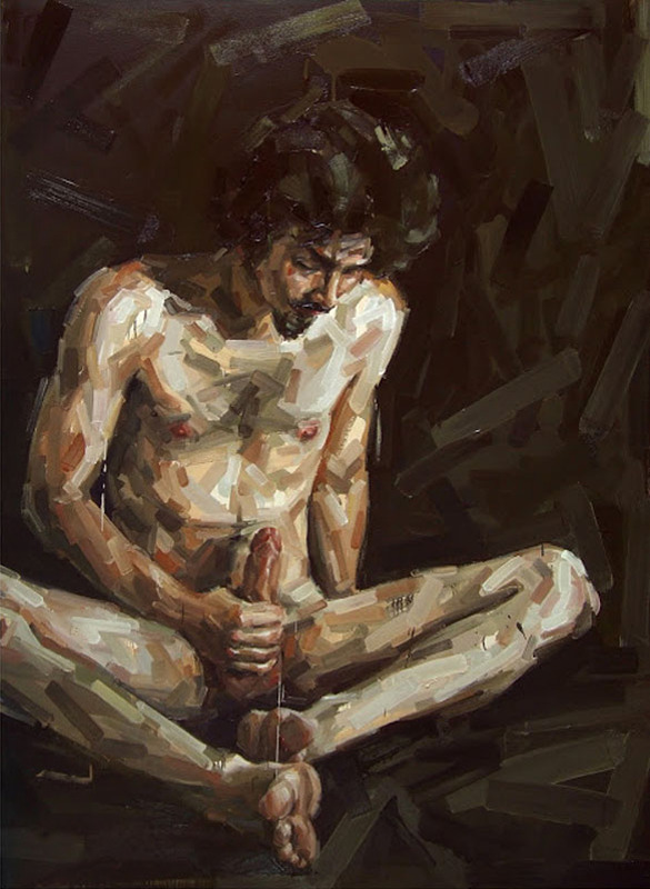
Fabio Baroli – Esto és peor (de Cristo à Tepes) from Apropriações Textuais series (2008)
I’ve featured a Baroli painting once before even if I didn’t know to whom to attribute the work at the time. (It remains one of my favorite images I’ve ever posted.)
Even though most of the attention he receives is due largely in part to the erotic/transgressive work, he has produced a broad spectrum of work.
These images (here, here, here and here) pull together a sort of comic book style confrontation with Chuck Close pastiche.
In other works, there’s the unmistakable flavor of Degas.
The unifying thread with these various approaches is likely a simultaneous attraction to and revulsion from the simple, direct compositional dynamics of murals. For example, although Diego Rivera tends to pack as much detail in his frames as possible, if you focus on the way Rivera presents individuals distinctly within the visual milieu, you’ll recognize their echo in Baroli’s rendering of his subjects.
Honestly, I’m so enamored with his preoccupation with genitals and masturbation as motifs, that it’s difficult for me to step back and look at the work critically. If I do that, however, there’s some weird stuff going on. The linear application of paint–which often reminds me of band-aids, tends to remain broad and nebulous around the edges, become more refined as the shape of the subject is defined.
The use of layering and color is masterful. You can tell that the application is not just suggestive of an understanding of color theory, it’s a short of showing the seams of how painters achieve such sublime colors; however, the more bandage-esque suggestive of tonal accuracy fades when Baroli reaches the genitals of his figures. (Or, at least as far as penises go. His depictions of vulvas are really abstract.)
It’s clear that he is interested in the notion of the relationship between physicality and visual representation as well as sexual and individual identity. He’s obvious invested in fucking with those boundaries.
Also, there seems to be a certain perhaps reflexivity between his conception of genitalia and sexuality that could further perpetuate the sexualization of bodies. I’d wager he’s aware of this; and I see his preference for depicting erections as a likely effort to preempt such criticism. However, I’m not 100% convinced it succeeds.
As much as a dig the emphasis of solidarity of experience over embodiment in
Sujeito da Transgressão #4, it feels as if it’s predicated on an implicit gender bias that doesn’t necessarily turn me off of the image but renders me uncomfortable because the work still very much turns me on–if that makes a lick of sense to anyone other than the voices in my head.
I can’t think my way into this; I have to just respond.
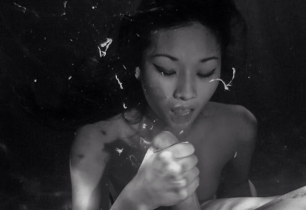
Source unknown – Title Unknown (XXXX)
I’ve mentioned a few times already about my interested in the potential for depicting ejaculation in a fine art context.
A sharp eyed follower pointed out that I was completely off base with my initial post. The shot is underwater. Something I can’t believe I overlooked. (Apologies for the fuck up.)
Usual ejaculation is presented with a slow-ish shutter speed. Something like 1/60 of a second in a video. Maybe slower under poor light for a DSLR still This creates a sense of ejaculation as a continuous stream.
The shutter speed here is much faster–1/2000 of a second or faster would be my guess. Notice how it changes from a single string to something closer to a shotgun-esque discharge. It looks less like liquid and closer to scratches on negatives or smoke.
Further, I’m reasonable sure this isn’t post processed. The tones and shadows would be very difficult to match and you can see the shadows created by globules of semen caught in the strobe.
I think my favorite part of this image is although you can’t tell whether it’s an up or downstroke, her white knuckles and the force she’s exerting are clearly visible.

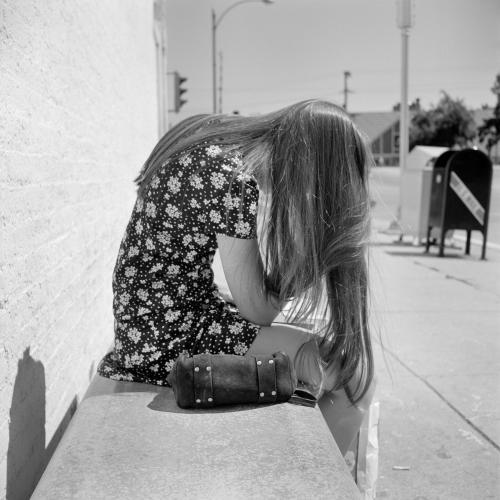
Colby Kern – More from table manners (2015)
Kern telegraphs his familiarity with Nan Goldin and Araki too much for my taste. (There’s some Ryan McGinley in there as well, which would at least be more in keeping with the work.)
It’s unfortunate because there are a couple of things his work does that turns out to be more interesting–at least to me–than the work he’s referencing.
For example: he has no qualms depicting graphic nudity. Yet, when sexual overtones emerge in the images, he always either partially or completely obscures his subjects genitals. Frequently, the frame edges or someone else provide assistance in such obscuring. It comes across as very nearly playful–which is why I think McGinley is perhaps the better reference to pursue given only the three aforementioned photographers.
I think this image is especially interesting because of the triangulation. The image maker is a participant in the image–he may not be casting that dark shadow on the lower table but with the guy looking at his hand covering the boys groin and the boy making eyes at the camera, the circular table cycles the eye continually around the frame. (I do think there should have been a third cup or no cups, however.)
Lastly, although I can’t figure out exactly how to explain it–I feel like there’s some genderfuckery at play in this. The boy stretched out on the table is both clearly masculine but the pose and the way he’s flirting with the camera are something one would typically see in fashion editorials target straight white cismen. Yet the placement of the blocking hand does more than anything to activate a sort of suggestion of androgyny. (Yes, if you follow the implication far enough–I’m pretty sure it turns out to be a problematic depiction. But it’s a sentimental image and when fine art folks eschew sentiment it’s not so much that sentiment in itself is bad; more the tendency to respond out of habit instead of thoughtfully. (It’s the same reason poets are told to avoid cliches, really.)
Vivian Maier – Untitled (1971)
Finding Vivian Maier isn’t just enthralling, it’s an exceptionally well-orchestrated documentary that is crucial viewing for anyone who is passionate about photography. (If you haven’t seen it already, please do.)
After watching it I was left with a number of questions: was Maier perhaps on the autism spectrum? To what extent is her work improved by Maloof’s posthumous curation? How did this woman who was–by all accounts absolutely awful at dealing with other people–produces such luminous and humane images?
But this image makes me drop those questions in favor of an imaginative flight of fancy:
A year before this image of was made, William Eggleston captured an image of a very similar looking young woman. Recently, Bryan Schumaat produced an image clearly intended to mirror Eggleston’s but that draws Maier’s image into more intimate dialogue with the other two.
It’s clearly not the same person–just a reflection of similar trends in fashion, similar predilections in image makers. (Although the same woman never aging and being photographed throughout the ages would make a wonderful premise for a sci-fi/fantasy story, no?)
I recently received a comment from an anon claiming that I was entirely too ‘self-satisfied’ considering the effect of prevailing intellectual trends in forming my notions. Generally, I do my damnedest not to feed trolls. And in spite of the fact that the fair response would’ve been have you bothered to read anything I’ve written? I’m pretty upfront about the deleterious effect of academnification on my brain. I call myself on it regularly.
I think less the question and more the statement these images make–whether they meant to or not–about the objective limits of originality in creative expression. Meaning and understanding function as a result of convention, after all.

P magazine with kara neko : ph erica shires
styling : heather newberger
h/m : amanda wilson
Pushed with enough force, out of all the photographers who consistently blow me the hell away with their vision and craft, I’d name Erica Shires the most consistent and thoroughly exceptional contemporary photographer.
On some level it’s a result of her technical chops–from wet plates to digital she knows various processes fluently enough to use each to pristine effect.
Yet, underlying even that is the interplay between her use of color and her incisive eye for photographing women.
It’s a fact you can take to the bank: no one in the world shoots Johanna Stickland anything like Shires. There’s an unfeigned stillness, an objectless/subjectless presence in the moment–like the pause in the storm where for a split second the surface of the water appears as a darkened windowpane.
It’s taken me a while to pick up on it but virtually everyone Shires chooses to shoot, the resulting images present something entirely distinct.
Kara has commented repeatedly that no one has ever understood her quite like photographer Jonathan Waiter. (And really, you need look no further than those images to be certain of the accuracy of the statement.) Yet, in the above images there is something uncharacteristically light about Kara’s mein. Something allowing her to walk effortlessly on the tightrope between her intensely focused, fiercely sophisticated and confident modeling persona and something uncomplicated, skirting joyfulness and abutting playfulness.
I’m abstracting. Let me attempt to be concrete. Kara is elegant, statuesque and grave in so much of her work. Yet, she also clearly enjoys herself (consider this image of her with rapper El-P). In these there seems less opposition between her ‘modeling persona’ and her unselfconscious performance of identity.
There’s more I could say but I feel like I’m rambling a little like an idiot. So moving right along: there another reason I posted this.
You know how I’m always talking about editing? Well, I wanted to illustrate what I mean.
First, given only this contact sheet which images do you think are the most effective?
Now, the answer is going to depend on a host of things. This appears to have been for an editorial. So, you’d need to consider the taste/aesthetic of the publication. I’m not privy to any of those things–I’m just going by things like composition, context and the dynamics of what the frame conveys.
The benefit here is that from the standpoint of exposure–the images are crazy uniform. (Like, seriously: my own shit is nowhere close to this consistent…) Thus you can pretty much choose to use any of the shoots.
My edit would be: Column 1 Row 4, Column 2 Row 1 & Column 3 Row 4.
Why? Well, Column 1 Row 1, Column 4 Row 3 & 4 are vertically oriented. This is one of the reasons I’m always screaming about #skinnyframebullshit–not how on the contact sheet given the orientation with which the contact sheet is presented, these shots are actually impossible to read without flipping the sheet so that it matches their orientation. (For the record I did flip them and I just don’t find these images as compelling. In the last two, it’s difficult to understand why anyone in that level of undress or not would be bending over the fence in that manner; it just seems awkward to me & while Column 1 Row 1 is a good image, it lacks the dynamism of other shots.)
Column 1 Row 2 and Column 1 Row 3 would have worked if you split the difference. The position of Kara’s arms is better in the C1R3, the position of her head is better in C1R2.
C2R2-4 increasingly diminish context and position Kara an increasingly abstracted landscape. The sense of audacity and spectacle is lessened.
C3R2 would’ve been the second best of the bunch but the hilltop house directly behind Kara’s head and the fact that even though it’s out of focus in the distance her eye line leads right into it and my eye sort of gets stuck there as a result. C3R1 and C3R3 have the same problems as C2R2-4.
C4R1 has something similar in mind to C3R2 but the less steep angle of the hillside is nowhere near as compelling. (This is the rare time I’d ever say closer is better but in this case it would’ve also blocked out that little bit of the house you can see in the background.)
C4R2 might’ve worked wider but as it is I’m not really sure what the hell is going on.
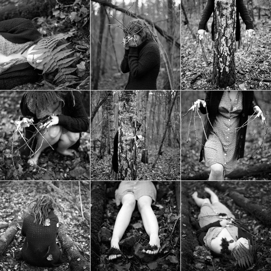
Marit Beer – [↖] woodchild III (2013); [↑] Title unknown (2013); [↗] \ (2014); [←] wald (2013); [+] woodchild IV (2013); [→] Title Unknown (2013); [↙] wald (2013); [↓] woodchild (2013); [↘] wald (2013)
Goddamn but if Beer’s work isn’t just breathtakingly fucking fantastic (and illustrative of the point that if you’re interested in making B&W images, you absolutely have no business whatsoever doing so digitally).
I’m especially enamored with these photos because although you can explore the far ranging influence of Francesca Woodman on them, what they showed me almost immediately is what I loathe about Laura Makabresku’s work–namely the loose consensus on the purpose that dreams serve is that they process or digest the surfeit of stimulus our minds absorb. Both Beer and Makabresku are interested in oneric scenes. Yet whereas Makabresku emphasizes the contrivance of her mise-en-scene with diptychs and animals, Beer improvises using readily available materials.
By contrast, the emotive response Makabresku seeks to elicit from her audience never escapes the fact that it’s call and response transaction-ness; Beer’s photos are closer to open ended questions.
In other words, there’s a presentation of all the authentic elements of a nightmarish fever dream. But it’s a surrealism that requires imagination arising from sustained energy and engagement. Makabresku wants merely to run up and kick the viewer in the shins before running off to gloat at her ability to make the audience feel something.
Beer’s work is excellent all around and IMHO you’d do well to check it out.
The relationship I have with my phone, I would like to have with a book.

So, this happened…
During any normal week of mine, this would be the absolute highlight. However, last week–sans returning from Europe where I wanted more than anything to stay–was an exceptional week.
camdamage didn’t just follow out of the blue. I was lucky enough to get to shoot with her while she was in NYC. She was–of course–a delight: charming and witty; she made me feel immediately at ease and comfortable (this being my first shoot with someone I haven’t known for years).
Bottom line: it was a fun day and if a few of the images manage to turn out despite my clumsy bumblings, I suspect you’re all in for a treat.
We now return to your regularly scheduled programming already in progress…
