

[↑] Dominic Sena + Bojan Bazelli – Frame from Kalifornia (1993); [↓] Source unknown – Title unknown (20XX)
“Less is more.”
–Ludwig Mies van der Rohe (after Robert Browning’s poem The Faultless Painter).
[↑] Dominic Sena + Bojan Bazelli – Frame from Kalifornia (1993); [↓] Source unknown – Title unknown (20XX)
–Ludwig Mies van der Rohe (after Robert Browning’s poem The Faultless Painter).
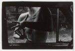
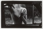

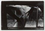
Agresívne prsty IV, II, I, III [from top to bottom] (1987)
The intended order of these images is constructed around how far the window is rolled up.
Those of you who’ve grown up entirely in the age of power windows are probably less familiar with those old manual monstrosities that one had to roll up by hand. You’ve also probably not fought with bitter siblings trying to lock you out of said vehicle by rapidly rolling up the window. If you put just enough weight on the window, the clutch or whatever it is that raises the window will slip and the window inches further open–this can be all you need to force your way into the vehicle.
…
Honestly, I prefer this ordering of the photos. Ignoring how far the window is rolled up, note how in this presentation the framing tracks from right to left across the four frames. It renders a set of images that would otherwise be inextricably entangled with a Repulsion-era Polanski-esque psychosexual paranoia into something more ambiguous/nuanced, a sort of meditation on movement, gesture and memory in the stream of space-time.
Top notch curating right here.

The Eye of Lamar – Beneath It All (2015)
As far as focal length goes, this is hell of wide–I mean the door way is bulging due to barrel distortion meaning were probably (given a 35mm equivalency) at around 16mm.
Normally, I’m a detractor from ultra-wide angle but here I’m rethinking my objection–at least in the case of this image. I mean the warping grows more noticeable toward the outside edges but since the illumination falls off, the vaguely parenthetical bulging of the door frame diminishes the effect of a frame within a frame.
I’m not sure that the two objects (it looks like a counter and a wall decoration of some sort) were meant to show up. That they do is kind of providential as it serves to balance the frame left-to-right in a way that probably wouldn’t have been as compelling with them.
The distinction between pornography and Art is functionally
indistinguishable from the question of the role of suspension of
disbelief in instances of exceptional storytelling.

Source unknown – Title unknown (201X)
In general, I dislike close-ups. Yes, the can serve a purpose but sadly we’ve all but lost the work ethic and attention to detail/nuance/context in contemporary image making.
Close-ups in porn tend to be even worse–the reduction of physical intimacy to acontextual intersections of genitalia.
There’s something different about this, however. Yes, it’s #skinnyframebullshit–no, the framing is not logically coextensive with the notion of leaving some things to inference. But, between the way the flush in her cheeks shifts her skin tone toward the shade of her lips, the way her mascara-ed lashes highlight her fixation on the way she is experiencing sans boundary the body of another being is fascinating.
To me there’s a palpable sense of awe in a moment of unrestrained fulfillment of experiential curiosity. This resonates on a primal level with my first experience of sexually exploring a lover–and that’s something that’s super rare for me to encounter in porn; thus, when I do see it, I make a point of celebrating it.
This is lovely and hot as fuck. And if it fails as art, there is something intrinsic to it that has the potential to become the subject of artistic expression.
Emil Schildt – Sille (2005)
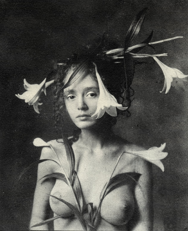
I am like 97% sure this photograph is a riff on a Renaissance painting since it’s triggering all sorts of drunkenly-wandering-the-Uffizi flashbacks.
Unfortunately, I can’t seem to lay hands on my notebook from then and Google is being less than helpful. (Of course, Google-ing Renaissance painting lillies likely isn’t the most inspired criteria.)
But even if I can’t produce the exact reference I need, I can at least show my work as far as what’s driving my instinct on this one. Consider da Vinci’s Annunciation and portrait of Ginerva de Benci. The curled forelocks and expression in the latter match, even if de Benci is haughty and Sille is merely aloof. In the former it’s both the lilies in the mid-ground and the openness of the composition. (I’m not sure if I’m making this up or if it actually holds true but it seems that the difference between Florentine and Venetian has to do with how crowded the painting is.)
Sille occupies only slight more than 50% of the total space of the frame. It just looks like more–again, similar to da Vinci’s The Last Supper (which you never remember with that much architectural negative space).
And there’s also the smoky inconsistencies in the background texture as a result of Schildt’s use of the Bromoil Process, which is not inconsistent with da Vinci’s refinement of the sfumato technique.
Also, for a real treat check out Schildt’s occasional color work–a little too self-consciously fashion editorial-esque for me but the cutthroat rendering of color is some next level shit.

CAH – Cam Damage (2015)
camdamage is an artist. Full fucking stop.
I mean she’s disarmingly pretty and if she’s taken a bad picture, I either missed it or have lost track amidst her steady stream of effing stellar work.
Still, I feel like commenting on her appearance misses more than half the point. It’s like Jon Stewart’s on fleek insight into the media response to Caitlyn Jenner’s transition: Caitlyn when you were a man we could talk about your athleticism, your business acumen…now you’re a woman and your looks are the only thing we care about.
What makes her beautiful is more than just her appearance. If you follow her–which if you don’t then real talk you are abso-fucking-lutely doing Tumblr wrong–you know she is a wickedly intelligent and kind individual, with a sarcasm setting that isn’t just a louder 10 but goes all the way to 11.
At risk of using a meaningless cliche, she’s down-to-earth. Not in that she makes an effort to be some with whom everyone can relate– but that she presents herself as someone who tries really hard but fails what feels like far too many times to justify the investment of time and painstaking effort. She stumbles, admits them, gets back up and tries to roll that giant fucking rock up ye olde hill of impossible climbing once again.
Her work to grow and evolve as an individual, her courage and uncompromising determination shine through in her work in a way for which I know of no precedent with which to compare it.
The saying goes: talent hits the target no one else can; genius hits a target no one else can see.
By that token, Cam’s work signals her as a genius.
(Oh, and this picture is stunning: the vague vignetting effect of the strobe and the way it casts just enough of a shadow to cause her to pop from the background. The skin tone is both natural and gorgeously accentuates muscle tone. The unraveling braids, armband tattoo and perfectly executed eye light are all artifacts of high-end glossy fashion editorial methods in service of presenting something closer to a candid portrait. Just goddamn fucking killer!)

Ying Ji – Prisoner of Childhood (2013)
Clichés are such because they manage to articulate the sense of an otherwise difficult concept with simplicity.
It’s become a cliche to explain cinema in terms of dreams. It is absolutely true that cinema leans heavily upon the grammar of dreaming: locations shift in the blink of an eye, time passes seemingly unmarked–you can even have dreams with in dreams (dream sequences).
In fact, I remember reading an essay as an undergrad which repeatedly referred to the fact that the screen in a cinema sweats. In that same essay, the writer commented on how it was either Godard or Dalí, who noted that the audience even approaches cinema in much the same was as they approach dreams: by descending into the darkened theater and staring upward at the flickering images.
If they are so effective at communicating a complicated idea in a simple fashion, why then are writers so aggressively admonished against their use? Well, to employ a ready cliché: there’s more than one way to skin a cat. In other words, only looking at a complex notion from one angle predisposes the interrogator to seeing said complex notion in only one way.
That’s where I think understanding cinema as founded open a language that closely parallels dreams serves, but at a cost.
The question that best illustrates the problem is: who is dreaming? One character, each and every characters, the audience, all of the above? However, we frequently see the dreamer in the dream and when was the last time you saw yourself in a dream. (And in dreams mirrors do not function normally.)
We term dreamlike elements in cinema oneiric. However, that ignores the previous question and reduces the surreal or fantastic to subconscious phantasm.
I don’t have an answer to the questions I’ve raised. I just know that with forms like establishing shot, shot reverse shot… we’ve slowly moved away from an unconscious awareness of a single, discrete perspective monitoring the action to this sort of quantum deity that is capable of being everywhere all at once. This is decidedly not how dreams function–even when you die and manage to stay in your dream, your perspective remains constant until you inhabit another body.
This is one of the reasons I am so totally enamored with Tarkovsky. His perspective is infallibly consistent–with the exception of Ivan’s Childhood and that ever so-slight frame rate ramp in Mirror.
There’s also Parajanov. Whose Color of Pomegranates is beyond dispute as one of the all-time greatest masterpieces of the cinema. It’s not just that I suspect that the objects by the woman’s feet are pomegranates, Ji’s work is certainly less compositionally formal but there is absolutely an overlap in the use of symbolism, as well as the carefully crafted perspective.
Also, although I haven’t studied Parajanov as extensively as other filmmakers–honestly, I find his pastoral musicals unwatchable–I somehow feel that Ji’s clumsily earnest but surprisingly unselfconscious and thoughtful artist’s statement would’ve appealed to him.
If nothing else, her ability to talk about what she is doing with her work and what her work actually represents show a great deal more alignment than most artist’s her age.

Jean-Luc Vertut – Apparition (2015)
If you browse Vertut’s portfolio with any attention, you’ll notice that beyond his preoccupation with the nudes-in-landscape motif this image feels different than his previous work.
Were I a betting man, I’d wager he’s been gorging on benoitp‘s work. Certainly, not a bad thing–and although I appreciate the straightfowardness of this image over Paile’s endless barrage of hallucinogenic visual fugue-states–I’m just not sure that the flash here is strategic enough or appropriately in harmony with the scene to serve. I love the idea and I think sans the strobe it might’ve worked; with it, however, what was clearly intended as a grace note, cacophonously muddles things.

René Groebli – Untitled from The Eye of Love series (1953)
Lately, I’ve been pondering darkness.
I know, I know… sounds like rejected Celtic Frost
lyrics; but seriously, another of the many unsavory side effects of the
shift from photography/cinematography to digital imaging is the
redefinition of how low-light scenes are represented.
Overlooking
the immense differences between analog and digital, Hollywood has
established an expectation for how things look at night that whether one
realizes it or not, is irreducibly stylized.
I
get asked all the time by folks to recommend cameras to fit a litany of
expectations which almost always center on a low price point and a
prodigious ability to handle low-light situations. People who aren’t
steeped in the technology seem to expect that there’s a camera out there
that’ll render your concert shots and exterior street at night scenes
as if they were Blade Runner
deleted scenes (overlooking that Blade Runner had arguably the best
production design in the history of cinema combined with the fact that
it was shot by Jordan Cronenweth, i.e. one of the all-time great cinematographers.
Working in low light is a challenge. Unless you’re Stanley Kubrick–who famously adapted f0.7 lenses made by Zeiss for NASA to shoot scenes in Barry Lyndon
with only candles for illumination–the recourse was to just let things
go too dark (I’m thinking here of the all but illegible evening walks
in Akerman’s otherwise masterful Jeanne Dielman, 23 Quai du Commerce, 1080 Bruxelles and the most naturalistic representation of low-light cinematography Kiarostami’s–arguably the greatest living filmmaker–Where is the Friend’s Home?)
At
a certain point, certain (largely European) filmmakers started flooding
night scenes with ambient blue light (likely a way of rendering the day-for-night tradition more visually palatable)–I first remember noticing this in del Toro’s Mimic but Besson’s La Femme Nikita
preceded that and as anyone who has followed the latter’s career, you
know he’s incapable of formulating an original idea (although, at least
he tends to steal from the best).
Then along comes digital with
it’s fundamentally less shallow depth of field which in combination with
the theoretical impossibility of it ever rendering even half the
dynamic range of black that the human eye can read. The tendency has
been to invert things and to, when working digitally, treat white as you
would black when shooting analog. (Orange is the New Black does this super obviously.)
Then
there’s also color grading to consider. Toward the end of the analog
era, what came out of the camera was not even close to what made it onto
the screen. Lighting was modified with magic windows, color graded,
etc.
That’s still done today. But that thing that’s different is
that digital cinematographers aim for an in camera image that is
essentially flat. When you export it, it looks bleached–like one of
those Tumblr’s that adds a soft grunge tag to everything. Subsequently,
the footage is graded. Contrast is add, color is resaturated.
Anyway,
I was thinking what I was going to say about this image last night and
even though I swore I wasn’t going to keep watching it after last
seasons bullshit finale, I was watching the 3rd season premiere of NBC’s
Hannibal–a show that I consider frequently reprehensible but features the best production design
in the history of television. (The digital cinematography is also
astute even if I strenuously disagree on a philosophical level with the
excess with which it resorts to glossy close-up inserts; I’m more in
line with Aaron Morton’s work on Orphan Black
and his precocious consistency with regard to scale and the resulting
compellingly believable three dimensionality of space in his scenes.)
While
I think the artifice from which the darkness in Hannibal’s visuals
emerge befits the ostentatious amorality the show goes to such great
length to foster, I can’t help but wonder what it’d be like if it were
as willing to go real and truly dark like the above image instead of
amending its tenebrism as a post-production filter.
