mrchill:

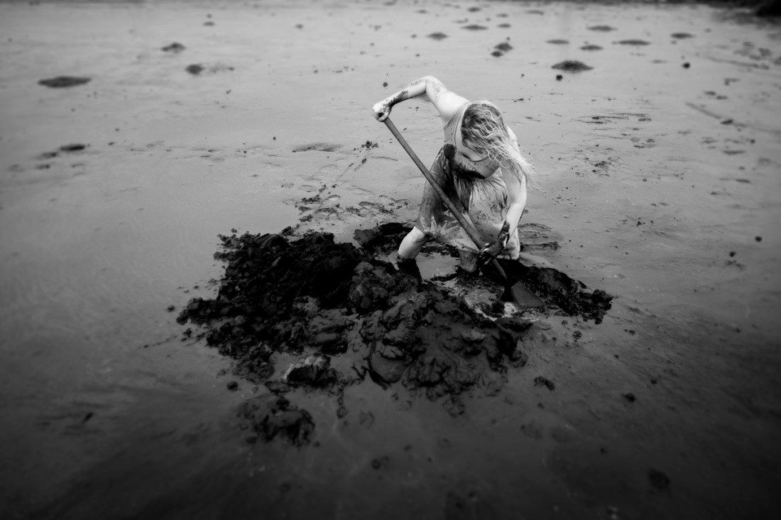
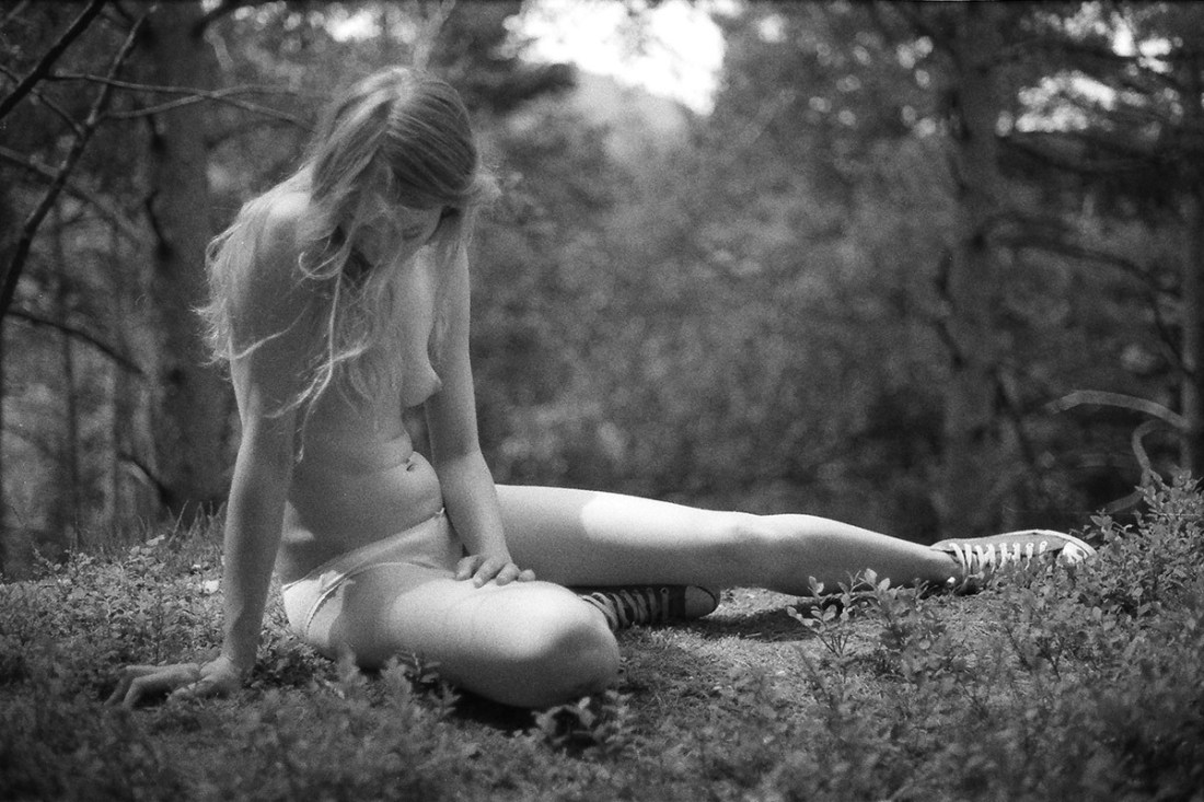
Pierrine, waiting in the woods
Canon AE1 & Kodak TRI-X 400
(expired film from 1969, found on a flea market)

© Chill
tumblr · portfolio · facebook

I’m a fan of Chill’s work. So much so that a bit over a year ago, I interviewed him.

He continues to do breathtaking things with color. (This recent image is not only one of my favorite of his, it’s an exceptional example of color as intrinsic to both composition and legibility of the image.)

But I wanted to take a minute to draw special attention to the above image. Consider the parenthetical note about how this image was made on 46 year old analogue film. Looks good, no? A bit grainy but Tri-X has always been super grainy. (I dig how the focus is ever so slightly behind Pierrine. Lovely.)

Here’s the thing: even expired B&W film renders better results than digital. Yeah, yeah. You can get ‘passable’ B&W if your camera allows you to shoot in monochrome natively–if you are shooting in color and then desturating in post, it’s my humble opinion you have no business anywhere near B&W.

The reason B&W film will always be the only way of shooting monochrome is simply this: digital’s Achilles’ heel is that it lacks the depth of black that analog provides. Film renders a depth of black exceeding what can be read by the human eye. But, operating off what the human eye can interpret, given the existing digital frame work, the math is something on a scale of given 0-255 as a range of black, you’d need a theoretical bit depth of 256 to get you to within spitting distance of what the human eye sees. Digital flat out wont scale to anywhere near that level… (And for the record, I realize I’m playing fast and loose with science here; this example is intended to be descriptive not empirical.)

marason:

Sögur/Stories

Sigurður Mar HalldórssonUntitled from Sögur/Stories series (2015)

This reminds me of one of my favorite scenes in one of the best TV shows of all time: Breaking Bad.

There’s something primal about the struggle of bone, sinew and skin trying to excavate the landscape. It’s mysterious, edgy and the amount of exertion required to make any progress is damn near monumental. (I think all of these reasons feed into the trope of characters digging their own grave under the watchful eye of a menacing captor–you really can’t approach the violence done to the earth without a mixture of literally morbid curiosity and dread.

Visually, this is a dynamic image. There’s a sense of heft and twist and flex of the physical motion conveyed in the pose. The mud streaked skin and fabric as well as the earth that has been cast aside all indicate this is only the beginning of a grueling task.

Insofar as the image is logically suggestive of a time that there was not a hole in the location, the present moment where a hole is perhaps beginning to yawn (more on that in a bit) and a point in the future when their will be a deep hole, it is flirting with narrativity. However, without an indication of the purpose for the hole, it only fits itself to the structure of narrative.

I will concede that there’s a fairly good chance this image is intended to reference an Icelandic Saga with which I am sadly unfamiliar. (The fact that it appears her shovel is currently empty and also that she is standing in the hole she is digging up to her shins in water leads me to this thought.)

However, whether or not it is supposed to refer to a widely known story, the fact that it the purpose of the hole is left so ambiguous, is actually very disappointing. I can’t really fully level the criticism I want here because I don’t know where the image was headed–although it seems very confident in itself. (Rightly so, for the most part.) Consider though how–and these are all cheesy cliche suggestions–the image would improve for the edge of a treasure chest in frame or the legs of a dead body.

In fact, as I think there’s something of an edgier tone and I get an amorphous feeling that the woman in this frame might very well have thinly veiled self-destructive motivations, a composite of her digging and then her body laying on the ground would’ve proved breathtaking in its simplicity and clarity.

foldingsoulsSelf Portraits (2015)

Back when I was a film student, I recall reading about an argument between an auteur (it may have been Buñuel) and a cinematographer. The cinematographer took issue with the fact that they were shooting on an iconic street using more or less the same frame as at least seven previous films. The auteur responded: yes, but this is the first time I’m shooting it.

Minimal body scapes with white sheets/walls are a dime a dozen on Tumblr. Which is precisely what makes these so freaking compelling: they take a tired conceit and with simple, specificity transcend the easy trappings of cliche and remind the viewer of the freedom limitation can bestow when approached with a humble, patient eye.

Loreal PrystajUntitled from Byrdcliffe series (2014)

There’s a fucking shit ton of image makers producing work with a sort of super high contrast, post-urban decay nightmarish feel.

Unfortunately, as appealing as any one of those facets are in and of themselves, taken together they almost always signify shitty work attempting to glorify style over content.

Prystaj appears to have discovered a means of making what should be an archetypal aesthetic and fuses it with a rigorously formal approach to composition.

Consider the above: the position of the subject is utterly perfect–curves balanced against the rectilinearity of the room and an awareness of the weight and ghost-like forms of shadow and light.

Normally, I’d be inclined to dock points for the 2-3 degree up tilt of the camera. A lesser image maker would’ve down this as a new jerk way of goosing the viewer into attributing a greater dynamic fluidity to the upward stretch/downward pull of the model. However, note how the tilt actually pulls additional angular symmetry between the light pouring into the room via the doorway and windows, the angle of the open door and most importantly the way the spill bouncing off the curtains and rising up towards the unseen ceiling echoes the angle of the falling direct light.

Harry GruyaertTitle Unknown (1966)

My dalliances with photography began out of a certain degree of misdirection.

Long story short: I took a film-making course in college to see if I could successfully complete a film that was (by some miracle) not unwatchable. Next I knew: I was a film-making kid.

Initially, my interest was directing. However, increasingly, I gravitated towards the cinematography side of things. (If you’ve ever questioned why I am so vehemently anti-digital, I learned both platforms side-by-side and was thus able to experience first hand the possibilities/limitations of either–digital is just awful if/when analog is an option.)

The reason I ended up shooting still images was less my being proactive due to the cost of shooting 24 frames per second on film and truthfully more to do with the fact that I have an outsize problem with authority and I repeatedly ran afoul of The Powers That Be™ in my film program/institution.

Cut off from access to school equipment, I purchased a Nikon 8008s and a circa 1960s Nikkor 50mm f1.4 lens.

I mention all of this to illustrate a point. Yes, I have absolutely benefited from an albeit short-lived but thoroughly academic indoctrination to so-called fine art photography. But that arrived subsequent to a period of autodidactic exploration.

Often folks find my ideas and approach to be heavily skewed in favor of underground/outsider work. Such is not a rebellion against my late-in-the-day academnification (or not only that); I spent those first two or three years trying to find stuff I thought was cool on Flickr.

The flip side of that background is there are still large swaths of historically significant photographers that I know seriously fuck all about.

I’d never heard of Gruyaert until early this week. His work is effing stunnning. I could follow the thread of his work down the line to Storm Thorgerson and Monika Bulaj; but, what I feel is more interesting is to compare his work–entirely contemporaneous with William Eggleston’s first divergences in color.

As fond as I am of Eggleston, I realized–and this is entirely in keeping with a theory I have regarding Eggleston; namely he was a Balthus level pervert (and pervert is a word like ‘slut’ that I think needs to be reclaimed already) who never managed to figure out how to make peace with who he was–his work fetishizes color; his dye transfer prints are fetish objects.

Gruyaert, on the other hand, uses color to abstract, highlight shape and/or form.

As great as the work is, it seemed like something I’d never get to showcase here. Then this afternoon I stumbled on the above image. It was featured in a showcase of 14 Magnum Photographers explaining what image of their own making proved to be the A-ha! moment that propelled them to the next level.

Here’s Gruyaert on the above image:

In 1966, I was losing my girlfriend, to her new lover. So, I decided
to make a movie about her and him, hoping that, when she would see the
result, she would understand how much I loved her. Filming her, I was
able to create distance. I became less vulnerable. I understood her and
myself better. I was able to let her go.This became an important thing
in my photography, to be less there and more there at the same time.

Source unknown – Title Unknown (XXXX)

I’ve mentioned a few times already about my interested in the potential for depicting ejaculation in a fine art context.

A sharp eyed follower pointed out that I was completely off base with my initial post. The shot is underwater. Something I can’t believe I overlooked. (Apologies for the fuck up.)

Usual ejaculation is presented with a slow-ish shutter speed. Something like 1/60 of a second in a video. Maybe slower under poor light for a DSLR still This creates a sense of ejaculation as a continuous stream.

The shutter speed here is much faster–1/2000 of a second or faster would be my guess. Notice how it changes from a single string to something closer to a shotgun-esque discharge. It looks less like liquid and closer to scratches on negatives or smoke.

Further, I’m reasonable sure this isn’t post processed. The tones and shadows would be very difficult to match and you can see the shadows created by globules of semen caught in the strobe.

I think my favorite part of this image is although you can’t tell whether it’s an up or downstroke, her white knuckles and the force she’s exerting are clearly visible.

Vivian MaierUntitled (1971)

Finding Vivian Maier isn’t just enthralling, it’s an exceptionally well-orchestrated documentary that is crucial viewing for anyone who is passionate about photography. (If you haven’t seen it already, please do.)

After watching it I was left with a number of questions: was Maier perhaps on the autism spectrum? To what extent is her work improved by Maloof’s posthumous curation? How did this woman who was–by all accounts absolutely awful at dealing with other people–produces such luminous and humane images?

But this image makes me drop those questions in favor of an imaginative flight of fancy:

A year before this image of was made, William Eggleston captured an image of a very similar looking young woman. Recently, Bryan Schumaat produced an image clearly intended to mirror Eggleston’s but that draws Maier’s image into more intimate dialogue with the other two.

It’s clearly not the same person–just a reflection of similar trends in fashion, similar predilections in image makers. (Although the same woman never aging and being photographed throughout the ages would make a wonderful premise for a sci-fi/fantasy story, no?)

I recently received a comment from an anon claiming that I was entirely too ‘self-satisfied’ considering the effect of prevailing intellectual trends in forming my notions. Generally, I do my damnedest not to feed trolls. And in spite of the fact that the fair response would’ve been have you bothered to read anything I’ve written? I’m pretty upfront about the deleterious effect of academnification on my brain. I call myself on it regularly.

I think less the question and more the statement these images make–whether they meant to or not–about the objective limits of originality in creative expression. Meaning and understanding function as a result of convention, after all.

Marit Beer – [↖] woodchild III (2013); [↑] Title unknown (2013); [↗] \ (2014); [←] wald (2013); [+] woodchild IV (2013); [→] Title Unknown (2013); [↙] wald (2013); [] woodchild (2013); [↘] wald (2013)

Goddamn but if Beer’s work isn’t just breathtakingly fucking fantastic (and illustrative of the point that if you’re interested in making B&W images, you absolutely have no business whatsoever doing so digitally).

I’m especially enamored with these photos because although you can explore the far ranging influence of Francesca Woodman on them, what they showed me almost immediately is what I loathe about Laura Makabresku’s work–namely the loose consensus on the purpose that dreams serve is that they process or digest the surfeit of stimulus our minds absorb. Both Beer and Makabresku are interested in oneric scenes. Yet whereas Makabresku emphasizes the contrivance of her mise-en-scene with diptychs and animals, Beer improvises using readily available materials.

By contrast, the emotive response Makabresku seeks to elicit from her audience never escapes the fact that it’s call and response transaction-ness; Beer’s photos are closer to open ended questions.

In other words, there’s a presentation of all the authentic elements of a nightmarish fever dream. But it’s a surrealism that requires imagination arising from sustained energy and engagement. Makabresku wants merely to run up and kick the viewer in the shins before running off to gloat at her ability to make the audience feel something.

Beer’s work is excellent all around and IMHO you’d do well to check it out.

Daniel RampullaKa’imina’auno (2014)

I’m on the fence regarding whether or not this is #skinnyframebullshit. The upward thrust of the elbow and the downward pull of the arm in tandem with the strong high-to-low angle of the light certainly establishes a dynamic tension.

I’d give it a pass except for the fact that I think the primary consideration in choosing vertical orientation was as a means of isolating the subject against the improvised background–which appears to be a flannel sheet. Therefore I’m inclined to think the composition echoes the subject out of necessity more than consideration toward a unified reading by the viewer. Namely, I can’t tell if the figure is supposed to be lonely–in which case a wider, empty frame would’ve communicated that point better as in this claustrophobic frame there is a way in which the scant distance between the subject and the background, the light and muscle definition appear tangled up in some notion of physical proximity and embrace. It’s not that it doesn’t work with the image, it’s just that it muddles things given the statue-esque icon insistence of the given perspective.

All things being equal though, I do like this. I feel like there are strong parallels with Patrick Gomme’s work–something I very much want to like but for which I suffer a greater and opposite distaste. (It’s not that Gomme is insincere, so much as the aestheticization of insincerity seems to be the point of the exercise.)

By constract, Rampulla is entirely earnest–maybe even clumsily so.