Gabriel Amano – Title Unknown (2015)
“Art does not exit on a material, but a spiritual level. It rests within us instead of upon a canvas or marble. Seeing art is more than an optical projection; it is a psychological process.” –Paul Klee
Gabriel Amano – Title Unknown (2015)
“Art does not exit on a material, but a spiritual level. It rests within us instead of upon a canvas or marble. Seeing art is more than an optical projection; it is a psychological process.” –Paul Klee
Source unknown – Title unknown (201X)
“Control the head: control the body.” –Martial Arts Proverb

Source unknown – Title unknown (XXXX)
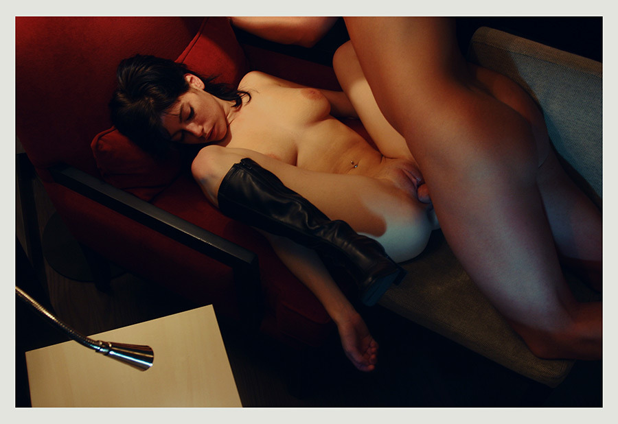
The feels this image instigates are hell of conflicting.
Technically, it’s rubbish (#skinnyframebullshit-ery, bizzare vignette-ish blurring and the fact that the image maker assumes a shared cis-male heteronormativity from his audience–suggested by not only the depilated vulva but the fact that the camera’s perspective is slightly elevated and looking down on this young woman.)
Further, I do not enjoy anal play–although I admittedly dabble with it on roughly the same schedule as blue moons occur.
Two things about it appeal to me: First, I appreciate how the intensity of her experience undermines the hegemony of the male gaze; in other words, it’s very difficult to read the dildo here as even an implicit ersatz cock; instead, this is very much a document of–what in my limited experience–appears to be an entirely unfeigned response to physical stimulus. Second, this reminds me of the first time I apprehensively explored my self in a similar fashion.
EDIT: an awesome follower steered me in the direction of what is at least a better quality (if not the original) version of this image.

Sergey Chilikov – From Old Samara cycle (2003)
Two days before departing to Europe, Igor Mukhin posted a digital copy of the flier for a show on at the Schilit Publishing Gallery in Amsterdam.
Of course I had to go–although saying the gallery is in Amsterdam is only true on a technicality. It’s nearly in the suburbs and getting there was interesting on a number of fronts not the least of which was I had to make a private appointment because the gallery hours did not match up with my extremely limited availability during my time in Amsterdam.
From what I gathered, Schilit Publishing is a husband and wife team who work out of their home–which serves as the gallery. This was the first show in which work was displayed throughout the entire house and thus the Russian House exhibition title.
In at least half a dozen ways, I was doomed to dig it. There’s some facet of Russian and Eastern European work that just instinctively appeals to my sensibilities. And really the quality of the work on display was excellent. (I don’t think the work necessarily sat next to other work especially well and I’d aggressively dispute several of the curatorial decisions guiding the installation, but that’s a different story.)
The disappointment turned out to be Mukhin’s work–and it wasn’t a disappointment. (The man is a fucking genius or rare proportions.) It’s just that the focus was more his early street photography and less on his more recent fixation on the transgressiveness of Moscow’s youth culture.) His early work bears an unexpected and EXTREMELY pronounced Cartier-Bresson inflection. (I don’t necessarily consider that a good thing, mind you.) But it’s interesting to see the fight between his instincts of what makes a good image and his exacting approach to form.
But this post is ostensibly about Chilikov–who I was only passingly familiar with before this visit–his prints were just gorgeous. His compositions tend to be chaotic, but he uses the color as a means of parsing the image for the viewer to more easily understand.
For example: here, the attention to skintone and the hint of green in the fence and the very careful rendering of red in the background diminish the mess in the mid-ground.

Akif Hakan Celebi – Raven (2015)
Although I’m not head-over-heals for Celebi’s work as a whole, I am in love with his rigorously consistent use of scale.
Yes. He uses different focal length lenses but across them the relationship between the amount of space occupied by the subject vs. their environment remains virtually identical.
I recognize that as an insanely subjective claim–any scale that compliments what the photographer is trying to achieve is acceptable in the end. However, I think Celebi present an ideal balance between the subject as focal point of the composition while presenting a contextually comprehensive cross-section of their environment.
My feeling this way likely stems from my background in cinematography. Given that in almost every image, if the character we’re not posed towards the camera and maintaining eye contact this could be a still from a narrative film. (Although I’ll grant that not many films these days would utilize a shot this wide for anything more than an establishing shot.)

[19.07.14] Bedroom #05/ quatre48.com
Plume Heters-Tannenbaum – Bedroom #05 (2014)
Normally, I try to space out posts from a single artist instead of packing them into a thick clot. I am making an exception for Quatre48 because I’ve been returning to this series with unusual frequency in the last three weeks.
I still maintain there’s a desperate need for more strenuous editing. Yet, these images trade in a palpable immediacy; and while you certainly can’t argue any sort of inconsistency in that theme across the entire series, what gets muddled in the presentation is their unusual perspective and carefully cultivated artfulness.
What I mean by the former is that the perspective of the images is definitively female. We have what I can only presume are self-portraits–so there’s the explicit photographer documenting her sexuality but even without knowing that there’s an implicit non-normative (w/r/t to stereotypical presentations in porn) gaze.
I can’t help but comparing the aesthetic to Aeric Meredith-Goujon, only these manage to intrigue and fascinate while Goujon–honestly–creeps me the fuck out.
Anyway, the point I’m getting at is that I can’t decide if this is an exception that proves a rule or if perhaps it is possible to produce something intended to be porn that is also simultaneously art–because this accomplishes exactly that.

Teknari – Untitled (2015)
I think most ‘curated’ Tumblrs are like gifs? Pshaw!
I mean there is something undeniably obnoxious about a grid layout on a infinite scrolling blogs filled with gifs.
However, I think there’s an insane amount of potential for creativity within the format–like Vine’s that don’t suck or something.
I’m super not enamored with all Teknari’s work–too much of it is Jenny-Holzer-joins-a-Burzum-cover-band–but as far as someone who is actively exploring the outer boundaries of what gifs can accomplish, he is pretty much the bleeding edge.
I love the minimalism of this–it’s not one of those where there’s only a factional movement that makes you question whether it’s a still image or not. But scrolling through my dash, the movement is timed in such a way that I scroll back because I wonder if you saw it right.


Hunny Bummy – Comfort Zone (2015)
These images are presented as a diptych even though they do not function as one.
They’re solid; neither composition holds up under scrutiny–the left appears symmetrical until you look at it a second time and discover it’s really not and that the positioning of he arms is actually makes it even more glaring; the wawkerjawed-ness of the second one is even more obvious but here the position of the arms actually de-emphasizes it ever so slightly.
Either way, together they round up to good because of the thoughtful use of color.
What’s interesting about the relationship between them not being diptypical (hurr durr) is that they imply a continuum between concept and execution.
The left image is simple, clear, the color pops and as a result it’s absolutely memorable. The right image uses negative space to draw entirely undue attention to the use of color–it’s like screaming hey, everyone look at how great I am at using color. However, the slight shift in the position of the arms on the right is utterly fucking sublime. (Also, you get water drops splattered on the side of the tub highlighted by the light pooling on the side of the tub.)
Split the difference in the distance between the left and right, make sure you line up the lines of the tile grout with your frame edge and include just a hint of the bathroom floor and keep the pose on the right and you’d have a great image.

Reverend Bobby Anger – Kyotocat (2015)
[A] face which inspires fear or delight (the object of fear or delight), is not on that account its cause, but–one might say–its target.
–Ludwig Wittgenstein Philosophical Investigations § 476


[↑] Michael Dweck – Natalie on the rocks from The End: Montauk, NY (2004); [↓] Pedro Ivan Serralva – River (2015)
Juxtaposition as commentary.
