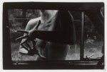
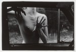
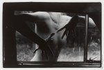
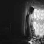
Ján Krížik – 

Agresívne prsty IV, II, I, III [from top to bottom] (1987)

The intended order of these images is constructed around how far the window is rolled up.

Those of you who’ve grown up entirely in the age of power windows are probably less familiar with those old manual monstrosities that one had to roll up by hand. You’ve also probably not fought with bitter siblings trying to lock you out of said vehicle by rapidly rolling up the window. If you put just enough weight on the window, the clutch or whatever it is that raises the window will slip and the window inches further open–this can be all you need to force your way into the vehicle.

Honestly, I prefer this ordering of the photos. Ignoring how far the window is rolled up, note how in this presentation the framing tracks from right to left across the four frames. It renders a set of images that would otherwise be inextricably entangled with a Repulsion-era Polanski-esque psychosexual paranoia into something more ambiguous/nuanced, a sort of meditation on movement, gesture and memory in the stream of space-time.

Top notch curating right here.

Emil SchildtSille (2005)

I am like 97% sure this photograph is a riff on a Renaissance painting since it’s triggering all sorts of drunkenly-wandering-the-Uffizi flashbacks.

Unfortunately, I can’t seem to lay hands on my notebook from then and Google is being less than helpful. (Of course, Google-ing Renaissance painting lillies likely isn’t the most inspired criteria.)

But even if I can’t produce the exact reference I need, I can at least show my work as far as what’s driving my instinct on this one. Consider da Vinci’s Annunciation and portrait of Ginerva de Benci. The curled forelocks and expression in the latter match, even if de Benci is haughty and Sille is merely aloof. In the former it’s both the lilies in the mid-ground and the openness of the composition. (I’m not sure if I’m making this up or if it actually holds true but it seems that the difference between Florentine and Venetian has to do with how crowded the painting is.)

Sille occupies only slight more than 50% of the total space of the frame. It just looks like more–again, similar to da Vinci’s The Last Supper (which you never remember with that much architectural negative space).

And there’s also the smoky inconsistencies in the background texture as a result of Schildt’s use of the Bromoil Process, which is not inconsistent with da Vinci’s refinement of the sfumato technique.

Also, for a real treat check out Schildt’s occasional color work–a little too self-consciously fashion editorial-esque for me but the cutthroat rendering of color is some next level shit.

Jean-Luc VertutApparition (2015)

If you browse Vertut’s portfolio with any attention, you’ll notice that beyond his preoccupation with the nudes-in-landscape motif this image feels different than his previous work.

Were I a betting man, I’d wager he’s been gorging on benoitp‘s work. Certainly, not a bad thing–and although I appreciate the straightfowardness of this image over Paile’s endless barrage of hallucinogenic visual fugue-states–I’m just not sure that the flash here is strategic enough or appropriately in harmony with the scene to serve. I love the idea and I think sans the strobe it might’ve worked; with it, however, what was clearly intended as a grace note, cacophonously muddles things.

René GroebliUntitled from The Eye of Love series (1953)

Lately, I’ve been pondering darkness.

I know, I know… sounds like rejected Celtic Frost
lyrics; but seriously, another of the many unsavory side effects of the
shift from photography/cinematography to digital imaging is the
redefinition of how low-light scenes are represented.

Overlooking
the immense differences between analog and digital, Hollywood has
established an expectation for how things look at night that whether one
realizes it or not, is irreducibly stylized.

I
get asked all the time by folks to recommend cameras to fit a litany of
expectations which almost always center on a low price point and a
prodigious ability to handle low-light situations. People who aren’t
steeped in the technology seem to expect that there’s a camera out there
that’ll render your concert shots and exterior street at night scenes
as if they were Blade Runner
deleted scenes (overlooking that Blade Runner had arguably the best
production design in the history of cinema combined with the fact that
it was shot by Jordan Cronenweth, i.e. one of the all-time great cinematographers.

Working in low light is a challenge. Unless you’re Stanley Kubrick–who famously adapted f0.7 lenses made by Zeiss for NASA to shoot scenes in Barry Lyndon
with only candles for illumination–the recourse was to just let things
go too dark (I’m thinking here of the all but illegible evening walks
in Akerman’s otherwise masterful Jeanne Dielman, 23 Quai du Commerce, 1080 Bruxelles and the most naturalistic representation of low-light cinematography Kiarostami’s–arguably the greatest living filmmaker–Where is the Friend’s Home?)

At
a certain point, certain (largely European) filmmakers started flooding
night scenes with ambient blue light (likely a way of rendering the day-for-night tradition more visually palatable)–I first remember noticing this in del Toro’s Mimic but Besson’s La Femme Nikita
preceded that and as anyone who has followed the latter’s career, you
know he’s incapable of formulating an original idea (although, at least
he tends to steal from the best).

Then along comes digital with
it’s fundamentally less shallow depth of field which in combination with
the theoretical impossibility of it ever rendering even half the
dynamic range of black that the human eye can read. The tendency has
been to invert things and to, when working digitally, treat white as you
would black when shooting analog. (Orange is the New Black does this super obviously.)

Then
there’s also color grading to consider. Toward the end of the analog
era, what came out of the camera was not even close to what made it onto
the screen. Lighting was modified with magic windows, color graded,
etc.

That’s still done today. But that thing that’s different is
that digital cinematographers aim for an in camera image that is
essentially flat. When you export it, it looks bleached–like one of
those Tumblr’s that adds a soft grunge tag to everything. Subsequently,
the footage is graded. Contrast is add, color is resaturated.

Anyway,
I was thinking what I was going to say about this image last night and
even though I swore I wasn’t going to keep watching it after last
seasons bullshit finale, I was watching the 3rd season premiere of NBC’s
Hannibal–a show that I consider frequently reprehensible but features the best production design
in the history of television. (The digital cinematography is also
astute even if I strenuously disagree on a philosophical level with the
excess with which it resorts to glossy close-up inserts; I’m more in
line with Aaron Morton’s work on Orphan Black
and his precocious consistency with regard to scale and the resulting
compellingly believable three dimensionality of space in his scenes.)

While
I think the artifice from which the darkness in Hannibal’s visuals
emerge befits the ostentatious amorality the show goes to such great
length to foster, I can’t help but wonder what it’d be like if it were
as willing to go real and truly dark like the above image instead of
amending its tenebrism as a post-production filter.

Andre-OUntitled (2013)

I’m usually super skittish when it comes to images which amputate, decapitate or otherwise maim bodies in the imposition of a frame on a scene.

What makes me uncomfortable is the history of using the frame to decontextualize. A body in space becomes disembodied by way of what is included vs what is excluded. You have a veritable litany of images wherein bodies are essentialized to a metonymy–where a part becomes an objective referent intended to represent the whole.

My eyes practically bleed from the repetition of images wherein the autonomy of the subject is de-emphasized as a result of the simple fact that his/her/zir is rendered immobile by the removal of feet, legs.

I admit amputation isn’t always dehumanizing/violent; however, I consider an image that manages it is the exception that proves the rule. (Decapitation is. Always. Do not cut your subjects head off at the neck. Ever. There are literally ten thousand other (more creative ways) to preserve anonymity.)

This image doesn’t bother me. In fact, I’m rather fond of it–surprising given how fucking irredeemably terrible the rest of the image makers work is.

What makes me okay with this image–I think–is the relationship of her right knee to the lower left frame edge in tandem with the fact that she is leaning into the focal plane with her left shoulder and her head is counter balancing away from the camera. (Here I’m okay with the partial decapitation because it fits logically within the composition. Further, the exaggerated lulling of her head is more than a little reminiscent of this study of Bernini’s masterpiece Ecstasy of Saint Teresa.)

I’m doubtful she’s actually masturbating but unlike many other O-faced imagistic insinuations of similar ilk, the dynamics of motion are consistent enough that she could be.

Bo Widerberg – Frame from Love 65 (1965)

I wish I was better able to speak to this image. Specifically it’s composition–which appears like on of those perfectly inspired moments where the resulting photograph reads as devoid of any sort of rehearsal, premeditation or artfulness.

The truth is there is an abundance of all the aforementioned traits (not the alignment of the eyepiece with the angle of the baseboards, the whiteness of the black sweatered arms focusing the lens contrasted with the grey scale of the woman, the angle of the floorboards.

I haven’t seen this film–I’m not sure it’s even available. However, based upon this one frame I would wager that a prevalent theme is the challenge of sharing the world an artist sees through their mind’s eyes with another.

Also, I can’t look at this and not think of the initial sequence in Kieślowski‘s The Double Life of Veronique where Weronika is laying upside down on her bed staring at the expanse of the star filled night sky through a glass orb, which inverts and magnifies everything.

Source unknown – Title unknown (200X)

Make no mistake, from the standpoint of technique this image is inexcusably inept as far as execution goes–there’s neither rhyme nor reason to the composition (the slight leftward cant in combination with the proximity of the camera to the wall distracts from the action by emphasizing the visual clutter of the curtains, TV and radiator) and the focus is most likely set to infinity and as such the foreground goes a bit too soft.

For all its fumbling, the image does succeed–if I you can call it that–in several small but notable ways:

  1. It’s firmly grounded in an ephemeral moment, i.e. this couple in this room with a view of the winter landscape through the windows;
  2. Despite the idiocy of the composition, there is a sense of acknowledged and subsequently subverted voyeurism, i.e. it feels less like the couple is photographing themselves and more as if there a several other people in the room watching the events unfold and this image just happened to be snapped by the person closest to the action;
  3. The couple is clearly more interested in what’s happening between them than the fact that they have an audience, i.e. her focus on how the movements of her hand are affecting his arousal, the way he’s touching her shoulder in a manner that is both romantically possessive and simultaneously a plea not to stop what she’s doing to him. (Also, you gotta love the way his ass is clenched and the sloppy grins on both their faces.)

Source unknown – Title Unknown (date unknown)

This is meant to resemble the Pietà, a work–predominantly represented sculpturally–wherein the Virgin Mary cradles Jesus Christ’s crucified body.

In general, I’m not into religious art–it’s largely redundantly boring and although I realize the majority of it was conceptualized as a means of earning a living through the practice of one’s art while also encoding religious work with a humanist undertow.

Pietàs are a notable exception–there’s just something viscerally affecting about them.

It took seeing this image for me to realize why I dig Pietàs: art historically the aren’t exactly erotic in form of fashion but they are decidedly physical. Christ’s musculature assuming a taut not of will but driven by the pull of his body’s weight by gravity. The duality of the Virgin’s attention to both the emptiness of the vessel as well as the vessel itself.

If the Virgin did cradle her son’s body after he was taken down and before he was put into the tomb, he almost certainly would have been naked–after all  Mark 15:24 notes the soldiers guarding him gambled for possession of his garments.

With Pietàs there is always a feeling that the cloth in which Christ’s junk is shrouded, was a concession to the holy patrons that commissioned the works and less an interest of the artist.

So while I don’t think the above is well executed–I am entirely enamored with it as pushes the erotic undertow to the fore. (I think there’s a great deal of room to explore various erotic notions with this form: la petite mort, angel lust and any number of other coded references. (One of my favorite erotic Pietàs is by the incredibly talented Paula Aparicio.)

Further I think there’s a winking bit of blasphemy to this as Jesus–if he actually existed as a legitimate historical figure–was a 33 year old man with a 36 hour refractory period. Whereas, the gentleman pictured above is already risen again.

Magdalena WosinskaLA, CA (201X)

Quite frankly, there’s a lot of entirely unmotivated nudity in so-called fine art photography. (Not to hate on nekkid folks–after all, I’m a fan.)

You hear a lot of talk about not wanting to have images tied to a particular historical epoch. Or, it’s insinuated that there’s some nebulous narrative impetus. (Only in both cases, those justifications are more get out of jail free card since the work to which they are applied barely/rarely supports them.)

That’s what I am in love with about Wosinska’s work: nudity in her work reads like it’s motivated by the same compulsion behind Walt Whitman’s sentiments early in Song of Myself:

The atmosphere is not a perfume, it has no taste of the
    distillation, it is odorless,
It is for my mouth forever, I am in love with it,
I will go to the bank by the wood and become undisguised
    and naked,
I am mad for it to be in contact with me.

Patricio SuarezDesiree Film Scans (2015)

The list of photographers whose work I’ll unreservedly endorse is short. Today, it got one photographer longer: Patricio Suarez.

I’m not even sure where to start. I mean, the quality of the work speaks for itself.

My customary fetish for extreme quality takes a back seat here next to how strongly these images resonate with me. It’s totally knee jerk, but the compositional logic is more than a little reminiscent of Mark Romanek–and that’s not a reference I toss around lightly.

As someone who came to photography via cinematography, there’s a tendency in my experience for photographers to treat locations as more of aesthetic enhancement or simple back drop than a facet in a holistic image.

Thus, what really blows me right the fuck a-fucking-way is the way Suarez creates portraits anchored in the relationship between person and personal occupancy of space–location informs character, character informs location.

(It’s not at all surprising that Suarez’s day job is a commercial director of photography.)

His images of Nettie Harris are jaw dropping in their Nettie-ness. Short of ericashires, no one shoots Johanna Stickland in so unmediated and present-in-the-moment a manner. And Kelsey Dylan… bring my smelling salts because I’m feeling faint…

All-around fucking fantastic.