Dylanne Leefoundation (2015)

This is essentially monochromatic as everything from the skin tone to the dark red of the wall in shadow at frame right is hanging out in red’s third of the color wheel.

It’s interesting because I’m not entirely sold on the composition. Yes, it functions and has a mostly consistent logic to it. And as much as I’m of a mindset that unless your camera shoots in native B&W whether analog or digital, that no one has any business ever using desaturate to create B&W images, this would actually work as a grayscale image (with only some minimal contrast tweaks).

That begs the question of whether or not color is essential to the image? On an objective level, I would argue it isn’t. However, within the context of Dylanne Lee’s work–who FTR isn’t one person it’s a image making duo from Mexico City–the only thing that consistently defines the work is it’s interest in instilling stolid scenes with a sort of inertia as potential for momentum instead of absence of it.

By that expression, the color makes sense. (And I think someone more fluent with color theory than I am could probably to the imagistic equivalent of diagramming a sentence to demonstrate how the color activates a dynamism that would read as more contemplative in B&W.)

I suspect this may be film. If so, it would benefit enormously from a dye-transfer print, IMO.

quatre48:

[19.07.14] Bedroom #05/ quatre48.com

Plume Heters-TannenbaumBedroom #05 (2014)

Normally, I try to space out posts from a single artist instead of packing them into a thick clot. I am making an exception for Quatre48 because I’ve been returning to this series with unusual frequency in the last three weeks.

I still maintain there’s a desperate need for more strenuous editing. Yet, these images trade in a palpable immediacy; and while you certainly can’t argue any sort of inconsistency in that theme across the entire series, what gets muddled in the presentation is their unusual perspective and carefully cultivated artfulness.

What I mean by the former is that the perspective of the images is definitively female. We have what I can only presume are self-portraits–so there’s the explicit photographer documenting her sexuality but even without knowing that there’s an implicit non-normative (w/r/t to stereotypical presentations in porn) gaze.

I can’t help but comparing the aesthetic to Aeric Meredith-Goujon, only these manage to intrigue and fascinate while Goujon–honestly–creeps me the fuck out.

Anyway, the point I’m getting at is that I can’t decide if this is an exception that proves a rule or if perhaps it is possible to produce something intended to be porn that is also simultaneously art–because this accomplishes exactly that.

John DugdaleA Turbulent Dream (1996)

I’m forever suspicious of artists who lead with a list of influences. It always feels a bit like an effort to force your work to rub shoulders with the work that initially drove you from passive consumer to active creator. And it frequently comes off as an attempt to predispose the audience to approaching the work in a proscribed fashion.

I’ve learned to be especially dubious of people who lead with exceedingly obvious options. Like I’m not going to talk about the influence of Francesca Woodman or Andrei Tarkovsky on my own work because the debt is so extensive and front-and-center that to draw further attention to it would be rudely redundant.

Dugdale’s portfolio is there double quick with the suggestion of a genealogy shared with Henry Fox Talbot, John Herschel, and Julia Margaret Cameron. Excluding Talbot, they aren’t the usual suspects.

He goes on to mention the American Transcendentalists: Whitman, Dickinson, Thoreau, and Emerson.

I’m always intrigued by the cross-pollination of disciplines in the arts. So a photographer who cites writers as influences, has my attention. (In my own work, although I won’t get into Woodman or Tarkovsky, I will absolutely drone one endlessly about the global impact on my own creativity as a result of the music of Godspeed You! Black Emperor.)

For the benefit of those of you who aren’t necessarily well-versed in the art historical equivalent of card counting, Dugdale is soft shoeing it around a rather obvious exclusion: William Blake.

But wait, you interject, wasn’t Blake all about Red Dragons and The Ancient of Days?

Indeed he was. But, bear in mind that Blake was subversive as fuck. He was re-introducing the fantastic to the familiar–the familiar being prudery surrounding the practice of Xtianity. Or, if you’d prefer: Blake wanted to reappropriate wonder from centuries of lifeless liturgical boredom.

Dugdale’s work seems comparably preoccupied with searching for the transcendent in the mundane.

And now I’ve earned the right to inform you that Dugdale is completely blind and has been for the majority of his photographic career. 

Brian’s Dickcumshot (2015)

This is beautiful and I have all kinds of (effing intense) thoughts/feels about it.

In content and form, it’s not really all that different from scads of other ejaculating phallus images floating around Tumblr; it’s the execution that distinguishes it.

Note the positioning of the body–angled toward the suffused daylight and the off-center framing of the cock demonstrates a foundation with the basics of compositional logic. Points have to be subtracted for chopping off the head, arms and legs, though. I abide concerns for remaining anonymous when putting such content on the interwebz, but finding creative ways to accomplish the same thing without decapitation/amputation is always possible and will categorically result in stronger images.

However, this gifset does something better than any similar images I’ve previously encountered. Watch how the subject quickly moves his hand aside as he starts to come. This movement decouples masturbation as process resulting in orgasm and instead focuses on the mechanics of ejaculation.

One of my pervasive critiques of mainstream, heteronormative porn is the at best inevitability and at worst monotony of the proceedings. The premise itself–namely: watching folks give and receive pleasure–leaves a great bit of room for beauty.

Sadly, as things diverge from documentation as a means of facilitating empathetic experience and becomes instead a fantasy fueled by a vampiric voyuerism, that’s where objectification and exploitation begin to intrude.

The empathy of this set is actually disarming. It takes a clear, unflinching portrayal of orgasm and renders it not about the viewer–in the stupid way some folks will send unsolicited nudes to a potential paramour as a sort of evidence of attraction–and instead something shared with the viewer.

In a less abstract way: it’s difficult to look at this and not relate to the sensual nature of what it depicts. In that way it functions in a vaguely synesthetic fashion: conflating seeing something with an inkling of the feeling of it.

Source unknown – Title unknown (2012?)

Google image search and Tin Eye are both dead ends trying to determine authorship with the above.

A shame because it’s exquisite. (In my experience you can have the best gear in the world, meter seventeen different points and do the math to determine the perfect exposure. But in the end what allows an image to turn out like this has more to do with trusting the unconscious instinct the demands you stop down and you don’t question you just rotate the aperture dial to the appropriate setting and trigger the shutter.)

Also, I’m certain this is riffing off Michelangelo’s The Creation of Adam.

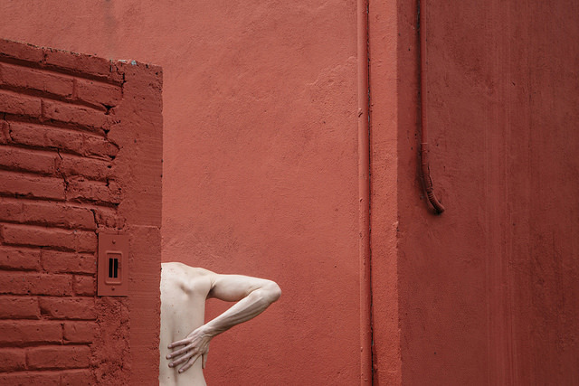
Source unknown – Title unknown (20XX)

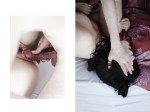
This is an interesting picture. I’d have preferred if it were a bit more evening exposed–all the shadow detail in her hair is gone whereas there’s still hints of detail in the cabinet or table to the left of the couch; also, if the camera had been raised perhaps a foot and moved back by a foot, you’ve have gotten both of them more or less fully in frame and enhanced the visual dynamism of the shot.

And as nice as I think the little details are here–i.e. her hand covering his and helping to hold her legs in position, her tongue and clitoral piercing and the books behind her legs on the couch cushion (hell, even the presentation of his erection and testicles is aesthetically pleasing)–what appeals to me about this is the question it perpetuates in my brain: is there a relationship between symmetrical representation and subjectivity?

I’m not at all certain the following applies anywhere outside my own head but I know that there’s always been this rupture or disjunction between the vision in my head and the final print. Generally, the small that rift, the better the photograph.

I think the thing is we tend to look at the world askew. The human brain is amazing at filling in blanks unbidden–sometimes to our detriment (most optical illusions are such because the brain straight up accepts its own grandiloquent assumptions on the regular).

I’ve gotten a bit ahead of myself. I need to backtrack momentarily.

Usually, I’m of a mind that there are two types of people in the world those that separate everything into two arbitrarily ‘oppositional’ extremes of a spectrum and everyone else who isn’t a pretentious douche nozzle. Yet, as blunt tools, things like Szarkowski’s windows vs. mirrors dichotomy do at least provide a set point of departure.

I think there’s another potentially useful distinction–images that are found vs images that are constructed.

It’s easy to just blame street photography as the singularity from which all found images emerge. Even in rigorously constructed studio work, there’s still an element of finding in the eventual edit. Yet, I think the distinction between objective and subjective, has something to do with symmetry.

Constructed work tends to flow outward from a place of symmetry. The trouble with symmetry is… well, it’s mostly an illusion. Spend enough time with a large format camera and you’ll begin to actually see the fruit of the whole Euclidean geometery projected into three-dimensional space. (In simpler terms: try drawing an equilateral triangle on the surface of a sphere. It’s impossible.)

When I’m trying to find an image, I’ll tend to see it but when I lift the viewfinder to my eye–the thing I saw that sparked my interest disappears. I sort of think it’s because what I saw came as a result of my brain projecting a symmetry onto the scene that either wasn’t there or was merely implied by what I saw.

When I experience this discrepancy between what I saw in my mind’s eye and what I see through the lens, I’ve learned to force myself to be patient. To do the heavy lifting, to search for something approximating the symmetry I perceived initially.

On the rare occasion that I succeed in finding it, there’s a sense that the image is less an image and more a window. The image maker steps aside in order to reveal the viewer the objective experience of seeing.

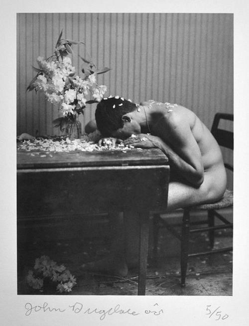
In the above image, there is a literal asymmetry. It’s not so much interested in the ordering of physical space as the conveyance of the moment. Yet, in that it is very clearly subjective. The camera’s focal plane is not a window but instead an approximation of some observer’s perspective.

The thing about symmetry is that we think of it as bilateral–in other words, vertical and horizontal mirroring in one point perspective. But symmetry can exist without centering.

I actually think that is what the brilliant street photographer Paul Graham means when he says:

I have been taking photographs for 30 years now, and it has steadily
become less important to me that the photographs are about something in
the most obvious way. I am interested in more elusive and nebulous
subject matter. The photography I most respect pulls something out of
the ether of nothingness… you can’t sum up the results in a single
line.

His work is full of found images that are more window than mirror and as much as Graham wants to chalk it up to elusive and nebulous subject matter, his work shines because of the way he finds a meta symmetry that doesn’t get in your way, doesn’t distract you from what your seeing but instead functions as a feeling.

The distance between the subjectivity of above image and the window-like objectivity of Graham’s best work is identical to the distance separating artful porn from pornographic Art.

Erwin OlafJoy (1985)

I didn’t immediately recognize Olaf’s name when msjanssen reblogged this image (which I have an inkling is a self-portrait) and it  seemed like it sort of wanted to riff on Peter Hujar’s haunting portrait of David Wojnarowicz masturbating and formed an informal point-of-departure for Jeff Wall’s rigorously formal and uncharacterically garish Stereo. (Also, if you want an interesting thought exercise: consider the trajectory from Blade Runner through Olaf to something like say the post-production infusion of underexposed tenebrism in a show like Hannibal while Wall is very painstaking, using a fucking shit ton of light to communicate gloaming.)

But you remember those hideous nudes with the bags from monolithic fashion designers over their heads? It’s called Fashion Victims and well, let’s just say it lacks any sort of subtlety.

Having said that: Olaf’s done some excellent work–though you wouldn’t know it from his website is basically MySpace with Quicktime VR plugin dragged kicking and screaming into some sort of javascript from hell bullshit. (There is no acceptable excuse for an image maker to subject people to such a goddamn awful fucking page.)

The Advocate put together an excellent edit of his work last year;  you should absolutely check it out.

Milan Vukmirovic – Marlon Teixeira for Made in Brazil (2015)

I feel like this is almost certainly at least subconsciously referencing Jeff Wall’s Milk–the color of the car in this matches is only a smidgen darker than the bricks and both include areas that are at least two stops below the minimum threshold for shadow detail.

The above lacks Milk’s rigorous form and restraint; however, I’m not here to discredit Vukmirovic. For what this is: it’s ingenious. Wall would’ve been shooting on a tripod. If you check the reflection in the chrome bumper you can see that the image maker is laying on his back on the asphalt to take the picture. And if you look closely, you’ll note that there’s roughly a five degree axial tilt that’s off from the horizon line. It emphasizes the overtly sexual nature of the pose.

The cloud perfectly haloing his head is inspired and was probably a happy accident. Still, short of the other car that you can just make out in the lower right edge of frame, this is an awesome image. That chooses two colors (blue and brown) and presents a dynamic spectrum within that scope.

Also, pro-tip: if it’s clean and you nail your 18% grey exposure, chrome looks fucking killer in color. Although if you are shooting B&W analog, you want to swear you can see your reflection now in the present moment showing up in the negs.

WowPornSize Matters! featuring Bella Baby (2013)

Despite what tend to be better than the run-of-the-mill online porn outlet production values, I object to the over-the-top heteronormative tropes in which WowPorn traffics.

And as much as this video is emblematic of everything I detest about the company, this shot actually has a great deal of inherent potential–I mean I’ve never seen framing quiet like it before.

Granted, the camera probably needs to pull back about two feet and perhaps angle up slightly. Cover that too hot key light source–probably a west facing window–with a couple layers of frost; gel what ever is casting that godawful purple sodium vapor tinge that’s working as the fill here (I’d say CTB but then I like everything to match and correct via a grade in post, CTO could work too.)

Also, production design dropped the ball. Sure the wood floor is nice, but how about some sort of rug to add some color. And the difference between the color of the wall and that cabinet needs either color or at least two stops greyer.

Lastly, this is one of those situations, where the default 16:9 aspect ratio isn’t quite as wide as you’d want. Ideally, this scene would’ve benefited from the abbreviated depth of field an anamorphic adapter would’ve brought to the table. However, given that those tend to be expensive, they camera guy could’ve opted for a wider lens and then letterboxed during editing. (Something I’m discovering is that the more rectangular your image, the more it invites a narrative reading–which is not to saw every movie made needs to be shot in 2.35:1 but there are cases where it is appropriate; this is one, IMO.)